2 neue Optimo-Releases
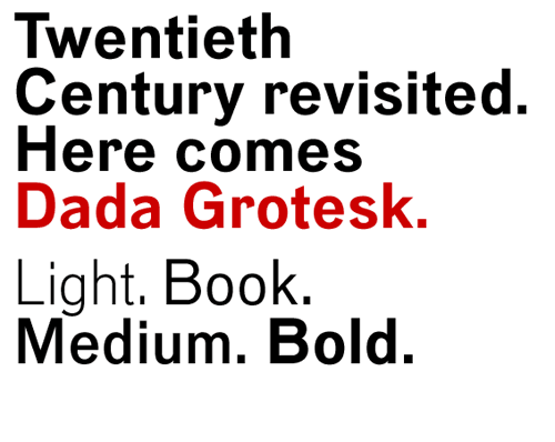
Dada Grotesk was designed for the book and the signage of the exhibition “Dada”, Centre Pompidou, Paris, 2005. Based on a typeface found in issues #3 and #4/5 of “Dada Paris”, 1918, this text-and-display typeface, with quiet but tough shapes, remains in the same time american “gothics” and german “grotesks”. This four-weights-family will soon be completed with its italics. By deValence, Paris.
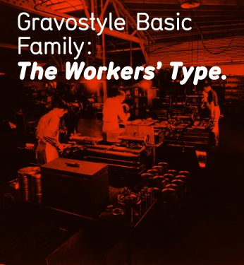
Gravostyle Basic is based on a transfer-sheet font (that was itself referring to swiss engraving fonts). The base font had only one weight. Originally drawn in 1999 as a rough multiple-master (named “Rubdown”), the font was tamed down and a slanted version drawn for the Optimo release. The idea was to keep an industrial touch without overstating it. By Niels Wehrspann, Lausanne.