Cadence
Es gibt Neues von Jonathan Perez, der auf www.typographies.fr seinen Font Cadence bekannt macht.
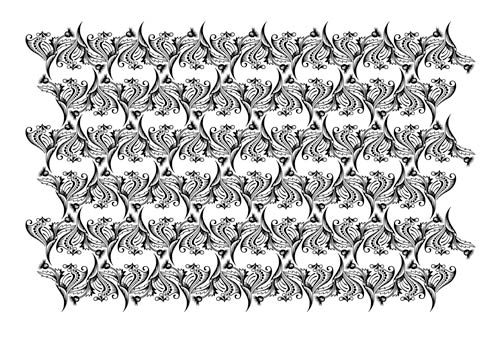
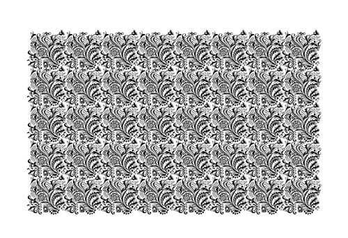
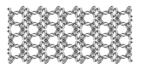
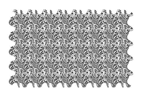
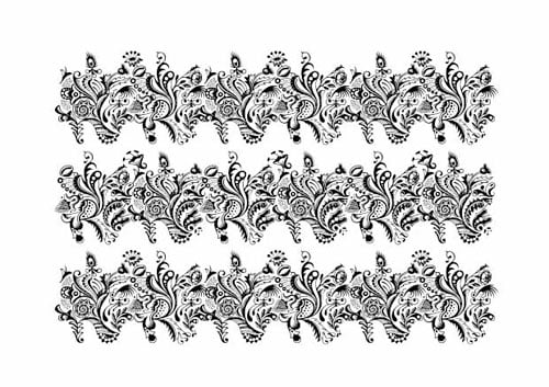
Vorgestellt wird die Cadence als Neuinszenierung eines Fonts aus dem 19. Jahrhundert, besonders auffallend durch seine komplexe Ästhetic.
Jonathan Perez selbst über die Cadence:
»This character is a revival of a metal type font, which comes from a French type specimen of the nineteenth century. I do not know who is the author of the original ornamental design. This work is not a strict revival of the original character: the main thing was to retain the strong aesthetic and conceptual bias, while making the system evolving, notably because of the evolution from metal typesetting to digital typesetting.
The character is remarkable for its process of construction: contrary to a classic ornamental font combining a lot of simple geometric elements, this one combines a few number of highly-complex non-geometric elements. One of the consequence is the speed and ease to set sophisticated pattern with a great rigour of construction. Another consequence is that the eyes are "lost" in front of the pattern: we hardly find at the first look the hidden construction as we do not see the shape of the basic elements. It refers to a kind of psychedelic aspect in the resulting aesthetic.
The font is designed to be used at large sizes. It is made of 3 versions, intended to be combined easily by the user to make patterns.«