Comic Fonts
Everything just Boom, Zoing and Wusch?
Donald Duck doesn’t swear in Futura. Garfield doesn’t think in Garamond. Superman doesn’t save the world with Helvetica. For this there are fonts with such striking names as “BlahBlahBlah!,” “Monster Fonts,” “Atomic Wedge,” “BIFFBAMBOOM” and many more.
Comic fonts may and should have more characteristics of their own, be more playful than other fonts. After all, they become part of the visual language. Especially if they fulfill an onomatopoetic function, i.e. a loud imitative, loud painting function. A “BUMM” should of course bang really nice and not come along harmlessly in Univers.
There is a tendency to assume that there is more room for manoeuvre in the field of comics when it comes to choosing fonts. But you will find similar fonts in the respective sections, e.g. science fiction or gothic. Especially speech bubbles are usually quite simple, the readability should be given. Typography in comics usually only catches the eye when it is badly chosen. What a pity, actually.
So is there really more freedom in the choice of type in this sector, more imagination? Every medium has its own rules.
I would like to raise another question here: Are comic fonts taken seriously at all? Are they beautiful or are they only for their intended purpose?
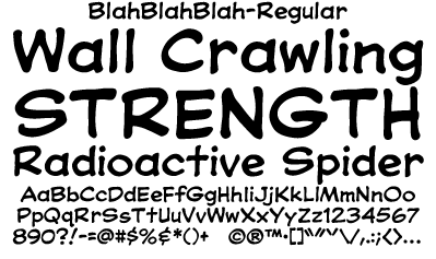
The font examples on the left are from Comicraft—“The world’s greatest comic book fonts.”