Dover Display & Monumental Grotesk / Tiny Type Co.
Wir freuen uns sehr euch eine neue Type Foundry aus Norwegen vorstellen zu dürfen. Sie wurde vom holländischen Designer Rob Mientjes (1988) gegründet, der auch die ersten beiden veröffentlichten Schriften der Tiny Type Co. gestaltet hat. Er führt ein kleines Design Studio in Oslo, das sich auf Markenkonzepte spezialisiert hat. Seine eigentliche Leidenschaft gehört aber dem Schriftgestalten. Seit 2016 ist nun Tiny Type Co. ein kleiner Raum für große Schrift.
Mit der Gründung der Tiny Type Co. hat Rob Mientjes, nach vielen Jahren Arbeit an ihnen, auch seine beiden Schriften Monumental Grotesk und Dover Display veröffentlicht. Die Monumental Grotesk ist eine historische Wiederbelebung eines charmanten, architektonischen Schriftstils. Die Dover Display ist eine Familie mit vier Schnitten und basiert auf der Arbeit von Eric Gill und William Caslon.
Pressetext: The Tiny Type Co. is proud to announce that it has opened for business. After many years of work, months of preparation and mastering, and a lot of glyphs, I am finally ready to show you my typefaces. The first release is Dover Display, a four-style type family based on the works of Eric Gill and William Caslon. The second release is Monumental Grotesk, a historical revival of a charming architectural lettering style.
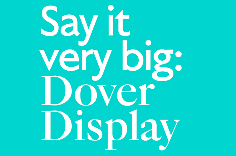
Dover Display
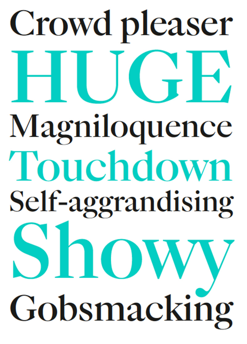
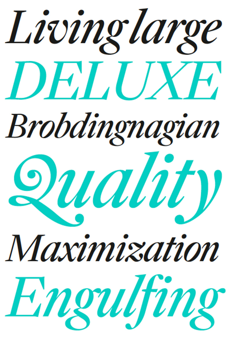
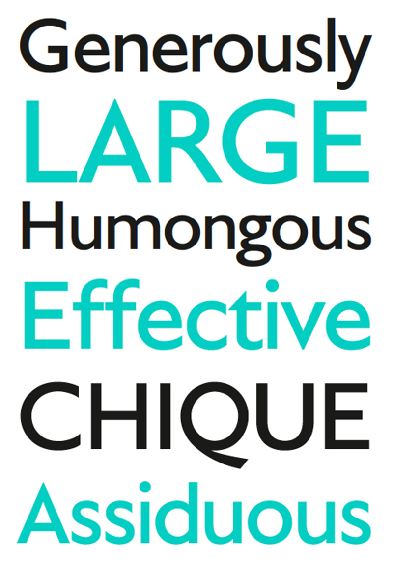
Dover Display is an exercise in historical design fiction: what if Caslon and Gill Sans were designed by the same person? What if that person were me? In this spirit, both the sans and serif support the same typographic framework: all numbers, symbols and tricks are directly matched from serif to sans. This, combined with the shared vertical proportions and the same basic skeleton, makes for a perfect typographic pairing. Started in 2012, Dover Display is now a small, fully matched type family. What it lacks in styles, it makes up for with style. These contemporary versions of Gill Sans and Caslon are ready for action: big, showy action. Think an actor doing their own stunts. It’s best used big, but works well down to 24 pixels on the screen, or 20 points in print. The standard Tiny Type character set supports over 200 languages using the Latin script. It further supports a vast range of manual combinations of base glyphs and diacritics using the OpenType Mark feature.
Dover Display
Foundry: Tiny Type Co.
Designer: Rob Mientjes
Veröffentlichung: 2016
Schnitte: Dover Serif Display Regular, Dover Serif Display Italic, Dover Sans Display Regular, Dover Sans Display Italic
OpenType Features: Fractions, Contextual Alternates, Discretionary Ligatures, Tabular Numerals, Proportional Numerals, Case-Specific Punctuation, Two Stylistic Sets
Preis pro Schnitt: 40,- Euro
Preis Familie: 160,- Euro
Buy
Monumental Grotesk
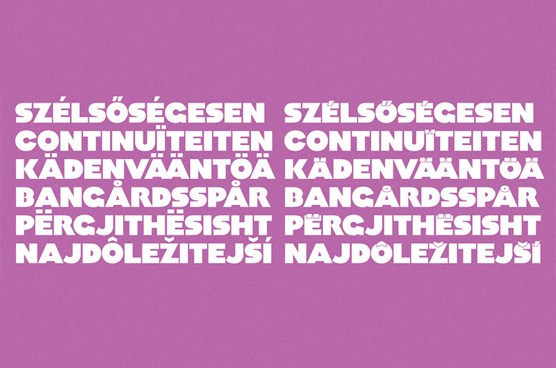
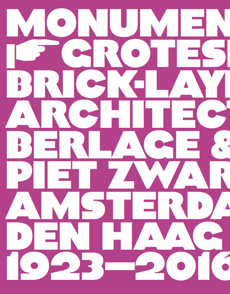
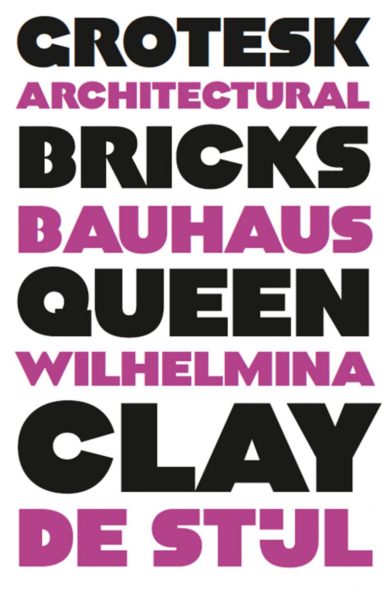
Monumental Grotesk is a spiritual revival of letters originally designed to be carved from stone. Piet Zwart, one of the first Dutch graphic designers, drew a small set of heavy, modern capitals for use in some of his poster work, and eventually took these designs to the physical world. Renowned architect Hendrik Berlage, who led the Amsterdam School movement, needed some façade lettering done, and Zwart had the right stuff lying around. Using OpenType, Monumental Grotesk is capable of a few useful tricks, such as contextual replacements of clashing glyphs, smart fractions and some stylistic variations of glyphs. The standard Tiny Type character set supports over 200 languages using the Latin script. It further supports a vast range of manual combinations of base glyphs and diacritics using the OpenType Mark feature.
Monumental Grotesk
Foundry: Tiny Type Co.
Designer: Rob Mientjes
Veröffentlichung: 2016
Schnitte: Regular
OpenType Features: Fractions, Contextual Alternates, Discretionary Ligatures, Tabular Numerals, Proportional Numerals, Three Stylistic Sets
Preis: 30,- Euro
Buy