Ikiru Sans
Gerade neu erschienen: IkuruSans mit 10 Schnitten von Boris Dworschak.
Since the release of the IkiruSerif font in 2007, designer Boris Dworschak has developed the Ikiru font family one step further and designed the new sans serif version IkiruSans.
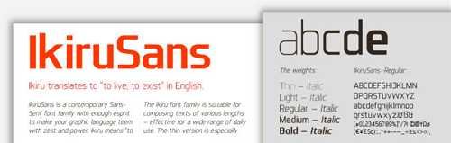
IkiruSans is a contemporary sans serif font family with enough esprit to make your graphic language teem with zest and power. Ikiru means “to live, to exist” in Japanese and the typeface comes in 10 weights including thin, light, medium, bold and their italic versions – all of which are designed from the thin version giving the typeface an elegant, sharp and discreet appearance and a forceful, concise look in the bold versions. IkiruSans is a text font that’s suitable for composing texts of various lengths – effective for a wide range of daily use. The thin version is especially designed for usage in big point sizes, for instance in posters or banners. (Quelle: dgv)
Mehr Informationen sowie ein kelines Interview mit dem Designer Boris Dworschak gibt es beim Gestalten Verlag