Lumin typeface family
Typotheque hat eine neue Schrift veröffentlicht.
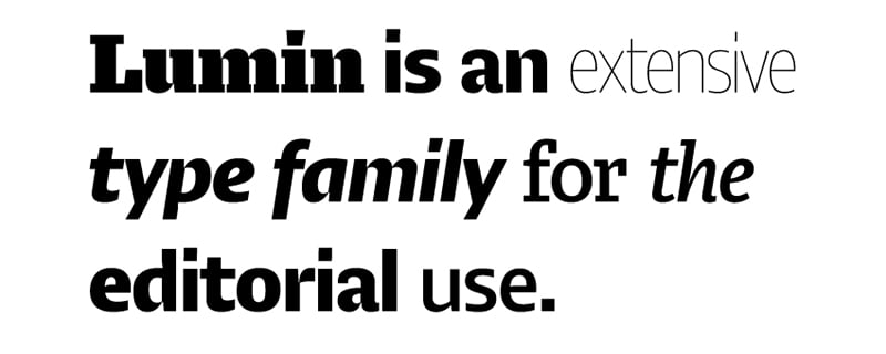
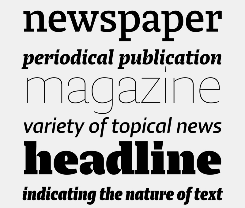
Pressetext: The Lumin family includes slab-serif, sans serif, condensed and display typefaces, all of which play with the idea of contradiction. The contrast between horizontal and vertical strokes seems to be quite subtle, evoking the slab serifs of the past century. The stroke connections, however, are sharply chiseled, reminiscent of high-contrast modern types, an effect especially pronounced in the heavier weights. The result is hybrid letterforms that look almost like stencil drawings, yet maintain high legibility at the smallest sizes.
Lumin is a sturdy slab-serif face with large counters and a large x-height. Its serifs are unbracketed and asymmetric, emphasising the rightward flow of reading.
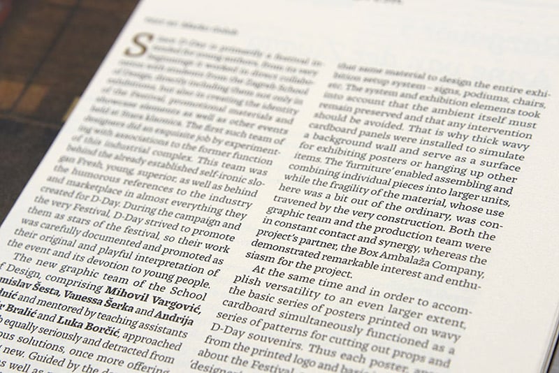
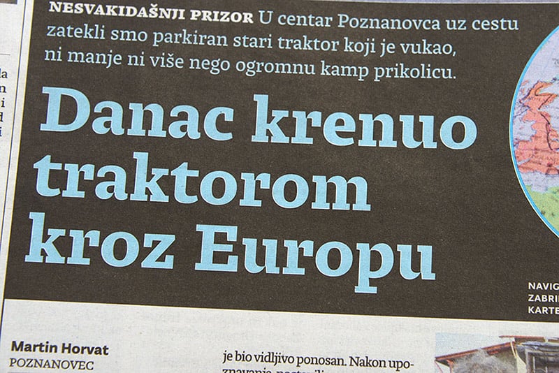
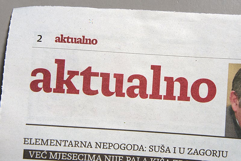
It’s not easy to describe newly-published typefaces before their usefulness has been demonstrated in real world application. Lumin has already been rigorously tested in magazines and newspapers, so you can see for yourself how it performs in these samples.
Lumin
Foundry: Typotheque
Designer: Nikola Djurek
Veröffentlichung: 2013
Format: OpenType
Schnitte: Light, Light Italic, Regular, Regular Italic, Medium, Medium Italic, Bold, Bold Italic
Preis: pro Schnitt 90 Euro, Familie 390 Euro