Mislab
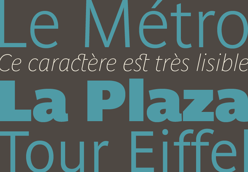
Mislab, die neue Schrift von Xavier Dupré, beschreibt schon in ihrem Namen selbst ihr außergewöhnliches Design. Im Französischen bedeutet «Mi» teilweise, auf halbem Weg und so kommt die Mislab teilweise ohne Serifen, teilweise mit Serifen daher.
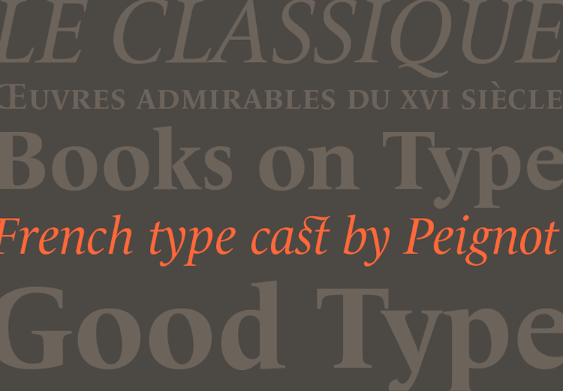
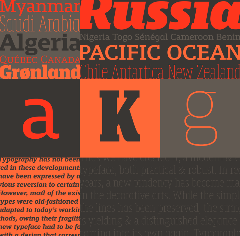
Pressetext: Referred to as Egyptian’s in the early years of the nineteenth century, today slab serifs are primarily used in display sizes but seldom used in body text. With Mislab, Xavier Dupré has designed a brighter and more legible slab serif than most. Mislab aptly combines the strength of a slab serif with the lightness of a sans serif. Bold and thick serifs make for strong impact in display uses while performing extremely well under the most stressful body text conditions. A slight cursive feel adds spice to the text while its delicate rounded rectangular structure is naturally adapted to screen displays. The capitals have fully assumed serifs while the lowercases have more discreet versions. Notable features include sanserif endings on the lowercase a, c, e & s, inducing fluidity and enhanced readability. This highly versatile typeface brings clarity to headlines. The Mislab family covers a wide range of applications thanks to the 32 styles in 3 widths & italics. Dingbats and optimized arrows are available through the family styles as a & g alternates. Mislab will provide foolproof stability to your layouts.
Mislab
Foundry: Typofounderie
Designer: Xavier Dupré
Veröffentlichung: 2013
Format: OpenType
Schnitte: Condensed, Sans, Serif
Preis: € 55 pro Schnitt, und die ganze Schriftfamilie der Mislab für € 993