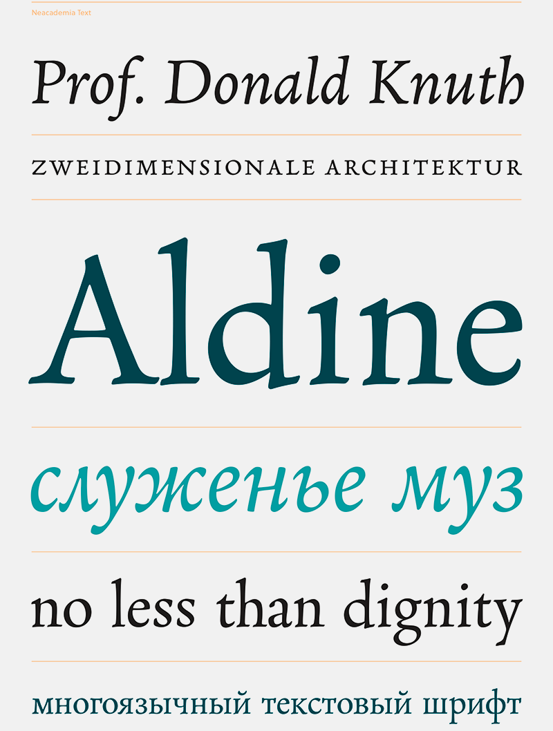
Neacademia Small Text / Rosetta
Heute stellen wir euch den neuen Schnitt »Neacademia Small Text« der Schrift »Neacademia« von Sergei Egorov vor. Sie ist von den Typen des Stempelschneiders Francesco Griffo da Bologna inspiriert, welche dieser für Aldus Manutius herstellte. Ähnlich wie im Bleisatz beinhaltet die Schriftfamilie verschiedene Versionen, welche für spezifische Punktgrößen optimiert ist. »Neacademia« passt besonders gut zu langen klassischen Literaturtexten und der neue Schnitt »Neacademia Small Text« ist besonderes für die kleinsten Punktgrößen optimiert.
Neacademia Small Text is the final instalment in Sergei Egorov’s investigation into 15th century typefounding methods. The new variant, which is intended for the smallest point sizes, features a low contrast and generous proportions, improving legibility in captions and small texts. The shapes owe much to the punchcutter’s graver, as it worked its way through the steel, making short curves and leaving sharp details in tight corners.
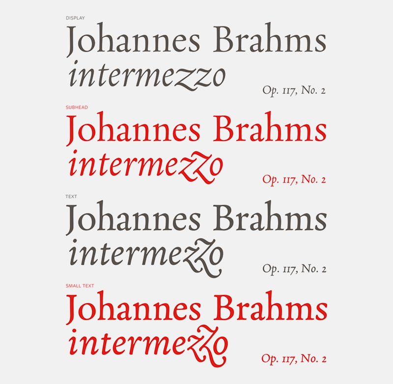
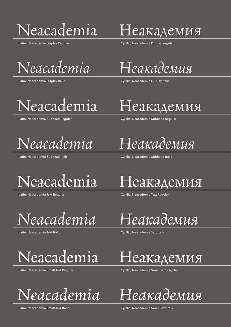
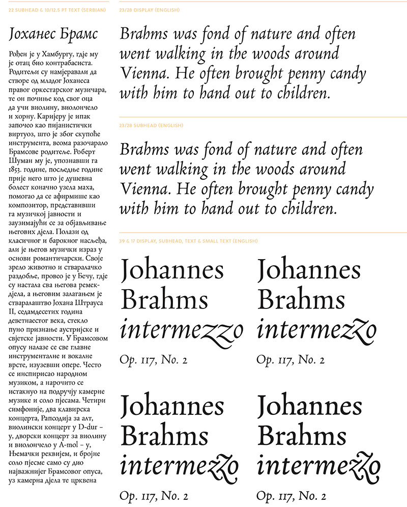
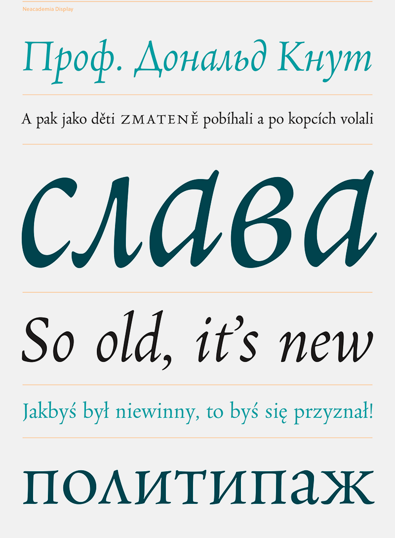
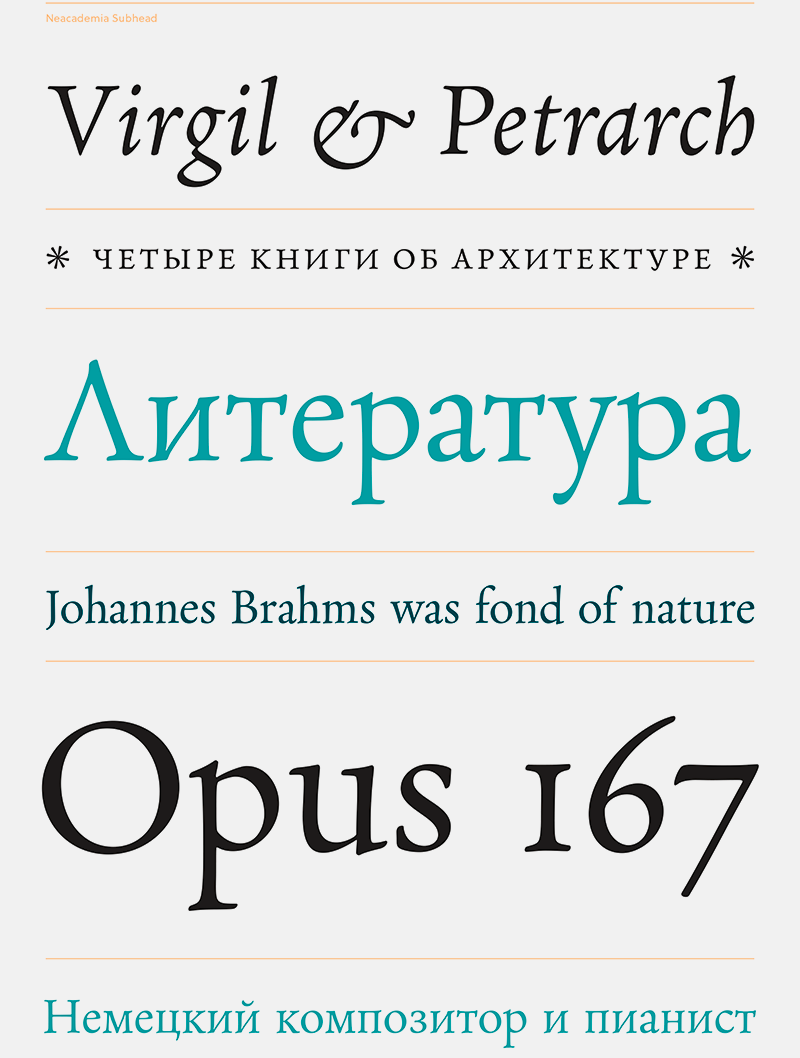
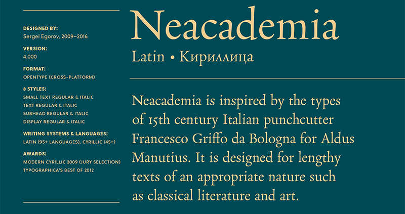
Neacademia is a Latin and Cyrillic type family inspired by the types cut by 15th century Italian punchcutter Francesco Griffo for the famous Venetian printer and publisher Aldus Manutius. The family comprises different versions optimised for specific point sizes, as was traditional in metal type. While the display sizes maintain a visual link to calligraphic roots, text sizes exhibit more typographic qualities, following the hand of the carver, not the calligrapher.
Neacademia was designed with specific allowances for letterpress photopolymer printing. Printed digitally, it can tolerate – and even benefit from – low resolution, rough paper, and low-grade presswork. It also adopts a more traditional approach to kerning and caps-spacing – instead of a multitude of kerning pairs, it makes use of alternative letterforms. In many ways, it feels like using metal type again!
Neacademia is a typeface with a past. Like other fonts that are inspired by a historical model, it conveys a feeling from a bygone era and transports it into a modern format. Where it differs to many others however, is its approach to be historically sensitive, rather than historically accurate.
The admiration towards a historical typeface, however strong, is rarely in itself a good enough reason to make a revival of it. For such an idea to make sense, it should fit into a modern typographic environment, fill a need not currently served by any of the existing fonts, and express something that does not have a typographic expression yet.
Neacademia’s historical sources are by no means original. The novelty lies in its approach to revivalism. At a time when mainstream typography shifts to digital media, it takes a step in the opposite direction, assisting the book-as-an-object community in its struggle to keep the art of making physical books alive. This relatively small group of retrogrades can hardly be considered a “market”, but they are very determined and capable of making things of exceptional beauty. In the not-so-recent past they had all tools of the trade at their disposal. Nowadays, hand-set type is disappearing at an alarming rate, with high-quality book paper and printing equipment following the same path. Thankfully, some losses are offset by technological advances; the arrival of relatively inexpensive photopolymer plates, which can be processed in small print shops, helped bring new life to letterpress printing. The process of typesetting can now be fully digital, and involve digital fonts.
Neacadamia
Foundry: Rosetta
Designer: Sergei Egorov
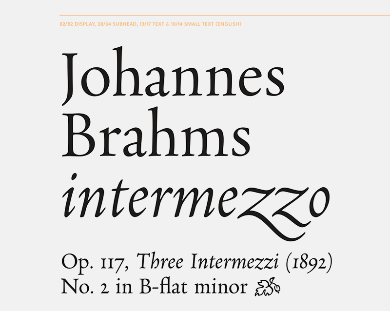
Schnitte: 8 Schnitte (Small Text Regular, Text Regular, Subhead Regular, Display Regular plus Italics)
Preis pro Schnitt: ab 60,00 Euro