Neuvos
Typolar stellt die neue und elegante Schrift Neuvos vor.
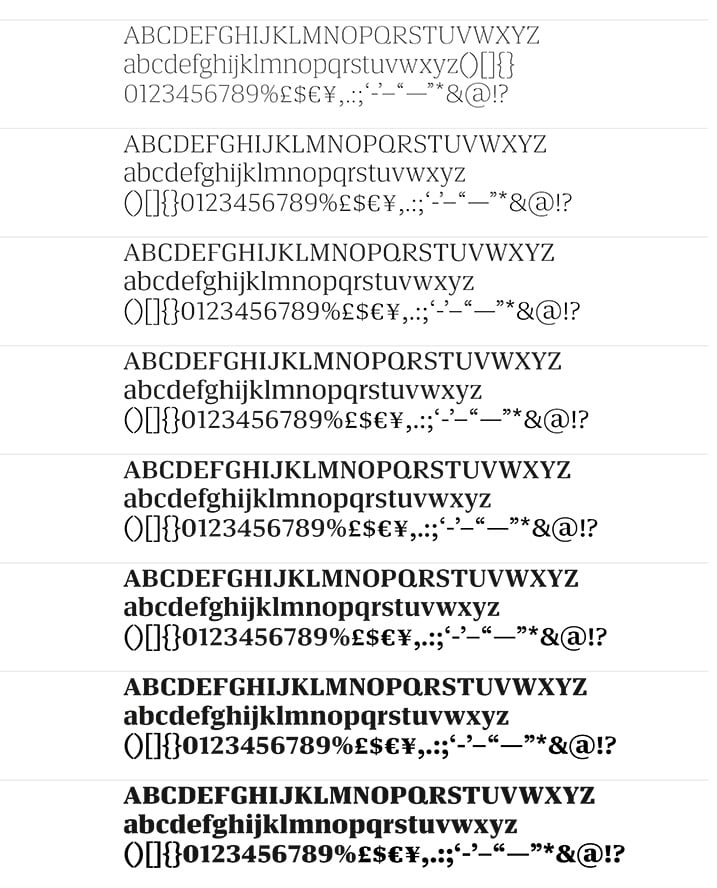
Pressetext: Having been under development for several years, Neuvos has been sparring with many newspapers and magazines to become fitter and leaner. It has two main goals: To be completely balanced in tight text strings and remain credible without loosing character. Neuvos will assure in editorial work and bring its Frutiger inherent calmness into branding or even signage systems. Its large x-height, vertical stress and snug serifs make Neuvos an upfront and tough headliner. Although it has a hard boiled cover, one can find hints of noble Transitional type like Baskerville underneath. Neuvos shares elements with sturdy late 19th century Newspaper types, but meets the latest standards for modern design and publishing models.
Neuvos
Foundry: Typolar
Designer: Jarno Lukkarila
Veröffentlichung: 2013
Format: Open Type
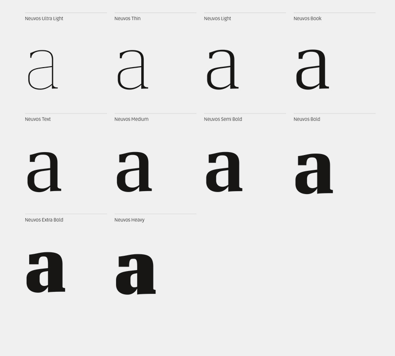
Schnitte: Ultra Light, Thin, Light, Book, Text, Medium, Semi Bold, Bold, Extra Bold, Heavy
Preis: pro Schnitt 50 Euro, Familie 320 Euro
Mehr Details über die Schrift erfahrt ihr unter: typolar.com.
PDF zum Download erhaltet ihr hier.