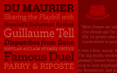
Trilby
Trilby hat Charme und sieht, vorallem in den fetteren Schnitten, irgendwie ein bisschen unbeholfen/unorthodox aus. Bei 8 Schnitten als Open Type hat man die Qual der Wahl.
Lest selbst, was sich David Jonathan Ross bei dieser Schrift gedacht hat:
Offbeat charm and subtle wit abound in this thoroughly distinctive, contemporary design which tips its hat to a slightly unorthodox model.
David Jonathan Ross has long been fascinated with the topsy-turvy quality of the so-called French Clarendon style. In its typical Victorian guise, this reverse-contrast genre is usually associated with wood type, circus broadsides, and the Wild West.
With Trilby, Ross eschewed any decorative excess and reined in the eccentricities for a more subdued approach. With generous and inviting letterforms, the result is a surprisingly functional maturity, suited to a variety of uses — from modest stretches of text to today’s headlines, posters, and ads.
Trilby flirts with the current fashion for slab serifs and reimagined Clarendons; but in the end, it goes its own clever way — with a sly smile.
