U8
Die U8 von Anton Koovit ist das Ergebnis aus einem Rechercheprojekt der Berliner U-Bahnlinie 8. In Slanted #18 stellten wir die Schrift erstmals mit einem Artikel über deren Entstehung vor und berichteten zum Release von Fatype über Antons Projekt. Ab nächster Woche ist die Groteskschrift endlich und offiziell bei fatype erhältlich.
Pressetext: U8, a new geometric sans serif, with seven weights, designed by Anton Koovit.
Anton started U8 as a research project about the Berlin subway system signage and particularly the U8 that connects the northern borough of Reinickendorf with Neukölln in the south of the city, through the Alexanderplatz junction. His goals were to restore a piece of history, to research a link between the DIN and Bauhaus, and to translate the lettering of individual handcrafted station signage into a formal typeface.
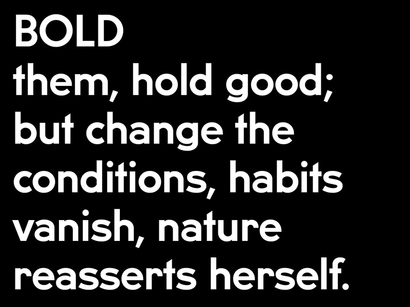
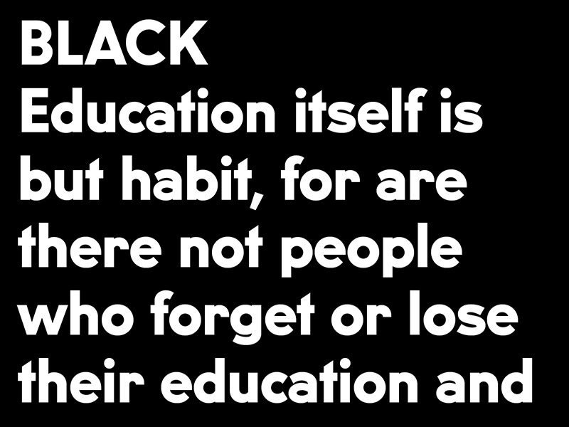
Apart from the regular weight's upper and lower case, glyphs such as numbers, and other weights, had to be created by the designer, allowing for his contemporary interpretation. The result is an early modernist typface, with wider proportions than most common geometric sans, a strong character, and a clean design. Initially intended for display purposes, U8 has proven to work well in text sizes. Italic styles will also be release in a few months.
U8
Foundry: fatype
Designer: Anton Koovit
Veröffentlicht: Januar 2013
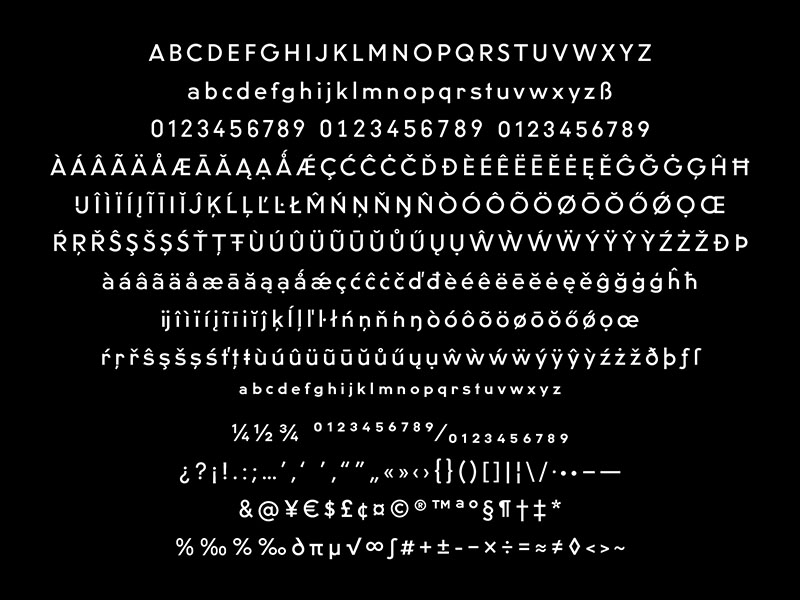
Format: Opentype
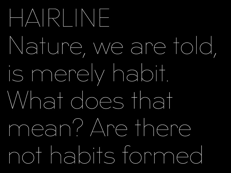
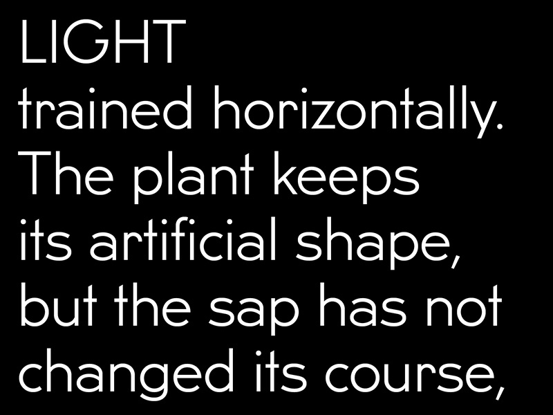
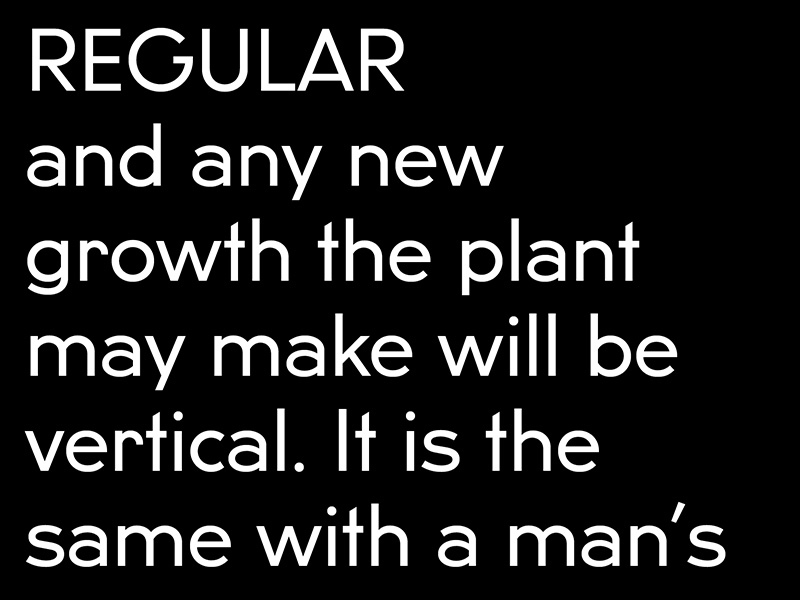
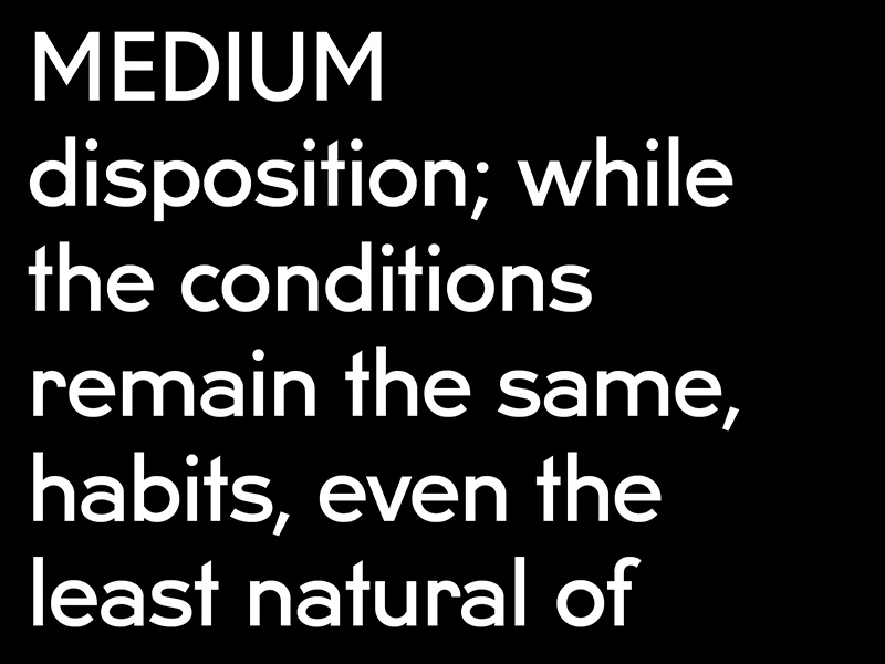
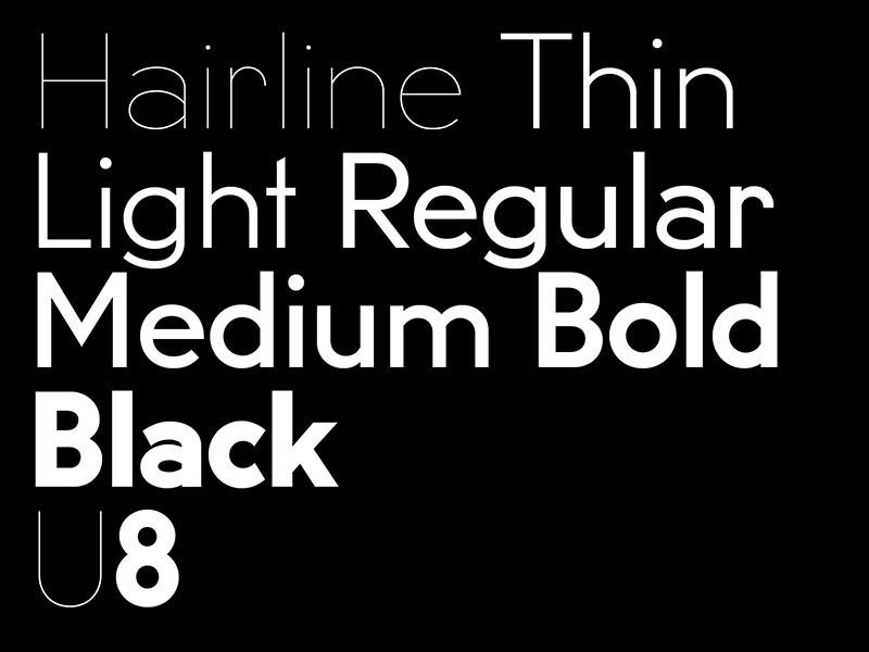
Schnitte: Hairline, Thin, Light, Regular, Medium, Bold and Black
Preis: pro Schnitt 50 €, U8 Familie 300 €
Hier auf fatype erhältlich (auch als Trial-Font). Montag mit 50% Rabatt und für den Rest der Woche mit 25%.