VolcanoType – Education Font Poster #2
Um dem tristen Schriften-Alltag an Hochschulen entgegenzuwirken, bietet der Schriftenverlag VolcanoType seit vergangenem Jahr im halbjährlichen Turnus Studenten die Möglichkeit, vier komplette Schriftfamilien kostenlos herunter zu laden und sie für studentische Projekte und privat einzusetzen. Mehr Infos dazu hier.
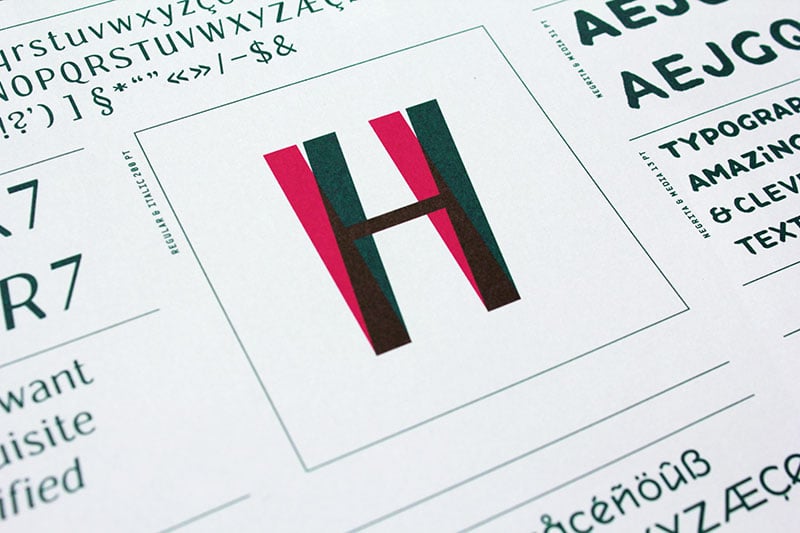
Für die zweite Aktion wurde ein schickes DIN A1 Plakat vom Designbüro Frankfurt (Frankfurt, DE) und Peter Brugger (Istanbul, TR) gestaltet (exklusiv erhältlich im Slanted Shop) und vollständig in Sonderfarben gedruckt, welches die aktuell zur Verfügung gestellten Schriften im Kurzprofil vorstellt.
Wie funktioniert’s?
Einfach auf www.volcano-type.de/education gehen oder den QR-Code vom Plakat scannen. Dort den eigenen Namen und seine Hochschul-Emailadresse angeben und sofort erhält man die zur Verfügung gestellten Schriften zugeschickt. So kann man sich nach und nach eine kleine Font-Bibliothek von VolcanoType anlegen. Baut euch eure eigene, kleine VolcanoType Schriftenbibliothek auf. Los geht’s!
Und wer das schicke Poster selbst besitzen möchte, kann es sich für nur 5 Euro exklusiv hier Slanted Shop bestellen. Bitte beachten: Das Poster wird gefaltet versendet.
Volcano Type – Education Font Poster #2
Herausgeber: VolcanoType
Veröffentlichung: 2 x jährlich
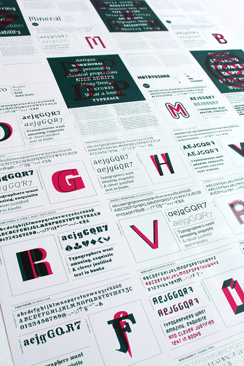
Schriften: Duwal Pro, Mineral, Matryoshka, Blue (Not) Mono
Gestaltung Vorderseite: Designbüro Frankfurt
Gestaltung Rückseite: Peter Brugger
Programmierung: Sebastian Tiede
Format: DIN A1, 594 x 841mm
Druck: Stober GmbH
Papier: ZANDERS medley pure, 110 g/sqm
Preis Poster: 5 Euro
Mit dem zweiten Plakat kann man als Student folgende 4 Schriften kostenlos beziehen:
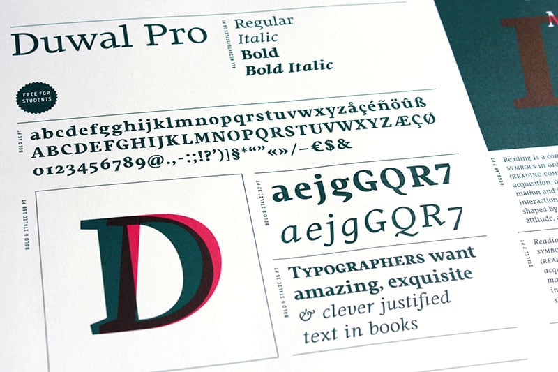
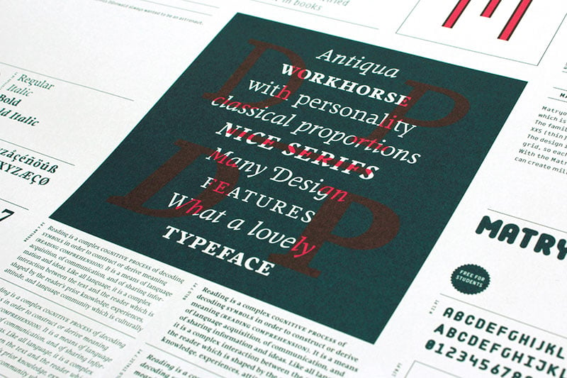
Duwal Pro by Dennis Dünnwald
The careful balance between the emotional swings and shapes set in strong contrast such as the burly serifs, or generally vertical and orderly appearance within the Duwal Pro determine the special look of this Antiqua typeface. All characters of the Duwal Pro are designed to be open and accessible. The lowercase letters are designed with a large x-height, which is why they are ideal for small font sizes. Many striking details give Duwal Pro a defined and firmer appearance with increasing font size so it is also suitable for use in headlines and work marks. The deliberately constructed and emphasized design of the serifs give the font a strong position and at the same time force the reading direction. Using Duwal Pro in Bold weight, the serifs look clearly striking, the design language is concise and the typeface receives an additional sympathetic force. The Italic weight draws on the expressive but not intrusive design of the Regular, but appears sharper and is ideal for text passages. The font family contains italics, small caps, lots of ligatures, swashes, another format set, contextual alternatives and special characters as well as other open-type features which allow the use of Duwal Pro in 48 languages.
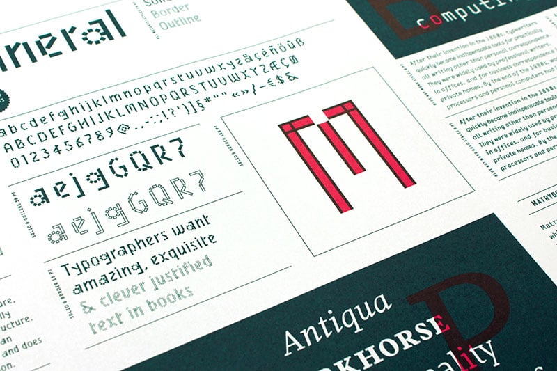
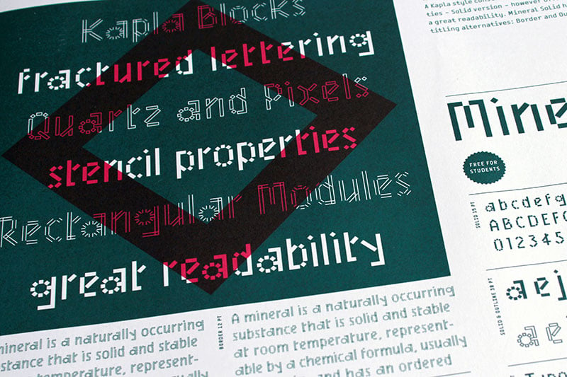
Mineral by Benoît Bodhuin
Mineral is a glittering writing, fractured into multiple tetragonal splinters, rectangular modules slightly spaced, like quartz and pixels. A Kapla style construction, with stencil properties – Solid version – however offers to the font a great readability. Mineral Solid has 2 stylistic titling alternatives: Border and Outline.
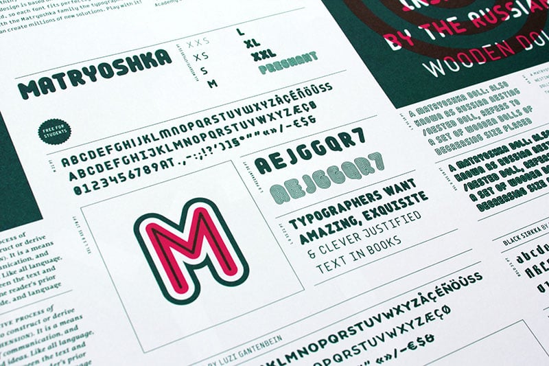
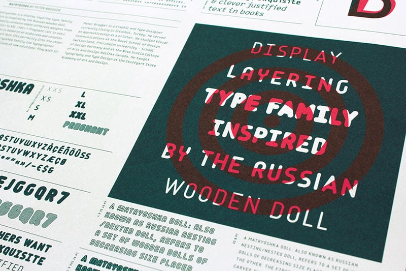
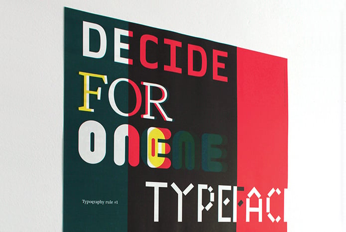
Matryoshka by Peter Brugger
Matryoshka is a display layering type family which is inspired by the Russian wooden doll. The family contains eight different weights from XXS (thin) to XXL (fat) + Pregnant (all in one). It was designed by Peter Brugger in 2009/10. The design is based on an elaborate and complex grid, so each font fits perfectly into the other. With the Matryoshka family the typographer can create millions of new solutions.
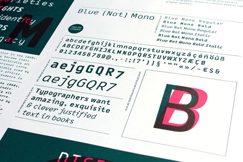
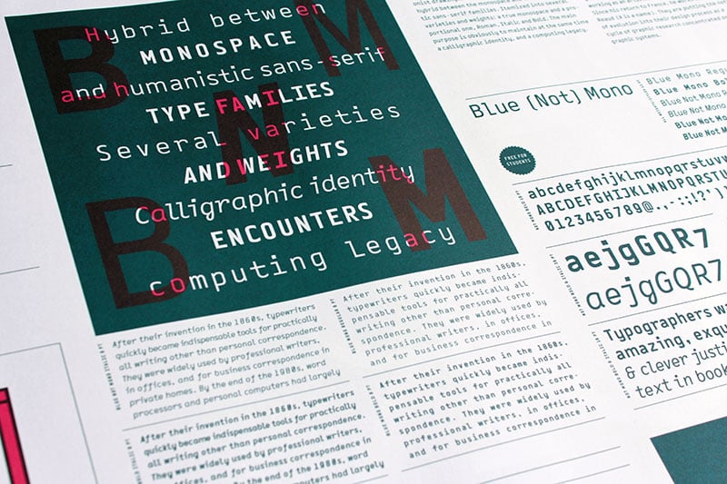
Blue (Not) Mono by Jéremie Nuel
As a binary system, at the junction to two antagonist drawings, the Blue (Not) Mono typeface is an hybrid between the monospace and the humanistic sans-serif families. Declined to several variants and weights: a true monospace and a proportional one, a roman and italic style, bold and the main purpose is obviously to maintain in the same time a calligraphic identity, and a computing legacy.
Und wer nicht genug bekommen kann: Das erste Plakat der Aktion, welches bereits international ausgezeichnet wurde, ist ebenfalls noch exklusiv im Shop für 5 Euro erhältlich.