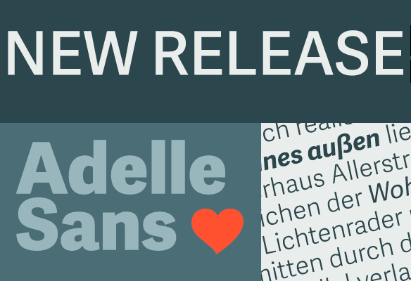
Adelle Sans
Endlich ist sie da! Die neu Adelle Sans komplementiert die mehrfach ausgezeichnete Serifenschrift Adelle.
Lest selbst, was die Designer José Scaglione und Veronika Burian von Type Together zu ihrer Schrift zu sagen haben:
Presstext: This sans serif counterpart to the award-winning Adelle type family proposes a cleaner and more spirited take on the traditional grotesque sans. As typical with TypeTogether fonts, the most demanding editorial design pieces were taken into consideration when engineering Adelle Sans. The combination of its lively character and unobstrusive appearance that is inherent to grotesque sans serifs make it an utterly versatile tool for any imaginable graphic application, whether it is branding, signage or advertising. Without any doubt, the key word behind Adelle Sans’ design is flexibility.
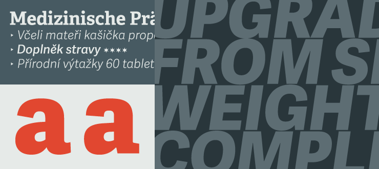
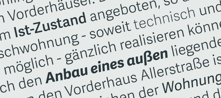
Adelle Sans is available in seven weights with their matching italics. Each one of these 14 styles is a perfect match in terms of weight and vertical proportions to its slab serif equivalent. This ensures a graceful fit between both font families in the same block of text, and a subtle, but noticeable, change of texture when used at similar point.
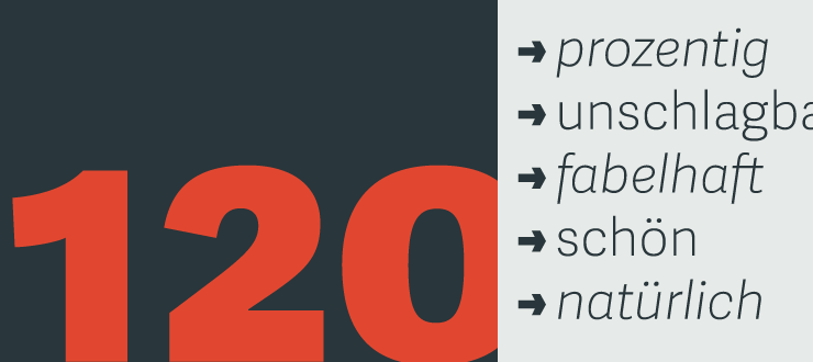
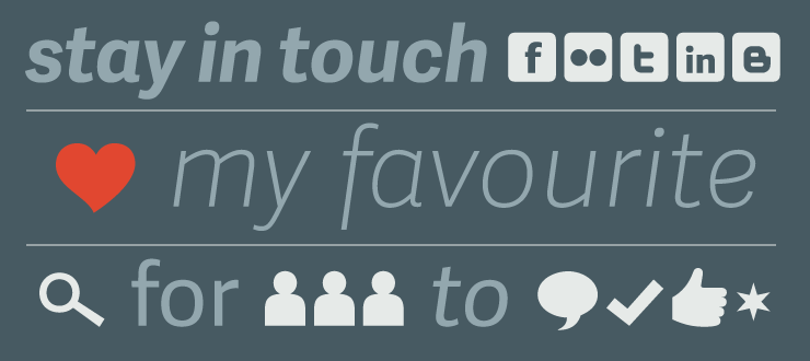
The 900 character set includes typographic niceties, small caps, several sets of figures, and support for over 90 languages. It also includes a set of 35 icons specially designed for electronic publications.
Design: José Scaglione, Veronika Burian
Label: Type Together
Schnitte: 7 Schnitte mit passenden Italics
Preis: Komplettpaket €445, Einzelne Schnitte € 49
www.type-together.com