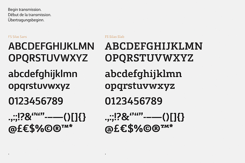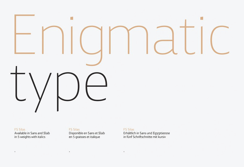
FS Silas
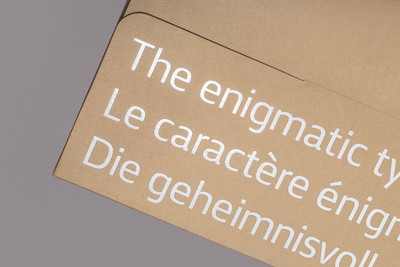
FS Silas ist das neueste Schrift-Geschwisterpaar der Schriftenschmiede Fontsmith. Als ein vielseitiges typografisches Toolkit ermöglichen die beiden Schriften Marken in unterschiedlichen Tonlagen zu sprechen. Die verborgenen Tiefen und subtile Nuancen führten zum Spitznamen: »die geheimnisvolle Type.«
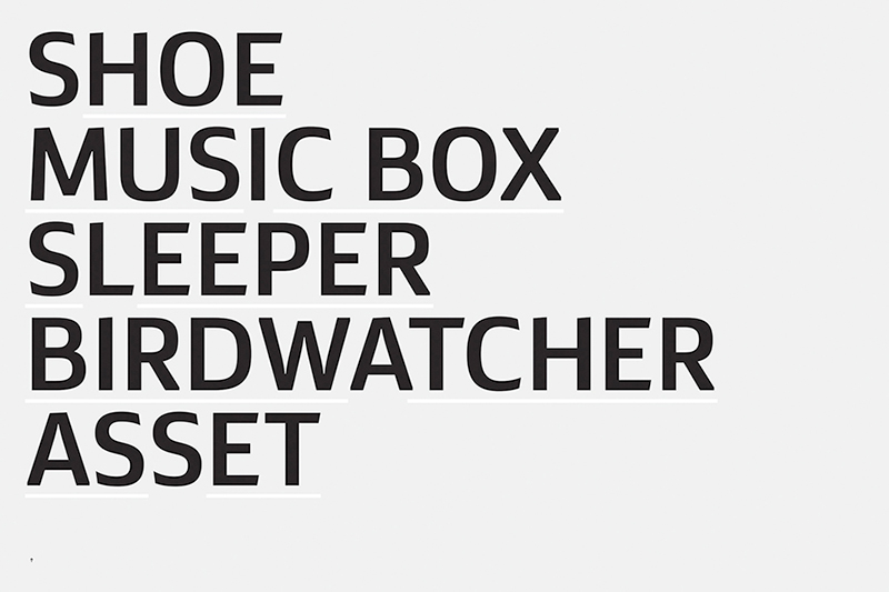
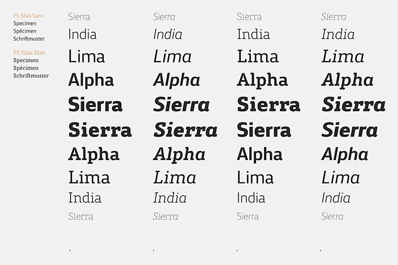
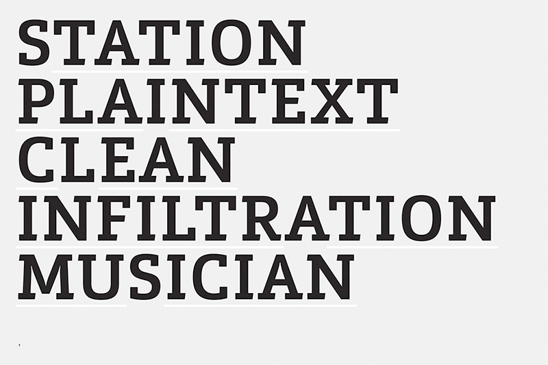
FS Silas wurde als Sans Serif und Slab Serif gestaltet, beide erhältlich in fünf Strichstärken mit jeweiligen Italics.
Aus der Beschreibung von Fontsmith: The various weights and styles are capable of displaying a wide range of personality traits, from elegant Thins to powerful ExtraBolds and enthusiastic Italics. The Sans and the Slab are true siblings, in the sense that they are drawn from the same origins, but display very different characters.
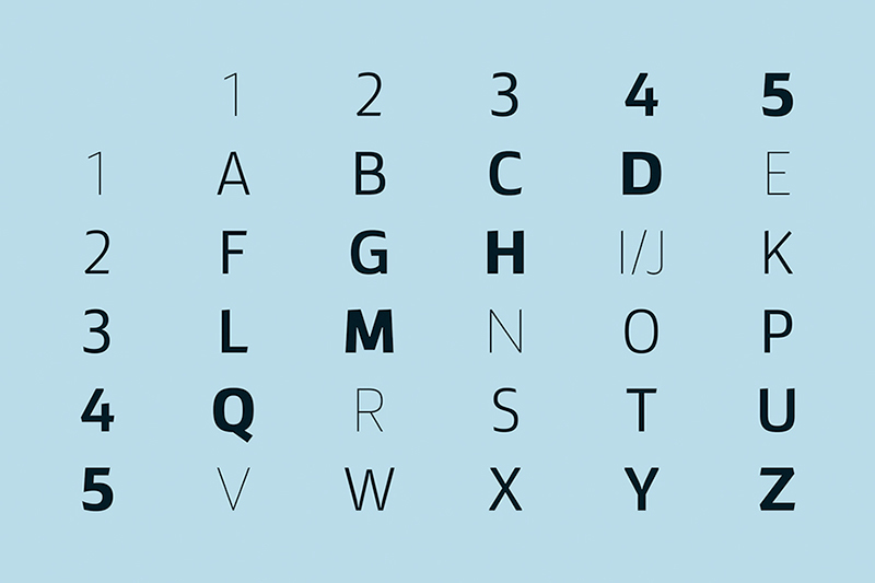
FS Silas initially appears unassuming – it goes about its work with a quiet industry. But on closer inspection, you begin to understand that there is more going on. Both versions make subtle use of varying angles across their respective character sets, giving copy a distinctive energy that compels the reader on.
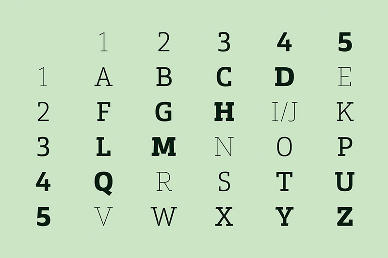
We stuck with the angular theme of the sans by drawing angled slab serifs, as opposed to the square serifs that slab fonts usually have. That created an inner dynamism in words and sentences on the page, and a very distinctive, crafted character, like a Victorian soul in a contemporary body.
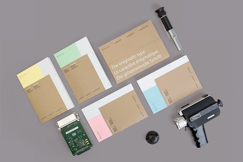
To introduce our newest typeface family, FS Silas Sans and FS Silas Slab, we worked with Believe In and The Space Between, to bring to life a creative concept that draws on the fonts’ intriguing nature.
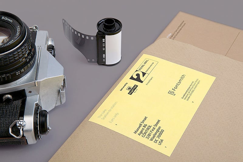
The first task was to find a name that would reflect its utilitarian sensibilities, crafted nature and hidden depths. Using the font brings to mind a host of cultural references including film noir, Scandinavian TV dramas and classic cold war espionage. So from an initial shortlist we chose Silas, a popular Scandinavian name with a folksy feel and a mysterious quality.
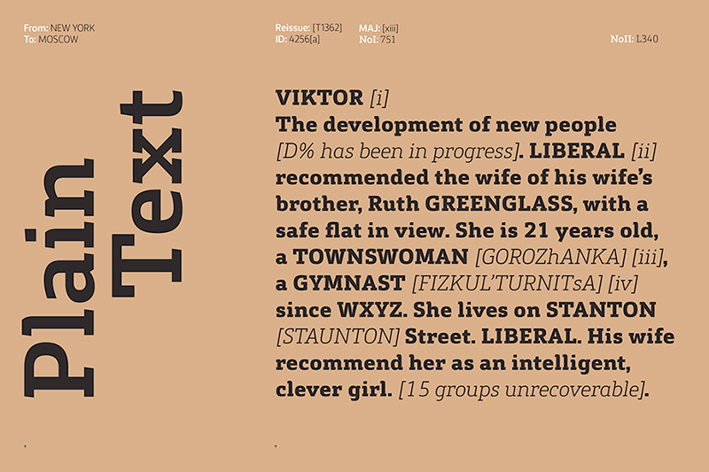
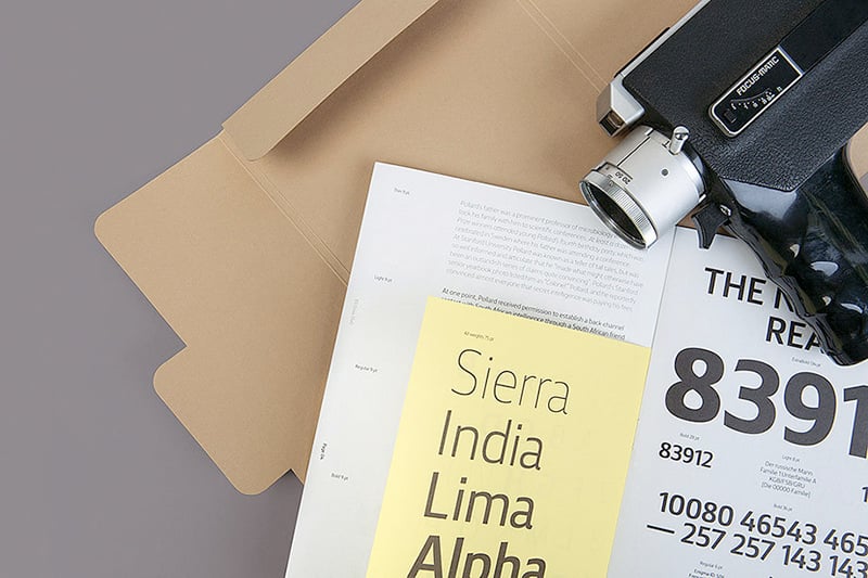
At the heart of the launch campaign are the printed type specimen and video teasers. The type specimen weaves themes of espionage into the form of a secret dossier, combining different paper stocks and page sizes into the finished piece. It is kept intentionally pure, the artwork consists only of type, printed in black ink throughout, save for a white foil that’s used on the Manila cover and enclosing folder.
Buy
FSSilas – FS Silas Sans & FS Silas Slab
Foundry: Fontsmith
Designer: Phil Garnham
Erschienen: Juni 2015
Format: Opentype
Schnitte: Thin, Light, Regular, Bold, Extrabold – jeweils mit Italics
Preis pro Schnitt: £80
Preis je Familie: £200
Buy