Maison Neue
Timo Gaessner veröffentlicht über MilieuGrotesque die Schrift Maison Neue. Basierend auf der Maison von 2010 wurde die Schrift überarbeitet und durch mehrere Schnitte erweitert. Die Maison wurde in Slanted #18 als Brotschrift eingesetzt. Desweiteren haben wir in der selben Ausgabe mit Timo über seine Arbeit als Grafiker und Schriftgestalter gesprochen.
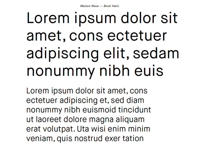
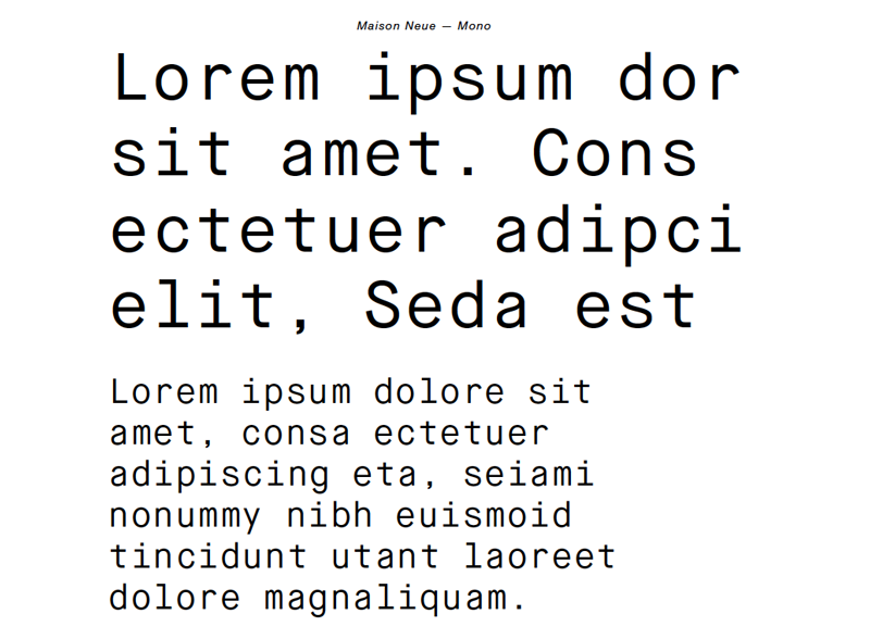
Pressetext: Maison Neue is the thoroughly reworked version of our early Maison typeface family. While the original version was constructed on geometric principles, Maison Neue has now been meticulously redrawn. Paying particular attention to harmony, rhythm and flow, the new typeface also accounts for up-to-date display and reproduction technologies to create a distinctly contemporary grotesque, with a classic touch and a friendly appearance.
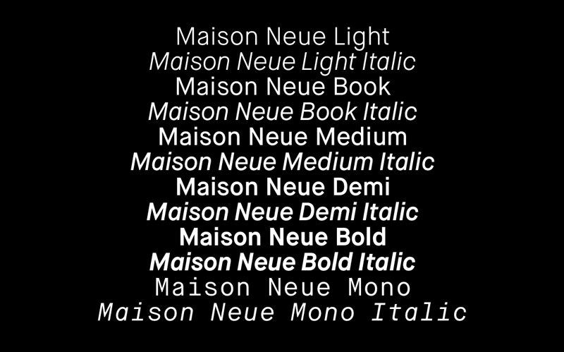
The whole family contains 12 styles thus far; each includes an extended Latin character set and a variety of OpenType features. Beforehand Maison Neue has already been applied in the new identity of Zurich based theatre Gessnerallee.
Maison Neue
Foundry: MiliueGrotesque
Veröffentlicht: 2012
Format: Opentype
Schnitte: Light, Light Italic, Book, Book Italic, Medium, Medium Italic, Demi, Demi Italic, Bold, Bold Italic, Mono, Mono Italic
Preis: pro Schnitt 99 CHF, Maison Neue Family 649 CHF
Hier kann man sie kaufen!