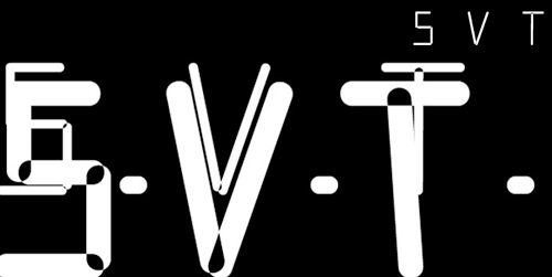
SVT
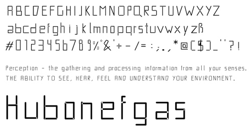
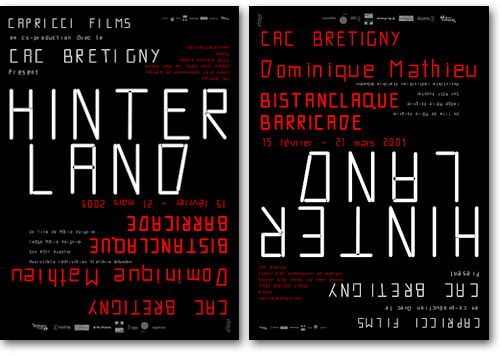
Der Gestalten Verlag nimmt einen weiteren Display Font in sein Repertoire auf. Die Schrift »SVT« gestaltet von den Designern Vier5 aus Paris. Die nun käuflich zu erwerbende Schrift kam unter anderem schon bei dem sehr schicken Ausstellungsplakat über Dominique Mathieu für das Centre of Contemporary Art in Brétigny zum Einsatz.
When Vier5 turn their gimlet eye to the subtitles used in cinema, the result is SVT, a spectacularly subtle font originally designed for the Centre d'art Contemporain de Brétigny in France. Boxy and light, this no-frills typeface is about communication in its clearest form.
Grounded on the classical notion of design, Paris-based Vier5 focuses on applying new, up-to-date fonts. They aim to replace visual empty phrases with individual creative statements tailored specifically for the client and medium used. "Design is the possibility of drafting and creating new, forward-looking images in the field of visual communication," Achim Reichert, one-half of the design collective, says of his work. Read more in this (very brief) interview with the artist below.
(Pressetext)