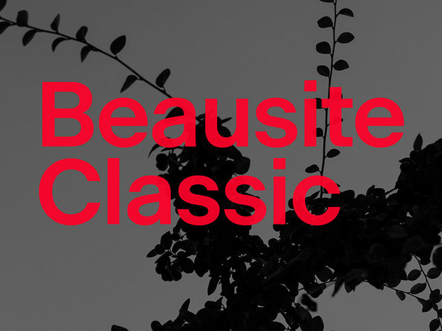
Typeface of the Month: Beausite Classic
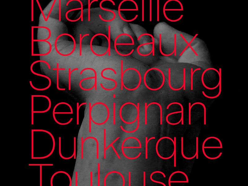
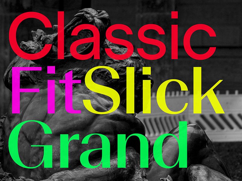
Vier Jahre nach Veröffentlichung der Beausite ist das große Project von Fatype endlich fertig gestellt. Schon bei der originalen Veröffentlichung der kontrastreichen Schnitte Grand, Slick und Fit im Jahr 2014 war klar, dass es noch einen Zusatz mit wenig Kontrasten geben muss. Deshalb darf Fatype ein neues Mitglied der Beausite Familie begrüßen: Beausite Classic. Mit wenig Strichstärkenkontrast und geometrischen Formen ergänzt sie die Familie als Allrounder für den Einsatz im Design eines jeden Gestalters.
Beausite is a typeface system that applies contrast on a neogrotesque skeleton. The first release offered 3 levels of contrast: Grand, Slick and Fit. It soon became evident that the family necessitated an additional version to complete the system: its own no-contrast version.
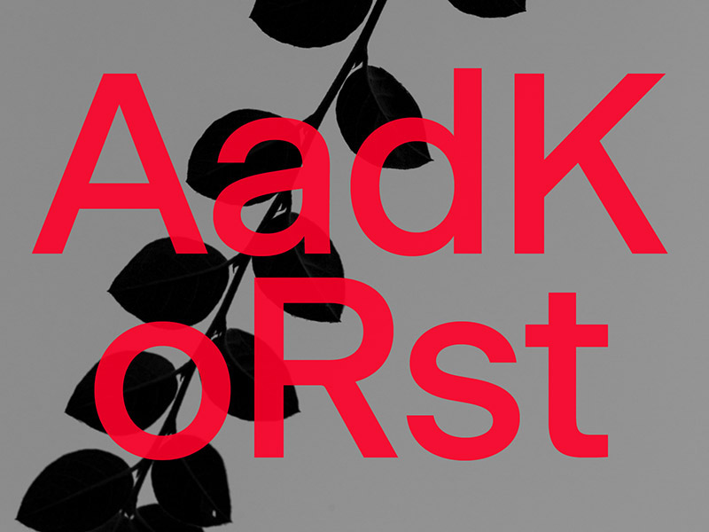
After more than two and a half years of work, Fatype is happy to release Beausite Classic. Revisiting the neogrotesque archetype, Beausite Classic does not attempt to be a revolutionary design but, with its geometric touches, to feel like a contemporary design and offer an interesting design tool for designers working today.
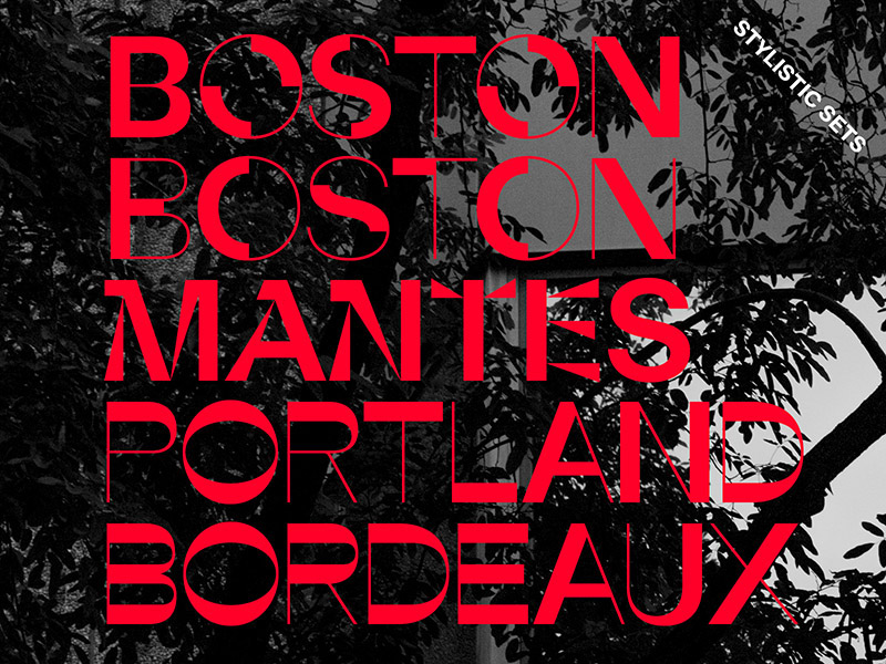
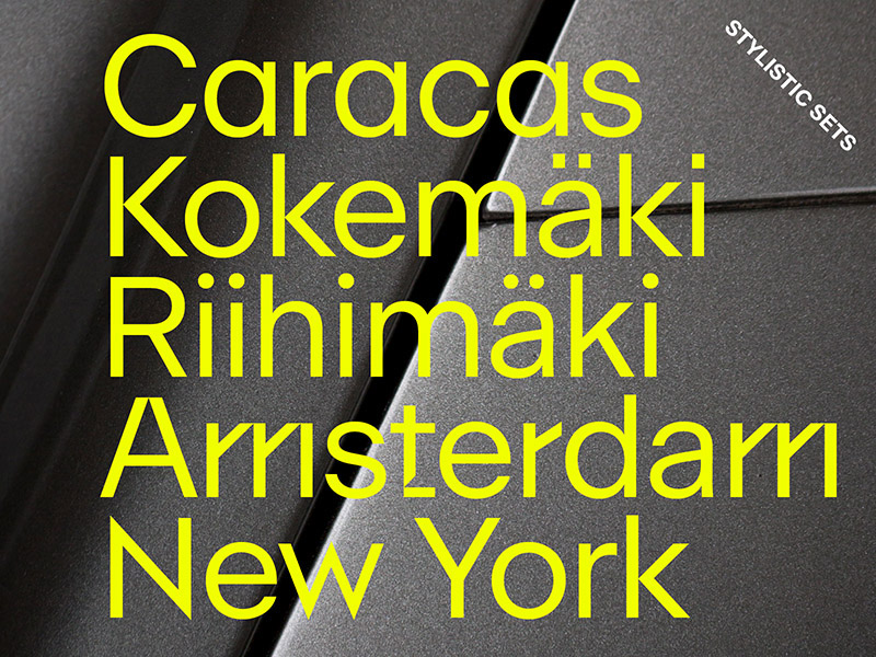
Additionally, Beausite Classic has 19 alternate stylistic sets – some practical alternate shapes, some referencing the history of modernism and art deco, and some pushing the concept of the family to its extreme, with reversed and mixed contrast.
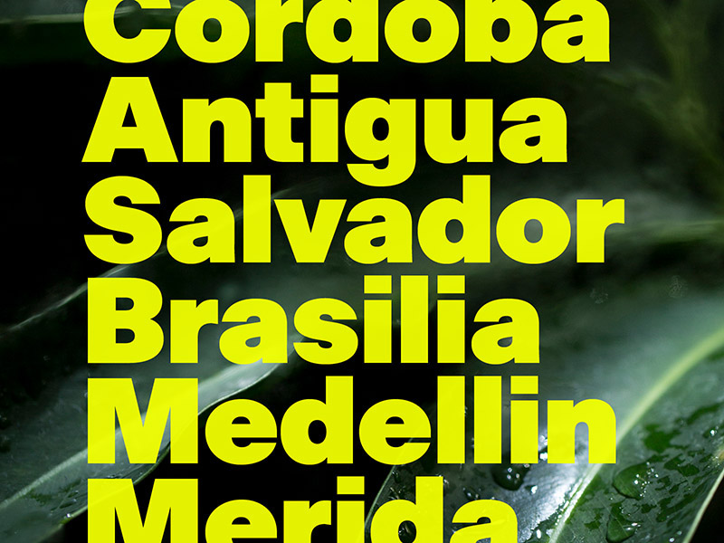
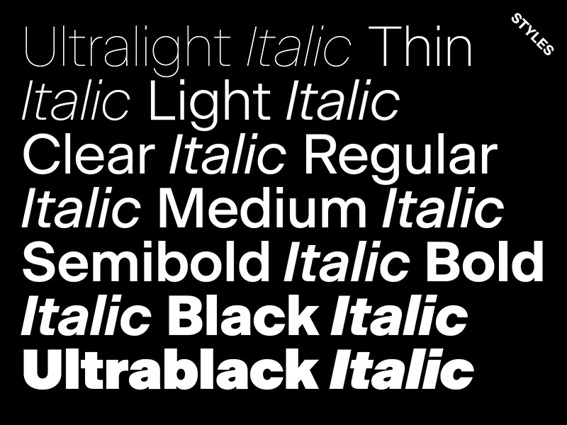
Beausite Classic comes in 10 weights with their italic partners. Some alternates are currently only available in the upright styles.
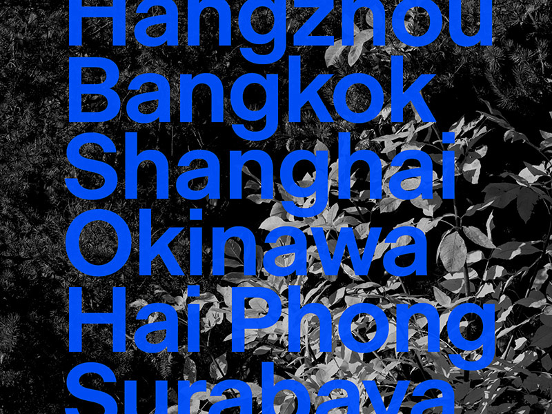
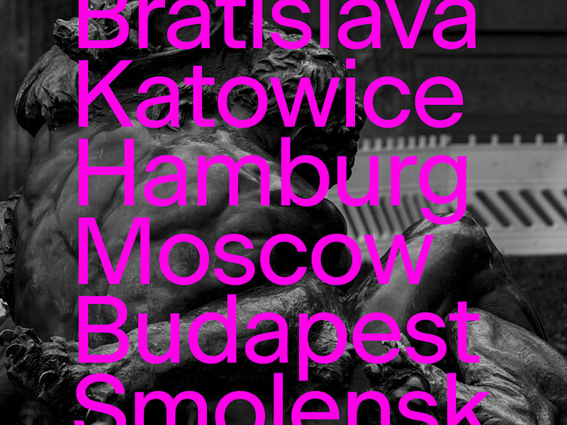
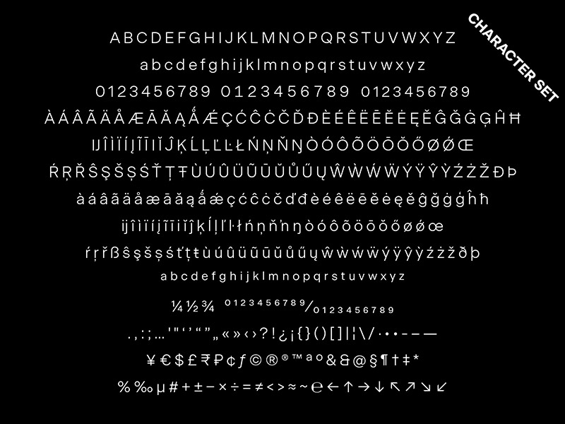
All styles come with a full character set for western and eastern european languages, and a number of OpenType features such as Stylistic Alternates, Ligatures, Smaller Figures for text, Tabular Figures and Fractions.
Beausite started in 2008 as a narrow high contrast typeface. The design evolved over the years and echoes Art Deco typefaces such as Peignot—designed by french graphic artist Cassandre and released in 1937 by Deberny & Peignot. Ultimately, the concept evolved to the idea of applying contrast onto a neogrotesque skeleton. Sans serifs such as Univers established the principle of programmed, consistent typeface families with a wide range of weights and widths. But contrast has rarely been a factor in such programs.
Beausite offers an alternative in the category of neogrotesques, while reliving the Art Deco trend for high contrast Sans in a contemporary fashion.
Beausite Classic
Foundry: Fatype
Designer: Yassin Baggar
Release: 2018
Format: otf, woff, eot; woff2 & ttf upon request
Weights: 10 weights from Ultralight to Ultrablack, each with Italics
Price: 80,– Euro / weight, 350,– Euro / familiy
Photography by Nayan Graf Quartier
