Unica77
Nachdem wir gestern erst die Neue Haas Unica von Linotype vorgestellt haben, möchten wir an dieser Stelle auch gleich auf die zeitgleich erschienene Unica77 von Lineto hinweisen, bei der es heißt, dass die Unica77 die einzige digitale Version der Haas Unica sei, die von den Designers des Originals (André Gürtler, Christian Mengelt & Erich Gschwind) autorisiert wurde. Christian Mengelt vom Team’77 hat die Schrift basierend auf den Originalen re-mastered.
Beim fast (nur einige Wochen davor) gleichzeitigen Release zweier Schriften, die auf den gleichen Originalen basieren, kann man sich fragen, wie das überhaupt möglich sein kann. Es scheint wohl ein Problem bei den Nutzungsrechten bzw. den Urheberrechten zu liegen, die diese Situation erst möglich gemacht haben.
Bei Lineto heißt es im Pressetext zum Release der Unica77:
We are proud and honoured to release Unica77, created by Christian Mengelt of Team’77, the original authors of Haas Unica. Some see Unica as the pinnacle of modernist type design, arguably the most modern and the most Swiss typeface: the idea of a «pure medium», a «neutral carrier». Unica was the typeface that finally delivered what Helvetica had only promised, at a moment when, in a bizarre twist of fate, no-one was looking. And released for a fading technology at a time of transition, it was soon relegated to undeserved obscurity. The tragic story of Haas Unica is one of technological progress, economic pressure, corporate powerplay, bad timing, and unfortunate coincidences. It’s the dark side of Helvetica’s bright success story.
Helvetica had been secretly developed at the Haas Foundry in the mid-1950s, against the will of Stempel, their majority stakeholder. First presented as Neue Haas Grotesk, in 1957, it was a sensational success. Haas, a relatively small enterprise depending on cooperation and licensing deals, licensed it to Linotype for worldwide exploitation, who adapted it and turned it into the fabled Helvetica. However, Linotype prevented Haas from producing Helvetica for the now prevalent phototypesetting technology, and as a consequence, Haas was denied any major share of its global success.
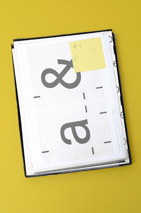
In 1973, Alfred Hoffmann of the Haas type foundry had enough. He invited the prolific type designers André Gürtler, Christian Mengelt, and Erich Gschwind to investigate improving Helvetica for phototypesetting, and to propose a new typeface optimised for the dominant technology of the day. Their thorough analysis of four formally related typefaces (Akzidenz Grotesk, Univers, Neue Haas Grotesk and Helvetica), later published in the document «From Helvetica to Haas Unica», served as foundation for the synthesis of the brilliant new typeface, its name an amalgam of Univers and Helvetica.
But by the time Bobst/Autologic (for their Eurocat system) and Linotype (for their Linotronic range) came out with Haas Unica, the days for phototypesetting were numbered. The personal computer was on its way to radically alter the design and printing professions, and in 1984 the Apple Macintosh promised a new dawn for type design. Haas Unica fell into the gap of this transitional period. It had taken six years from commissioning to foundry release, and when it came out, the world was ready to move on.
The shift from analogue to digital turned the industry upside down. In rapid succession, companies went bankrupt, were taken over, stripped of their assets, and sold down the river. Four years after launching Haas Unica, Haas’ business partner Stempel was sold to Linotype. Haas, one of the world’s oldest foundries with a back catalogue of sheer excellence, was taken over and terminated in 1989. Haas Unica disappeared, and its designers’ appeals to Linotype for a digital reissue bore no fruit – it remained buried for close to 30 years.
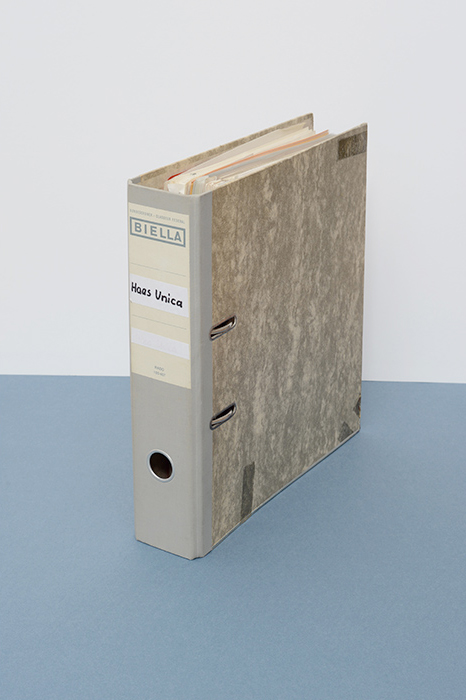
But it was not forgotten. As avid users of type, we often wondered why Haas Unica wasn't available on the market. In 2004, Berlin-based designer and Lineto partner Stephan Müller came across a digital version in a Scangraphic specimen book. As it wasn’t available to buy, he sourced a black market copy, made minimal changes to it and discreetly used it for an artist book. This made waves and before long, Unica became a revered tool of choice for keen designers, among them Norm, Cornel Windlin, Laurent Benner, Jon Hares, and Gregor Huber & Ivan Sterzinger, to name but a few.
The years passed, and in 2012, there still was no legitimate version of Haas Unica around. What was the problem? It seemed mysterious. When we got in touch with Team’77 to express our gratitude and respect, Christian Mengelt told us the whole Unica saga. Talking to him, we also realised that the version of Unica we had grown to appreciate as a quietly obedient servant was an unauthorised version, resolutely rejected by its original designers. According to Mengelt, its more monolinear drawing and its spacing and kerning bore little resemblance to the more subtle and refined original.
At the same time, Mengelt confirmed that Linotype had absolutely no interest in re-issuing Haas Unica and had even given up the trademark years ago; it was obviously just dead weight to them. We were awestruck and decided right there and then to collaborate, in a mission to preserve Unica in its true form and original state. Christian Mengelt dug out the original drawings and went to work, carefully redrawing each of the 8 original cuts. Maurice Göldner closely collaborated with Mengelt to adapt character sets to full Latin Extended encodings, build features and extend the family with new weights (Thin, Medium, Extra Black — coming soon). The rest is history, as they say.
Unica77
Foundry: Lineto
Designer: Christian Mengelt / Team ’77
Veröffentlichung: 2015
Format: OpenType
Schnitte: Light, Light Italic, Regular, Italic, Bold, Bold Italic, Black, Black Italic
Preis pro Schnitt: 140,– CHF
Preis Familie: 520,– CHF
Abbildungen: Copyright Lena Amuat & Zoë Meyer/Courtesy Lineto.com