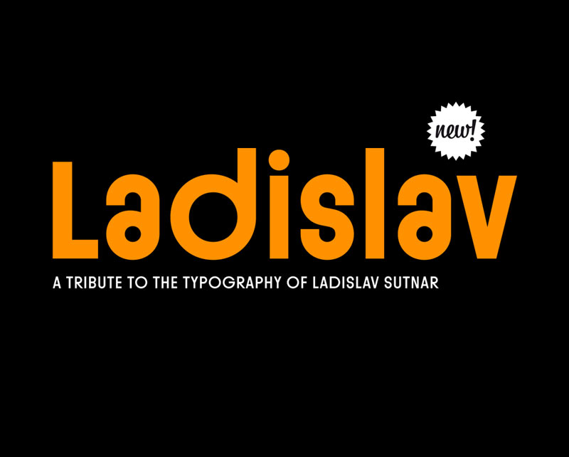
Ladislav
Suitcase Type Foundry stellt ihre neue Schrift Ladislav vor.
Pressetext: Ladislav Sutnar was one of the most significant and also most universal pioneers of modern graphic and information design. It was therefore only a matter of time before he added font creation into his area of expertise. This took place in 1958, when he drew a part of the alphabet and a set of numerals to be used in marking houses in Bronx in New York. He would later develop a similar concept for the information system of the local Brooklyn School. It’s not surprising that Sutnar’s fonts have all the characteristics typical of his work: simplicity, lucidity, directness and a strong graphical impact.
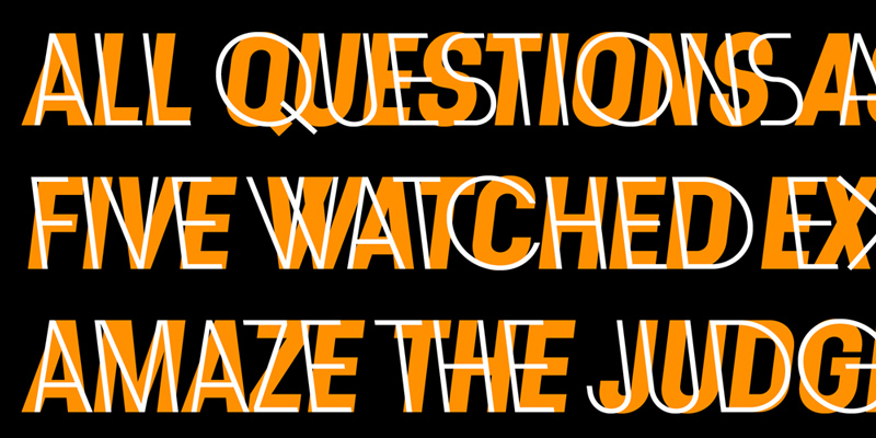
The Ladislav font revitalises Sutnar’s legacy, while not explicitly copying any of his original fonts. It however keeps true to their technicist character and initial principles of character creation - a simple modular system of combined geometrical segments. This approach affects all round shapes of capital and lowercase letters, as well as the shapes of the majority of numbers. The Ladislav type family consists of font styles, derived from four basic weights (Light to Bold). Apart from traditional italics, Ladislav also contains atypical, left-inclining italics. These weren’t simply slanted left, but were completely redrawn, so that they would look natural and would work in harmony with the other styles in all weights.
Ladislav
Foundry: Suitcase Type Foundry
Designer: Tomáš Brousil
Veröffentlichung: 2013
Format: OpenType
, WOFF, EOT, SVG
Schnitte: Light, Light Italic, Light Reversed, Regular, Regular Italic, Regular Reversed, Semibold, Semibold Italic, Semibold Reversed, Bold, Bold Italic, Bold Reversed
Preis: pro Schnitt 29 Euro, Familie 269 Euro
Mehr Informationen unter ladislav.suitcasetype.com.