Morris Sans
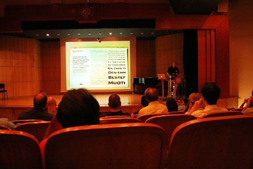
Auf der 3nd ictvc in Thessaloniki war ich im Vortrag von Dan Reynolds welcher die Entwicklung der Bank Gothic zur Morris Sans präsentierte. Die Schrift wurde sicherlich schon in vielen anderen TypeBlogs und Foren präsentiert und diskutiert. Ich möchte dieser schönen über 2 Jahre dauernde Entwicklung nun auch hier in Slanted ein Posting widmen.
Anbei eine Reihe von Links
TypeOff_Morris Sans released
TypeOff_Morris Sans, first responses
Flickr_Morris Sans work
TypeOff_How they do it there
TypeOff_Thessaloniki 2007
Linotype
From the Linotype website: Morris Sans™ is a newly revised and extended version of a small geometric family of typefaces originally produced by Morris Fuller Benton in 1930 for ATF. His initial design consisted of an alphabet of squared capital letters with a unique twist that characterized its appearance: corners with rounded exteriors and right-angle interiors. The types were intended for use in the fine print found on business cards, banking or financial forms, and contracts. But over the ensuing decades, this design became a popular element in all sorts of design environments, and several foundries revived the typeface in digital form. Since digital fonts are bicameral, with slots for both upper and lowercase letters, new cuts of the type opted filled the lowercase slots with small caps.

