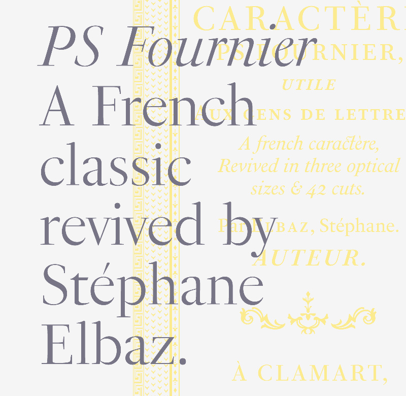
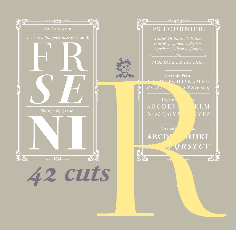
PS Fournier
Zur Feier der Veröffentlichung der stets eleganten PS Fournier, gestaltet von Stéphane Elbaz und herausgegeben von der Typofonderie, präsentieren wir euch hier einige Details dieser umfangreich ausgebauten Serifenschrift. Durch ihre drei optischen Größen mit jeweils 14 Schnitten ist sie vielfältig einsetzbar und kann in jedem Kontext überzeugen. Dabei sind, wie die Namen schon sagen, die PS Fournier Petit für kleine und die PS Fournier Grand als Displayschrift für große Schriftgrößen gedacht.
Pressetext:
PS Fournier, created by Stéphane Elbaz, is designed in tribute to Pierre Simon Fournier. Fournier was the prolific Parisian type designer whose work is best known for its iconic representation of French transitional style. PS Fournier elegantly represents the transition to the modern era of typography. Featuring three optical sizes, PS Fournier is designed to perform in any context.
The Pierre Simon Fournier heritage
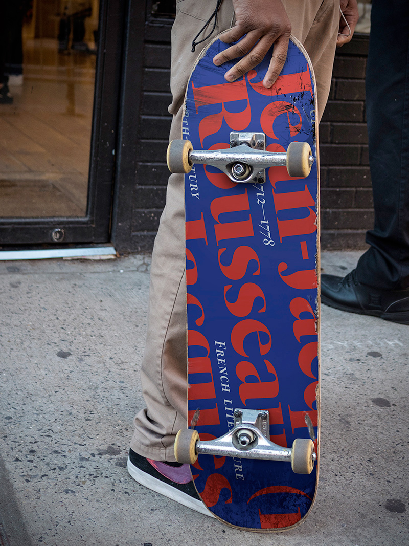
Pierre Simon Fournier (1712–1768) was a leading innovative type designer of the mid-18th century. Early in his career, the young Pierre Simon developed a strong aesthetic that he cultivated throughout his life. His art is representative of the pre-revolutionary “Age of Enlightenment” (Siècle des Lumières). Precursor of the Modern style, Fournier’s body of work deeply influenced his times, and created the fertile ground from which the Didot family and Giambattista Bodoni developed their own styles.
During the historical period of the 18th century, Fournier exemplified the intellectual pursuits of the times with his own research on type, documenting in detail the typefounding process. He also offered a unique vision: he is the first to clearly comprehend the concept of “type family,” sorting a set of similarly styled alphabets by sizes, width, and by x-heights. In addition, Fournier is one of the earliest advocates of the point system to organize the practice of typography, the point system that contemporary typographers continue to use to this day.
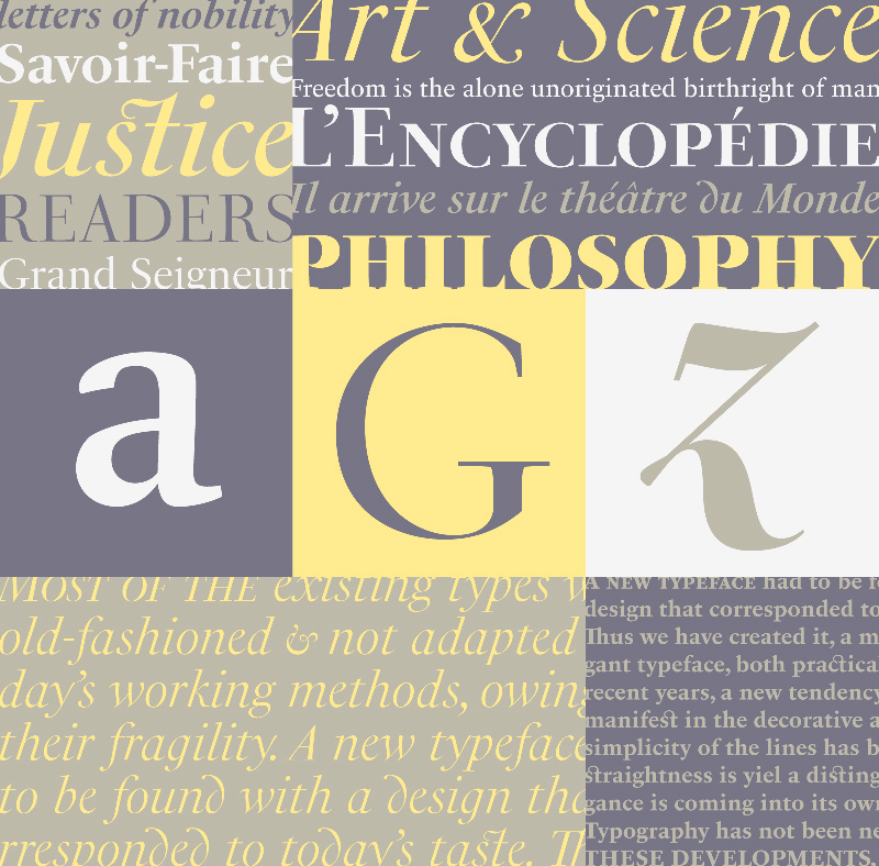
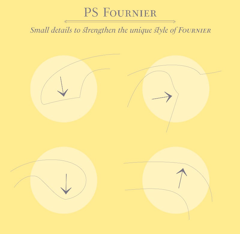
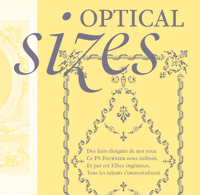
The refined and discreet elegance of PS Fournier
The 42 styles of the PS Fournier family include romans and italics, with weights ranging from Light to Black, and 3 optical sizes to accommodate a large diversity of uses. With a close look at the family, one finds you’ll find that the difference between the optical sizes (Petit, standard and Grand) is more than a contrast variation between the thin and the thick; the eye can also denote a palette of distinct tones: More streamlined and robust in the smaller sizes (Petit), more refined and detailed in the larger sizes (Grand).
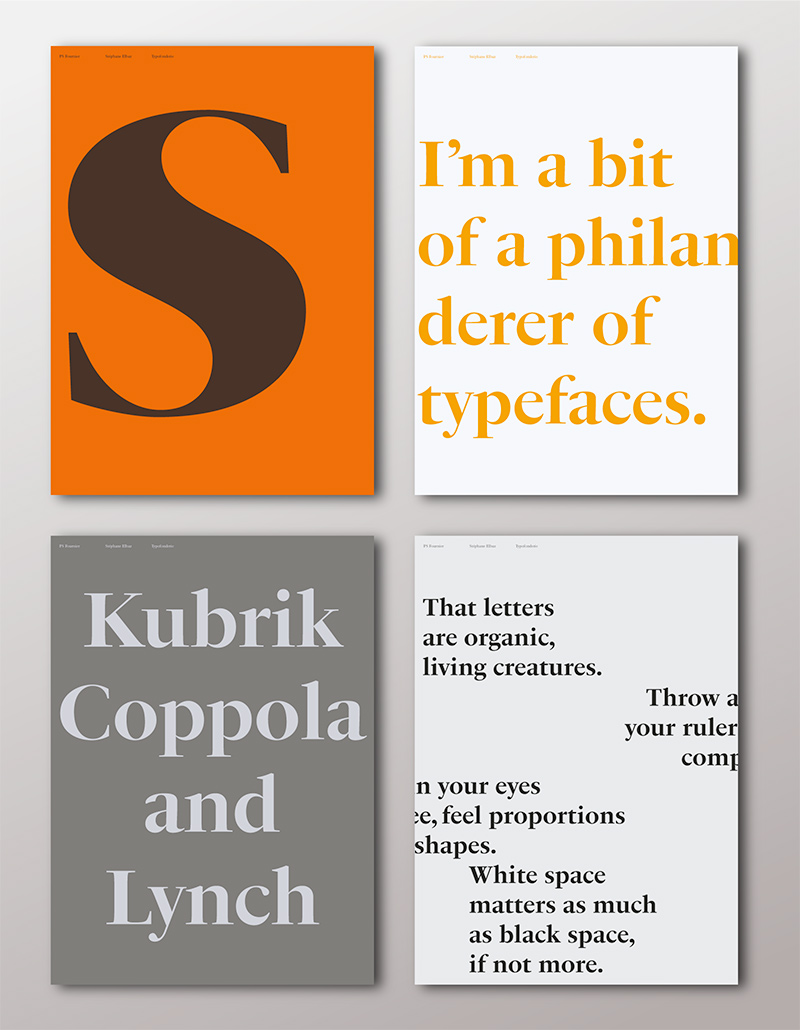
PS Fournier Grand presents a higher contrast adapted to large text sizes, displays or banners. Its refined elegance makes it a perfect choice for Design, Fashion or Luxury publications. As a “modern” type PS Fournier Grand features a larger x-height than the preexistent old style typefaces such as Garamond or Jenson. These proportions provide any basic text set in PS Fournier Grand a strong typographic texture.
As a result, the PS Fournier global family is a versatile alternative to the Modern typefaces commonly used in the publishing industry. The optical sizes, the large range of weights, and the design variations make this family adaptable to captions, paragraphs, and pages, as well as to large texts and displays.
A leading-edge typography in the 18th century
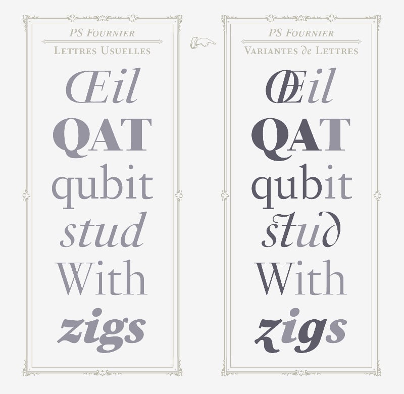
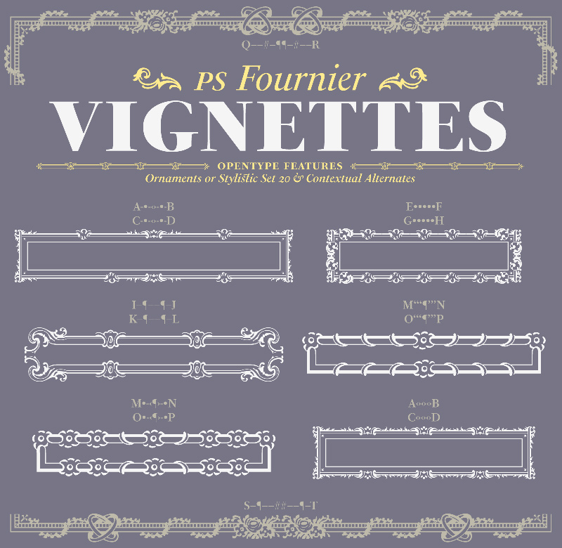
In the spirit of modernity, Pierre Simon Fournier did not find any use for the conventional swashes still produced by peers such as Caslon or Baskerville. Nevertheless the French designer created many inventive elements to decorate the page and set delightful variations in the text itself. To this regard PS Fournier includes a large set of glyphs variations, ligatures and more than one hundred glyphs for borders, rules and ornaments or — as called in French — “vignettes.”
Download for free the PS Fournier Full Family of 42 fonts in Try-out format!
For the first time, we’re very pleased to announce that the PS Fournier OpenType Full Family of 42 fonts is available in Try-out format: This license grants you rights solely for preparatory works, evaluation and internal testings use only of the licensed owner. Neither production, nor final sketch, final artwork are permitted. The Try-out fonts include only capitals, minuscules, figures and minimal punctuation.
PS Fournier
Designer: Stéphane Elbaz
Veröffentlichung: 2016
Familie: PS Fournier, PS Fournier Petit, PS Fournier Grand
Schnitte jeweils: Light, Light Italic, Regular, Italic, Book, Book Italic, Demi, Demi Italic, Bold, Bold Italic, Heavy, Heavy Italic, Black, Black Italic
Preis pro Schnitt: 55,- Euro
Preis Familie: 1295,- Euro
Buy