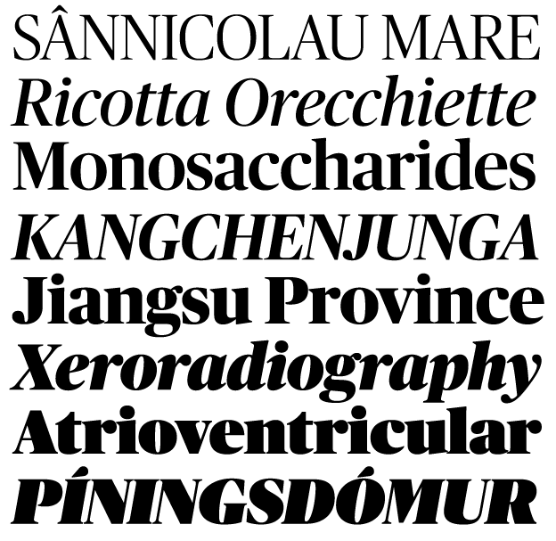
Publico Banner von Commercial Type
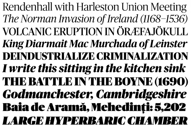
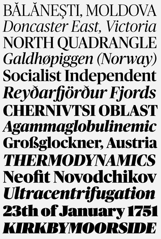
Der neue Serifenschnitt Banner der Schriftfamilie Publico von Commercial Type ist raus. Designed von Paul Barnes, Christian Schwartz und Ross Milne. Sie beschreiben ihre Schrift als eine liebevolle Hommage an die 1970er-Display Schriften.
Aus dem Pressetext:
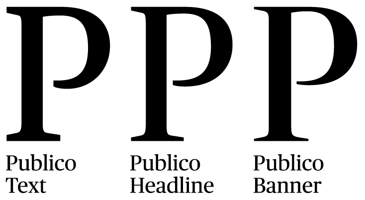
Publico Banner was initially designed to meet the needs of magazine designers who found that Publico Headline was not quite sharp enough for enormous display type. Publico Banner offered designers Paul Barnes and Christian Schwartz, assisted by type designer Ross Milne, an opportunity to indulge their love of high-contrast, large x-height, very tightly spaced late 1970s display type.
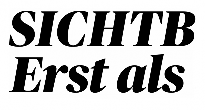
The Ultra weight, in particular, is a loving homage to Tony Stan, Ed Benguiat, Tom Carnase, and others from their generation of American lettering artists and type designers. This family was first seen in 2011 in Dagens Nyheter, Sweden's largest-circulation morning newspaper, and in Mark Porter's 2012 refresh of Portuguese daily Público. Publico Banner is available in seven weights, from Light to Ultra, all with italics.
Structurally, Publico takes many cues from contemporary type design, with its narrow proportion, consistent character widths, square, sturdy skeleton, and a pleasant openness. The balanced interplay between sharp serifs and soft ball terminals and lack of fussy details gives the face a clean, contemporary look and a quiet elegance, and the wide range of weights makes Publico Headline well-suited to any kind of publication design.
Publico originated as one of many stops on the long road to The Guardian’s 2005 redesign and the Guardian family. Originally named Haçienda, after the iconic Manchester nightclub, it was later finished for Mark Porter and Simon Esterson’s redesign of Público in Lisbon. Because it shares the skeletal form of the Guardian typeface, Publico is a perfect companion for this family.
Publico Banner
Gestaltung: Paul Barnes, Christian Schwartz und Ross Milne
Herausgeber: Commercial Type
Veröffentlichung: 2012
Schnitte: Light, Light Italic, Roman, Italic, Medium, Medium Italic, Bold, Bold Italic, Extrabold, Extrabold Italic, Black, Black Italic, Ultra, Ultra Italic
Preis: Alle Banner Schnitte $700
Eine Übersicht der anderen Schnitte und Preise gibt es hier.
