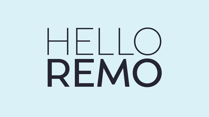
Remo
OurTye präsentiert ihre neueste Schrift Remo.
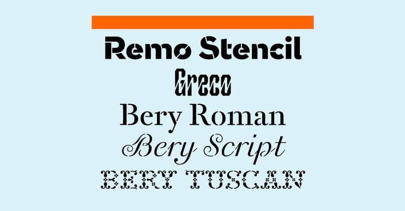
Pressetext: Remo is designed by Thomas Thiemich and is his sixth typeface for OurType. Remo and Remo Plus – its stylistic counterpart – both now join Remo Stencil, released in 2012 as part of OurType's Stencil Font Series.
Remo's sans serif design is both serious and playful. The effect is achieved by an astonishing combination of qualities drawn from grotesques of the nineteenth century, and geometric and humanistic sans serifs of the twentieth. The combination comes close to defining a new class of sans serif typefaces. Remo's basic framework is undoubtedly the circle and the square.
This provides precision and a very satisfying articulation of form across the glyph set, enhanced by oblique endings (c, e, s) and low contrast throughout. But the geometry is then softened by finely shaped curves and a few strategically turned out strokes (a, d, l). The result is a typeface of warmth and good humour, with italics that are nothing less than sunny and delightful. Thoughtful shifts in proportion (B, R, P), a rolly S and a raised-apex M bring an echo of French and Italian mid-century modern, and complete the effect.
Together with Remo's essential traits, Thomas Thiemich's highly systematic approach to typeface design brings with it a generous offering of variant forms that make Remo a versatile tool for typographic multi-tasking. Ascenders in two lengths shift the flavour of the typeface, as do alternates for characters such as a, d, u, y, with which calligraphic effects can be enhanced or subdued.
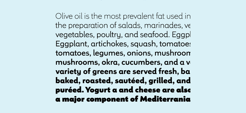
In display sizes, the 'outer' weights – Thin and Light, Black and Ultra – are especially confident, while the capitals throughout all the weights are nobly architectural. Remo's versatility in all its added features gives designers a superbly contemporary typeface, that is charmingly evocative of past lettering and type. This makes Remo a fine choice for countless design applications, from food labels and packaging, to apps, books, and even film titles.
Remo
Foundry: Our Type
Designer: Thomas Thiemich
Veröffentlichung: 2013
Format: OpenType PRO, TrueType, EOT, WOFF
Schnitte: Thin, Light, Blond, Normal, Medium, SemiBold, Bold, ExtraBold, Black, Ultra. In roman und italic designs.
Preis: pro Schnitt 50 Euro, Familie 595 Euro