Panno Text
Bold Monday, die Typefoundry von Paul van der Laan und Pieter van Rosmalen, bezeichnen sich selbst als Indie-Fontlabel (weil selbst gemacht, weil klein, weil künstlerische Freiheit) und haben neben einem sehr schönen Type Specimen gerade einen neuen Font herausgebracht: Panno Text.
Description
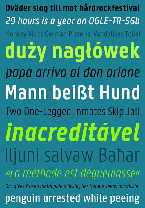
Panno Text is a reworking and extension of Panno Sign and has been optimised for continuous text. Similar to its signage counterpart it has narrow proportions, a very large x-height and open counters. The design of Panno can be characterised as simple and robust with little difference between its thickest and thinnest parts. Panno can serve as a perfect replacement for DIN in situations where the latter might feel too constructed or too cold. It will feel comfortable in many different environments whether that might be in editorial use, in corporate identities or in manuals.
In comparison to the signage version many shapes have been carefully adapted and the spacing has been completely reworked to assure excellent legibility in small sizes. Furthermore the family has been expanded into multiple weights and to complete the typographical palette each weigth comes with a proper italic as well. Every version sports an extended Latin character set and various OpenType features that give access to fractions, different styles of numbers and alternative versions of glyphs.
More info: http://www.boldmonday.com/en/pannotext/
Type Specimen
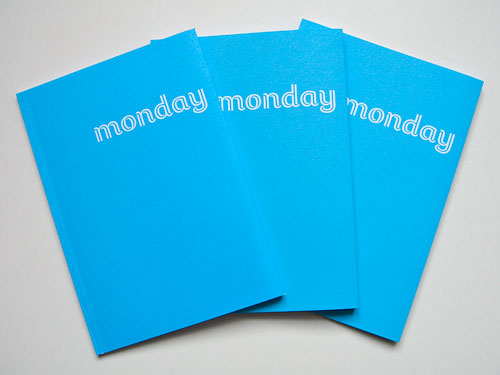
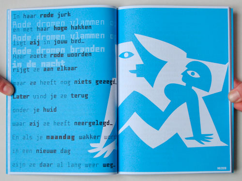
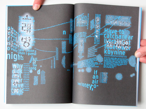
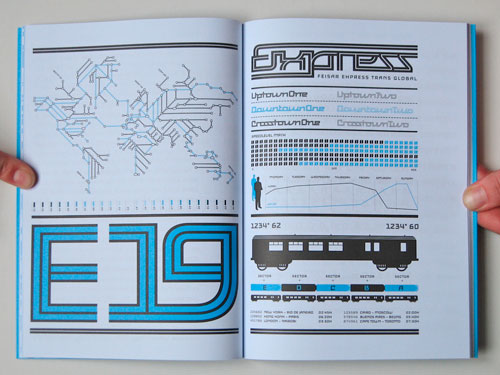
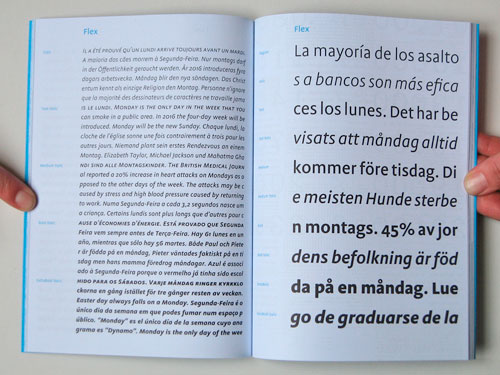
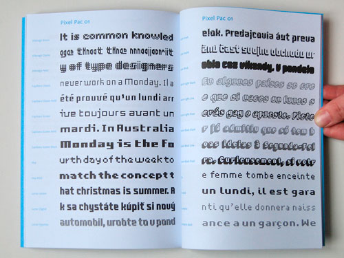
It’s here! The first official Bold Monday type specimen: A5 format, 64 beautifully designed pages, produced in two colour offset printing, glue bound and showing all of our typeface designs including custom work and upcoming releases.
With guest contributions by Donald Beekman, Liza Enebeis & Marc van der Heijden, Koen Geurts, Bart de Haas, Léon&Loes, Max Kisman, René Knip, Dennis Koot, Indra Kupferschmid, Tobias Peier, R2 and Jesse Skolnik.
Order your copy now at http://www.boldmonday.com/en/specimen/