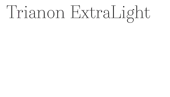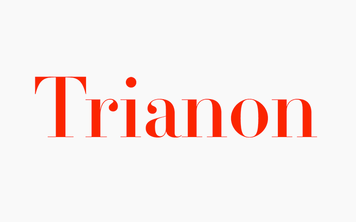
Trianon
Dass eine klassizistische Antiqua mehr kann als nur Mode-Magazine zu schmücken, zeigt Loïc Sander mit seiner kürzlich bei Production Type erschienenen Schrift Trianon. Für seine Neuentwicklung schaute er sich die Spätentwürfe Didots an und lernte von den kleinen 6 Punkt Bleilettern der Didot.
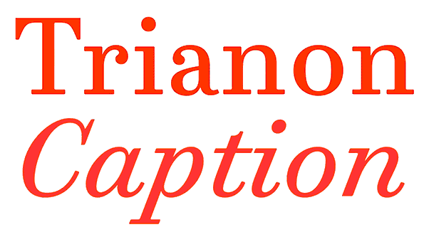
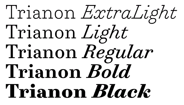
Die Trianon beweist, dass eine klassizistische Schrift viel vielseitiger sein kann als man denkt. Basierend auf der Weisheit des Bleisatzes, für unterschiedliche Schriftgrößen Schriften unterschiedlich zu schneiden, bietet die Trianon vier optische Größen in 42 Schnitten. “Caption” und “Text” sind breit und robust gestaltet für lange Textpassagen und kleine Schriftgrößen, “Display” und “Grande” dagegen glänzen mit ihren hohen Kontrasten und ihren klaren klassischen Formen.
Aus dem Pressetext: These days, Didot is a typeface known for its bold stems and delicate hairlines, for its prominent ball terminals and decorative italic. These are the showy traits that made the typeface synonymous with glossy fashion magazines and luxury brands. Yet Didot’s family and history are much more complex and varied than our narrow contemporary view. What we’re missing begins with the small stuff – the metal fonts that were cut for sizes as small as 6 pt.
Trianon proves that a Didone can be much more versatile than it is usually assumed to be. Returning to the pre-digital wisdom of size-specific cuts, the family offers four optical sizes in 42 fonts: Caption and Text built broad and sturdy for long passages of small type, and Display and Grande which imbue all of the sparkling contrast and sharp, sculpted bracketing of a familiar Didot.
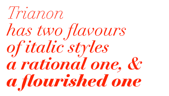
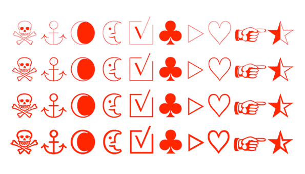
For Trianon, Sander focused on editorial publishing, where type is primarily a tool for serving content, and where he feels the call to build his own tools. The 42 fonts are replete with useful function for editorial design, including oldstyle figures (based on the classic Didot) and lining figures (cued by vernacular street signs in France), ornaments which fit each font’s contrast and weight, and a large range of weights for building harmony and contrast into a publication’s complex hierarchy.
Trianon
Foundry: Production Type
Designer: Loïc Sander
Team: Sandra Carrera, Roxane Gataud, Yoann Minet
Veröffentlichung: April 2015
Format: OpenType
Schnitte Trianon Caption, Display und Grande: Extra Light, Extra Light Italic, Light, Light Italic, Regular, Italic, Bold, Bold Italic, Black, Black Italic
Schnitte Trianon Text: Extra Light, Extra Light Italic, Light, Light Italic, Regular, Regular no2, Italic, Italic no2, Bold, Bold Italic, Black, Black Italic
Preis pro Schnitt: 40 Euro
Preis Familie: 1.250 Euro
Buy