Typeface of the Month: Blacker Pro
by Zetafonts
Blacker Pro is the result of a journey into the history of the “Evil Serifs,” whose origins date back to the 15th century. The Italian type foundry Zetafonts has designed a typeface family that offers a very extensive selection of styles, widths and weights and can therefore be used like the “little black dress” in every editorial and branding project as an all-rounder.
The design of Blacker started in 2017 with a research by Cosimo Lorenzo Pancini and Andrea Tartarelli on “wedge serif” typography, where serifs are rendered with a simple triangular shape. Although these serifs appear mostly in modern typefaces (the style was particularly successful in nineteenth century France) their origin can be traced back to the first humanist serif typefaces developed by Nicholas Jenson in 15th century, that were influenced by broad nib calligraphy.
This interesting mix of geometric construction and calligraphic expression allows wedge serifs to express both the elegance and contrast of traditional old style typefaces and the stark beauty of modern sans typefaces. When there importance in the design of the letters is pushed to the extreme, the result is a visual style that has been defined by Jeremiah Shoaf as “evil serif,” where blade-like triangular serif are combined with high contrast and old style serif proportions.
Blacker was developed along these lines, reinventing the humanist proportions and their calligraphic roots with a strong interplay between straight edges and soft curves, looking for a bold design that could feel both fresh and classic at the same time. This is especially visible in the lowercase and in the italic letters, designed to create an interesting counterpunch to the more geometrically constructed letterforms of the uppercase.
Even the weight system has been developed keeping in mind the hybrid nature of the project, so lightier and heavier weights were designed mixing different historical influences. The transitional wedge serif shape is more recognizable in the bolder styles while the thin variants are more similar to modern didones. Another feature of Blacker derived from traditional punchcutting is the difference in design between the standard display version—to be used in large point size—and the text version, modified to allow for better readability at small point size.
For logo, editorial and large size design, the display version offers tighter tracking, higher contrast and sharper corners, as well as an array of discretionary ligatures and alternate forms. For a pleasing reading experience on screen and in print the text version has been designed with lower contrast and looser spacing, and equipped with a large array of notational forms, open type features and symbols for body-text handling, and a different distribution of the weights to expand the middle range with subtle control of the blackness of the text.
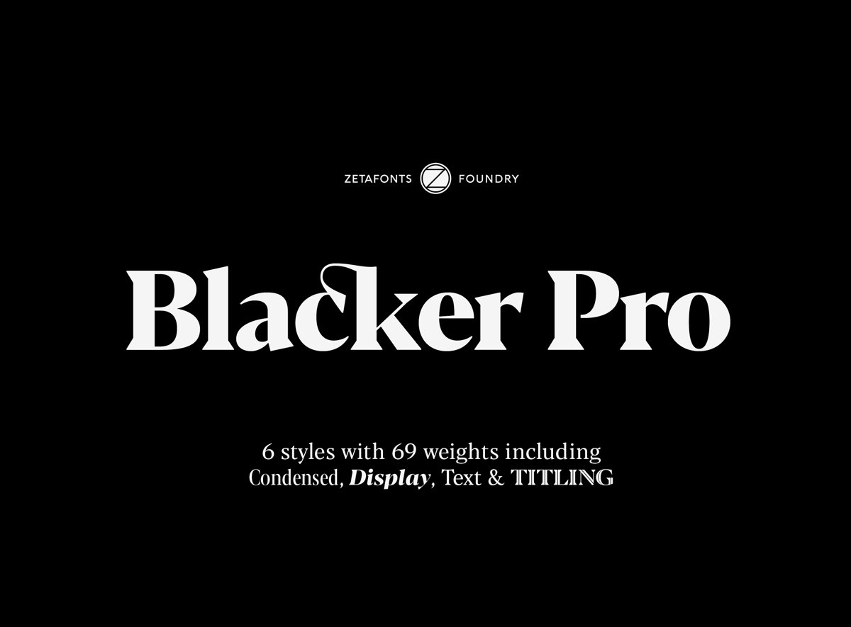
In 2019 Blacker was fully revised and expanded with two condensed and three titling variant subfamilies bringing the Blacker Pro family to a total of 69 styles, all with an extended character set covering over two hundred languages and three different scripts: Latin, Cyrillic and Greek. Open type features include small caps, positional numerals, fractions, superior & inferior figures, alternate and case-sensitive forms, and standard and discretionary ligatures.
Blacker Pro is part of the Blacker superfamily and is complemented by a Sans version (Blacker Sans) and a inverted-contrast “italian” version (Blackest).
Blacker Pro
Foundry: Zetafonts
Designer: Cosimo Lorenzo Pancini with Andrea Tartarelli and Francesco Canovaro
Release: 2019
Format: Desktop, Web, App
Weights: Four families—Display, Text, Titling and Condensed:
Blacker Display, Blacker Display Condensed: Light, Regular, Medium, Bold, ExtraBold and Heavy, with matching Italics
Blacker Text, Blacker Text Condensed: Light, Book, Regular, Medium, Bold and Heavy, with matching Italics
Blacker Titling: Light, Regular, Medium, Bold, ExtraBold Italic and Heavy in Titling, Inline and Inline Diamond variants, uppercase only.
Price: Single weights from 25.– € (some weights free), full family (69 styles) from 225.– €


