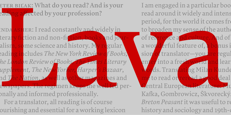
Lava
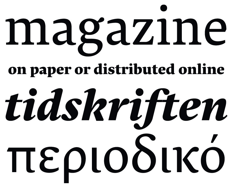
Vor Kurzem haben wir die zweite Ausgabe von Works That Work vorgestellt. Der Herausgeber ist Peter Bil’ak, der für das Magazin die Lava entworfen hat. Von Anfang an stand fest, dass es neben der Print-Ausgabe des Magazins digitale Ausgaben für das Smartphone, E-Reader, Tablets und den Computerbildschirm geben würde. Die Schrift wurde für all diese Anwendungen optimiert und ist die Plattform übergreifende Stimme des Magazins. Seit Ende September ist sie nun frei bei Typotheque lizensierbar.
Mehr über die Entwicklung kann man in einem Artikel bei ilovetypography.com lesen.
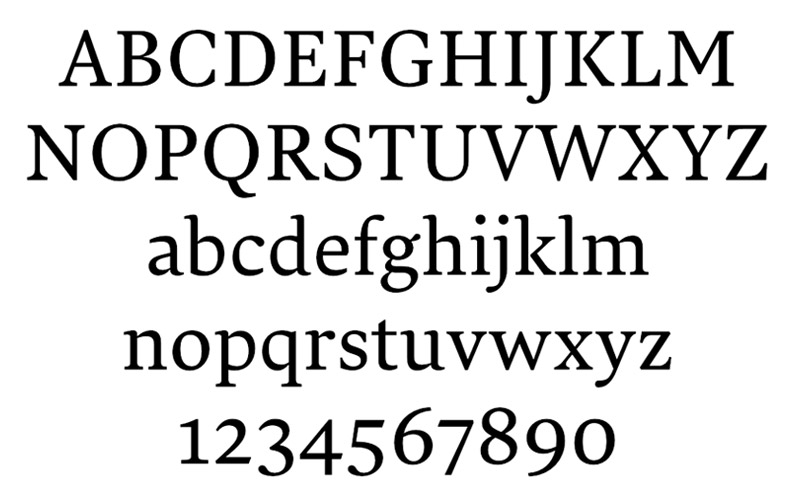
Pressetext: Lava was originally designed for Works That Work magazine, but far transcends its original application. It’s a no-nonsense workhorse typeface that can handle large quantities of text with ease. It’s legible and harmonious at small sizes, sophisticated and elegant at large sizes.
Since the magazine exists both in print and on screen, Lava was designed to perform optimally in both high- and low- resolution environments. Lava looks closely at system fonts such as Times and Georgia and aspires to work on screen as well as they do. In print, Lava delivers something that user interface fonts usually lack: refined details, finely tuned proportions and meticulous spacing that let the reader forget about the typeface and pay attention to the text.
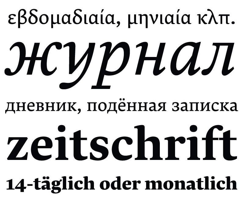
Lava supports hundreds of languages and three writing scripts: Latin, Cyrillic and Greek. Furthermore, a special version of Lava has been developed for Latin/Arabic typesetting. It is being released as the Latin component of Harir, and has been adjusted to match Harir’s weight, rhythm and contrast, as well as its three optical sizes.
Lava
Foundry: Typotheque
Designer: Peter Bil’ak
Veröffentlichung: September 2013
Format: OpenType, Webfonts
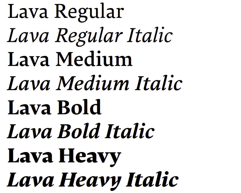
Schnitte: Regular, Medium, Bold und Heavy, jeweils mit Italics
Preis pro Schnitt: OpenType mit Webfont 90 €, Webfont ab 18 €
Preis Familie: OpenType mit Webfonts 450 €, Webfonts ab 90 €