Akkordeon
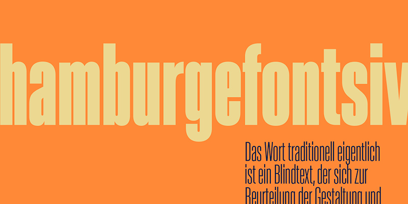
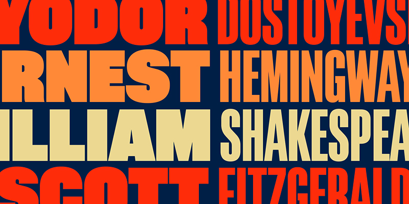
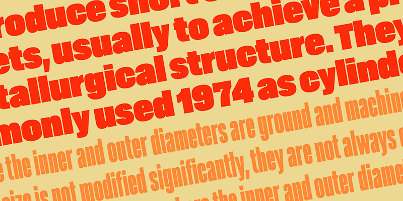
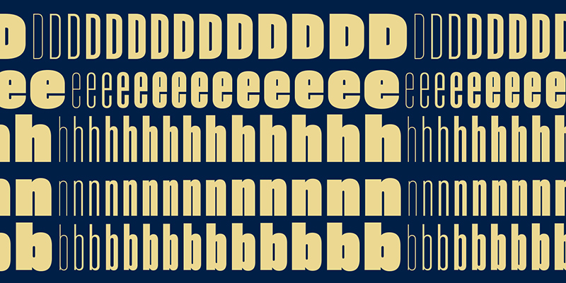
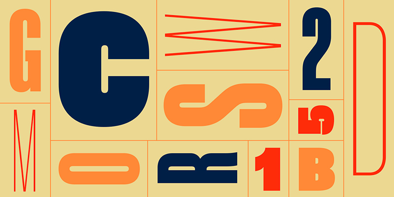
Akkordeon ist eine neue Display-Schriftfamilie von Emtype, die grob von Grotesken aus dem XIX. und XX. Jahrhundert inspiriert ist.
Die flexible Gestaltung und technische Umsetzung der Schrift macht es möglich, dass sie sich in allen Situationen dem Layout anpasst. Mit 14 definierten Schnitten, aber mit integrierter flexibler Laufweite, funktioniert sie intuitiv je nach Anwendung.
Die Familie bewährt sich in kurzen Texten sowie Magazin-Titeln, Bannern, Covers, Werbung, Branding und jeder Situation, in der eine kompakte, solide und leistungsstarke Schriftart erforderlich ist.
Akkordeon
Foundry: Emtype
Designer: Eduardo Manso
Veröffentlichung: 2017
Schnitte: 14
Preis pro Schnitt: 22 Euro
Preis Familie: 149 Euro
Buy
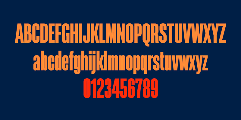
We are glad to introduce Akkordeon, a display font family roughly inspired by grotesques from the XIX and XX centuries. It is not conceived as a family of constant width but has a variable breadth from narrow to expanded, offering a wide gradation of weights. The font is designed to be used in any situation where a compact, solid and powerful font is required. Akkordeon is not structured as a typical typographic family where weight and width go separately, it does not differentiate between one and the other. The name of the family, Akkordeon (accordion in German) tries to reflect that same idea of flexibility. The type family consist of 14 weights and it is specially designed for use in combination with text fonts to generate contrast. Heavy weights contain an unusual amount of black making them the right choice when impact and force is needed. However the lightest and more condensed weights are subtle and elegant. Akkordeon is a versatile display font that offers a wide range of weights as well as creative options.