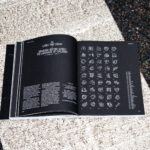
ICH WAR HIER: Typographies in Public Toilets (Latrinalia)

Master’s Thesis by Zeynep Yesilmaden
The master’s thesis ICH WAR HIER: Typographies from Public Toilets by Zeynep Yesilmaden is framed through the lens of typography and graphic…

Reiner Neue

A Contemporary Typographic System Inspired by Imre Reiner
Reiner Neue is a contemporary type system informed by the work of Hungarian-born modernist Imre Reiner. Rather than reconstructing historical models, the…

KTF Prima

A Classic Jobbing Typeface
KTF Prima began over a decade ago during Yevgeniy Anfalov’s studies at ECAL, sparked by an interest in Forma, a modernist sans…

Inside Aardman: Wallace & Gromit and Friends

A Graphic Identity for the Anniversary Exhibition at the V&A by Galicheva–Gahlen
To mark Aardman’s 50th anniversary, the V&A commissioned Galicheva–Gahlen to create a graphic identity and interpretive design system that translates the studio’s…

Letterspace 50

Mapping the Lively Letterform Scene of Amsterdam
Since 2018, letterspace.amsterdam has served as a platform for Amsterdam’s local letterform culture, dedicated to expanding the ways we think about communication,…

Traktor

A Humanist Mixed Serif Typeface
Road to Venice Type released Traktor, a mixed serif humanist typeface with roman and gothic influences. It is suitable display sizes in…

Internship at Slanted Publishers—apply now!

Du liebst Typografie und Editorial Design und möchtest in einem internationalen Verlag arbeiten? Dann bist du bei uns genau richtig! Wir vergeben…

J Type 101

An English Guide to the Use of Japanese Typography
Japanese typography is everywhere right now, from streetwear and album covers to editorial layouts and branding. Designers around the world are drawn…

Coin

A Contemporary Superfamily
Coin is a contemporary font superfamily comprising 36 fonts and 4 variable fonts. The type system includes weights ranging from Thin to…

Eregalle

A Bilingual Typeface Informed by Pagan Visual Culture
Eregalle is a contemporary typeface that explores how regional visual culture can inform typographic form without resorting to historical imitation. Developed through…

Serrucho

A Variable Display Typeface With Teeth
In a landscape defined by softened edges and calibrated restraint, Serrucho cuts through with intention. Not smooth, not polite, but sharpened. This…

Experimental Typography by Hiroshi Imaeda (PENETRATE)

Visual explorations of structure, chaos, and bio-digital forms.
In an era where connection is effortless, intimacy often feels distant. Surrounded by countless digital voices, we may find ourselves more isolated…

App Sans

A Contemporary Typeface for Digital Interfaces
App Sans is a contemporary typeface with six weights and matching italics. Designed for both print and user interface (UI) applications, it…

Typography Meets Teaching

Lars Harmsen in Conversation
Lars Harmsen successfully combines theory and practice in the world of design. As the co-founder and publisher of Slanted Publishers, as well…

Velocity

An All-Caps Display Font Tightly Set, Boldly Moving
Velocity is an all-caps display sans-serif that immediately grabs attention. The letters sit tightly horizontally but remain clear and airy. The result…

Reimagining Hangeul Across Cultures

AG Typography Institute Publishes A-Project 2024–2025
A comprehensive catalogue titled A-Project 2024–2025 has been released, documenting the outcomes of an international typography initiative led by AG Typography Institute…

Bárur

A Wavy Display Typeface for Bold, Expressive Designs
Bárur is a wavy display serif defined by rhythm, softness and flow. The typeface embraces movement as its core principle, echoing ocean…

Visual Voices for Change

A Book on Design as Civic Practice and Cultural Responsibility
Visual Voices for Change—Global Typographic Posters is an international publication exploring how typography can become a powerful tool for positive change, empathy,…

Golt

A Sans Serif Shaped by Berlin’s Urban Design
Golt is a contemporary sans serif, designed for clarity, character, and versatility. Inspired by the visual culture of Berlin’s U-Bahn and street…

Blaze Type 3.0

Website Relaunch
Blaze Type has relaunched its website—not out of ambition, but out of necessity. The old platform had become slow, navigation was cumbersome,…

TypeParis Now26

An International Typography Conference in Paris With Talks and Workshops
On May 30, 2026, the TypeParis Now26 Conference will bring designers, typographers, and creatives from around the world to Paris for a…

Maurizio

A High-Contrast Display Typeface for Big Screens
Maurizio feels like Italian bellezza as the evening sun accompanies the second glass of strong red wine on the shores of the…

Recap: FEDRIGONI × NINO × SLANTED

Between Paper, Process, and People
Our Get Together celebrating the collaboration between NINO Druck, Fedrigoni, and Slanted Publishers on the production of the latest Type Directors Club New York…
1 2 3 28