Grunge Typedesign in Bogota, Colombia
Slanted: Hi Carlos! Can you give us some informations about yourself and your foundry?
I was born in San Cristobal, Venezuela in 1977. I founded www.andinistas.net, www.tipografico.org and www.adgcolombia.org together with some colleagues. Graphic Designer graduated from the Instituto Universitario de Tecnología Antonio José de Sucre (IUTAJS), Merida, Venezuela. I have worked as a Graphic Designer and as an Art Director in several advertising agencies such as: McCann Ericsson Venezuela, Leo Burnett Venezuela, Ogilvy One Colombia y SSA Bates Colombia. Nowdays, I run Andinistas.net studio and I am specialized in typographic fonts development. My typographic work was awarded by www.tiposlatinos.com (2008) and also it has been reviewed by several publications in Brasil, Colombia, Uruguay, Switzerland and the US. I assume my daily work with my own criteria, developing usefull fonts in order to help my customer's brands to be different from the others, from their competition. Every day, Andinistas work is purchased by more and new buyers from different countries around the world.
Slanted: Which path do you follow in Graphic Design?
In my opinión, design is constituted by designers and "non designers". Design has a lot to learn about "non design" and vice versa. That is why I try to take ideas from both sides. I do not like to diminish what other designers call "non designs". Being excluding do not give me good energy for working because sectarianism and discrimination produce blindness. My typographies are based on my own criteria and that is why they look for vision instead of the mere recognition of things. Andinistas' fonts offer different graphic possibilities so that their users can make their brands shine and be different from the competition.
Slanted: How would you describe your style?
Over the years, people had shown their interest for the typographic work I have been doing and that is why I think they are the ones who could answer this question better than me.
Slanted: What are your strength?
Mi typographies are recognized because they help the users inspiration contributing with specific elements and enriching the creative effort. For example, my DiaD font (http://andinistas.net/2009/02/diad/) is a typographic family that I started in 2000 to advertize a set of movies about World War II. At present, DiaD works like a set of fonts that represent guys who practice motocross.
Slanted: What signification has design/type for you?
Graphic Design and typography, as every activity done in any society, are produced between ideological agreements. For me, they mean new oportunities and posibilities for researching, working and expressing the way I see the world.
Slanted: What is your favorite font?
I could not make generalizations because that choice is always going to be subjected to the project parameters in which the font is going to be used. With that said, there is always going to be a favorite font for each work.
Slanted: Why do you create fonts?
Beacuse of the same reason every day we have new babies, new birds, new flowers, new music, new poetry, etc.
Slanted: Could you give us a small decription about your Fonts/ a favourite font?
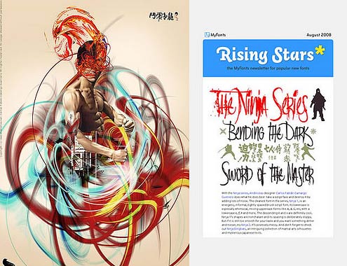
In this moment, my favorite font is Ninja (http://andinistas.net/2008/06/ninja/). It came up from my typographic interpretation of the imaginary Ninja: Irregular brush strokes. Some other favorites: my 6 family fonts based on abstract shapes. All of them with ideal physiognomies to print words or sentences in t-shirts, posters, cd's, etc.
Have a look at:
myfonts.com/fonts/andinistas/floro
myfonts.com/fonts/andinistas/navaja
myfonts.com/fonts/andinistas/Obdulia
myfonts.com/fonts/andinistas/gancho-petare
myfonts.com/fonts/andinistas/alcira
myfonts.com/fonts/andinistas/heleodora
Slanted: How did you come up with the idea?
Since I was a child, I have always liked comics and science fiction stories. In school, the subjects I liked most were those related to drawing and music. The last pages of my notebooks and my bedroom door were always full of ink, stickers, letters and drawings. With the money my parents gave me during the week, I used to buy music LP´s and comic books.
Slanted: What´s behind all this?
Fun and constant search of new ideas.
Slanted: What would be the ideal application method for your Fonts?
Actually I have two. The first one is the "non convencional" way. It consists in following my intuition, improvising shapes and words that provide me new ideas for new fonts. The second one is the convecional one, based on old typographic traditions. It consists in designing by means of parameters. The method is called typecooker.com and has created by Mr. Erik Van Blokland from letterror.com.
Slanted: Do you make hand sketches or do you work immediately on a Computer?
Both, sometimes I make hand sketches and other times I work directly in the computer. The only constant thing is that I never hope to finish the work in the first try. I draw words better than only letters. I assume the first rough drafts as the "substance" which will be the final fruit at the end. I do not do very slender sketches, I prefer to make them more analithic and save on it a quick evidence of what I came with in that moment.
Slanted: How do you develop a typeface? Do you start precisely with a unique letter or are there moments inbetween when you think again about the idea and maybe change it?
I receive emails from peolpe asking the same things very often. From my point of view, graphic design is very large and for that reason, the development of each typography use to be very specific. There are fonts that can be used only for dingbats and there are other
specifically designed to write individual words. There are others thought for sentences and tittles and other for short paraghraphs. According to an argentinian colleague called Eduardo Manso, everyone has to have stylistic logic, a uniform grey and learn to balance correctly the internal whites in order to obtain a good rhythm. I think each person has its reasones to chose depending on his believes and ideologies. There are some who make this election depending on the project they are working on at that moment and others keep doing it by intuition. Anyway...it is so subjective...
Slanted: What inspires you?
Being able to dedicate all my time to design fonts for andinistas. Also, a special font for a new customer, or taking up again files I saved since 1998 or maybe to go out and take pictures in a sunny day with my wife and our beagle Ramona.
Slanted: From your point of view, which Fonts still have to be drawn?
Each one creates the fonts needed for its job.
Slanted: What are your plans for the future?
Keep designing fonts for andinistas.net
Slanted: Thank you for the interview. It was very interesting for me to see how a foundry's normal life looks like in Columbia.
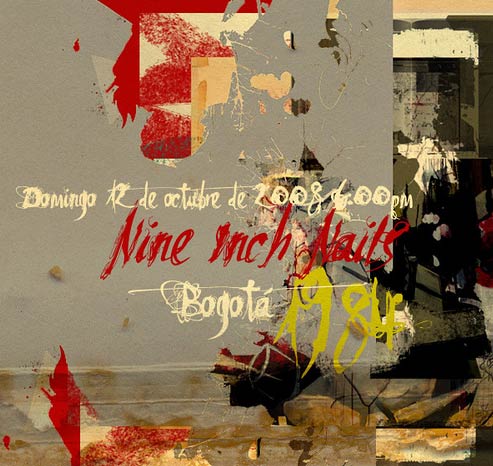
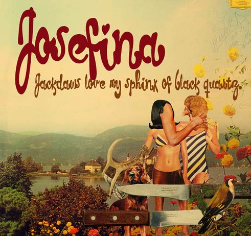
Some impressions of his work:
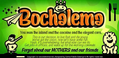
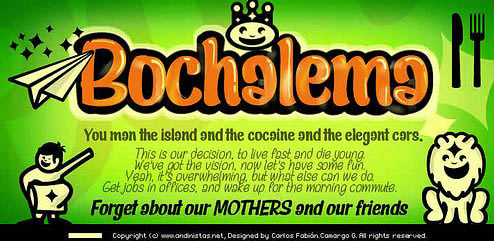
Bochalema
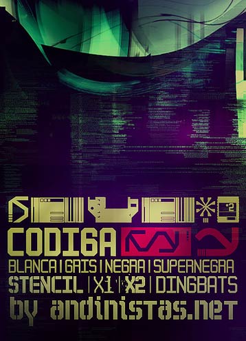
Codiga
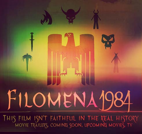
Filomena
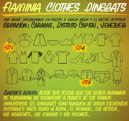
Flaminia
Heleodora
Josefina
Modelia
Navaja
Ninja