Capricorn, ein neue Schriftenfamilie bei DGV
Jens Gehlhaar (ist das ein Künstlername?) hat den Font Capricorn entworfen und vertreibt diesen nun via DGV. Endlich, denn die letzten Font-Releases von DGV waren eher Headliner und weniger für Copy-Anwendungen geeignet. Capricorn könnte auch aus der Emigre-Schmiede stammen. Liegt vielleicht daran, dass Jens in Californien lebt? Wir sind gespannt auf erste Anwendungen.
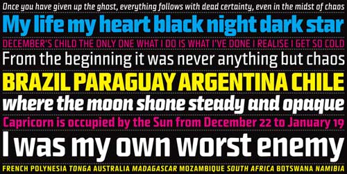
Capricorn is the work of German California-based designer Jens Gehlhaar and is a timeless compact sans-serif font. This narrow running font has vertical stroke endings which gives it a particularly interesting look and is especially suitable for use as body texts in magazines for its good legibility. We recommend that you use a point size of 9 and larger. Durable and sophisticated, Capricorn is a champion font to convey your words.
Capricorn Old Style Figures features old style numerals and comes in six weights including regular, medium and black plus italics in regular, medium and black. These old style figures are very useful and beautiful when set with in text. An alternative Capricorn package including lining figures, numbers aligned with the capital letters, is also available in all six weights.
Gehlhaar is now working on the script version of Capricorn which dgv plans to release this fall.