Granville
Die Granville, die diesen Februar von Production Type veröffentlicht wurde, ist eine serifenlose Schrift, die auf starken Strichstärkenunterschieden basiert. Jean-Baptiste Levée hat sich von Postern, Schildern und Werbetexten aus Paris, zur Mitte des 20. Jahrhunderts, inspirieren lassen. Was damals modern war, ist in den letzten 40 Jahren kaum noch zu sehen gewesen, gut dass dieser Schrifttyp mit der Granville wiederbelebt wird.
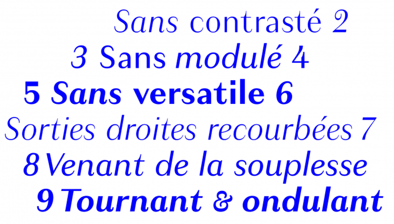
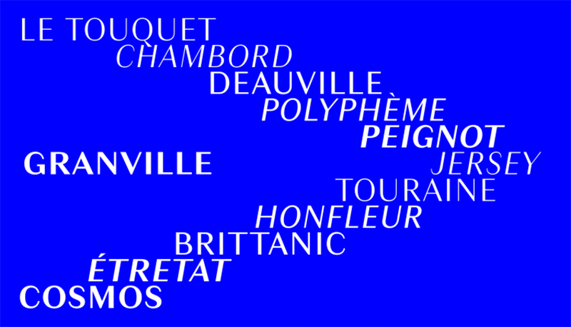
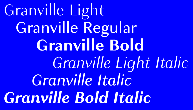
Pressetext: Sturdy enough for text, subtle enough for display. Granville is a reinterpretation of the thick-thin style, built with a rational construction like the early French Moderns, yet without a tie to any specific period or model. This concept brings to mind the classic charmer Peignot and lesser-known influences like Polyphème and Chambord. Granville’s character, however, isn’t derived from eccentric letterforms, but subtle details instead, making it a much more adaptable design. The family range was planned for versatility as well. Unlike most typefaces in this genre, Granville is sufficiently sturdy for text setting, despite its elegant contrast.
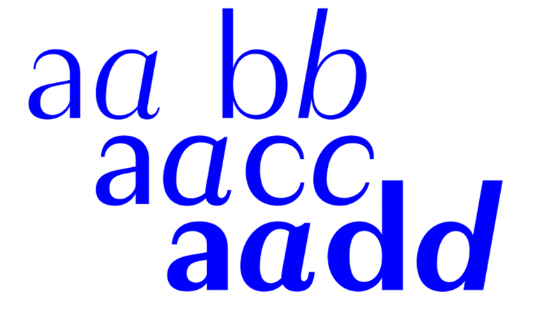
In its italic, Granville radiates a muted calligraphic tone yielded from the flexibility of the pointed pen. Strokes gently turn and swell. Small tails curl upward. This italic has a distinct personality of its own, but never departs too far from its roman counterpart.
The 6-font family has all the debonair refinement of an old modulated sans, without its antiquated baggage.
Granville
Foundry: Production Type
Designer: Jean-Baptiste Levée
Veröffentlichung: Februar 2015
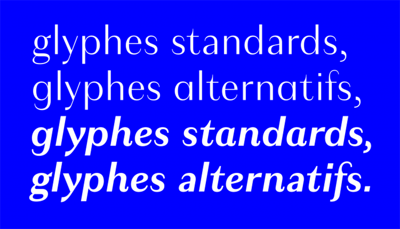
Format: OpenType
Schnitte: Light, Light Italic, Regular, Italic, Bold, Bold Italic
Preis pro Schnitt: 40 Euro
Preis Familie: 200 Euro
Ein Granville Display Schnitt, mit dünnen Haarlinien und der schmalen Gestalt eines Überschriften Fonts, wird Mitte 2015 erscheinen.