Le Bureau des affaires typographiques
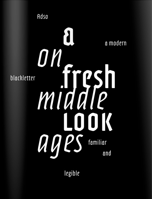
Die Französiche Type Foundry «Bureau des affaires typographiques» ist heute mit ihrer Website online gegagen und ist somit nach eigenen Aussagen die erste französische Foundry im Netz. Bruno Bernard, Mitbegründer des Büros ist mit seiner Schrift “Adso” in unserer aktuellen Slanted Heavy Metal. Lovers.-Ausgabe vertreten.
(Pressetext)
The Bureau des affaires typographiques (B.A.T) is a company founded by four young graphic- and type designers. Based in Paris, it aims at fostering innovative and quality French typography throughout the world. The website will open on April, 26th, while a video reel is already available on the internet.
Since 2009, Bruno Bernard, Stéphane Buellet, Jean-Baptiste Levée and Patrick Paleta secretly work on the creation of what is now the first French type design and distribution company since the 1980s.
A first presentation video is viewable here: http://vimeo.com/10925690
These four freelance graphic- and type designers got together in founding a Limited Liability Company aimed at promoting their own typeface designs along with the ones of other French type designers’ (or designers whose works bear a certain French spirit.) Thus, the BAT is a collective project, based upon the will of merging energies and strugging against the scattering of type designers and their tendancy, for a few years, to isolate into one-person businesses.
The BAT ambitions the gathering ot the finest creative French type design, whether it comes from young talents or confirmed artists.
Since the 1990s, France is indeed in the middle of a typeface design renewal. For thirty years, foundries have not ceased to close their doors, amongst them Deberny-Peignot (1974), Olive (1976), Hollenstein or TypoGabor (1989) ; and there has not been one collective structure to ensure visibility on the international type design scene. The BAT has been created to respawn this visibility and to defend its know-how and specificities.
Creating one’s own model
In the process of creating this business, the four associates encounter unexpected difficulties.
These four freelancers must first learn how to work together, and forget about their habits to merge their forces into one organization which is to be thought anew. The necessity to create a LLC quickly chimes in, and a whole corporate culture and collaboration has to be built step by step: a relatively rare phenomena in the world of design agencies.
Based in France, French laws applies. But the specificities of typefaces (both artistic creations and computer softwares) are unknown to French IP specialists and lawyers. It will take BAT months, and three law advisors, to pull out the end-user license agreements and the binding contracts with the designers.
Cutting-edge fonts
Key ambition of the BAT is also to offer the best of available technologies to graphic designers, along with the greatest flexibility when it comes to selecting and purchasing typefaces.
Each and every font of the BAT is directly available in “Pro” version, including an extensive character set. Thus, each font features an average of 800 characters, covering 119 languages ; along with small capitals, tabular and proportionnal figures, super- and subscript, case-sensitive punctuation, numerous ligatures and a set of pictograms and ornaments.
The BAT website offers exclusive option to ease one’s task. For instance, the purchase of a single weight can be deducted from the purchase of the whole family. Time-limited evaluation and educational licenses are also available on demand. Lastly, complete PDF specimens are available for each typeface family.
Bruno Bernard
Bruno Bernard is a graphic- and type designer. Graduated form the type design section of École Estienne in 1998, his startkick occurs in cultural communication. He comes back to the practice of typography in 2005 during a residency at the ANRT. Since then, he designs his projects on a personal or a commissionned basis, such as Achemine designed in 2006 for the French national railway company (SNCF).
Stéphane Buellet
Stéphane Buellet is a graphic designer and programmer. Graduated from École la Martinière-Diderot in Lyon, he is a member of atelier Chevalvert since 2007. Having a cult for open and multidisciplinary design, he co-founds Objetgraphik in 2008 where he develops the Paul Hoc project, amongst others.
Jean-Baptiste Levée
Jean-Baptiste Levée is a type designer. Graduated form the type design section of École Estienne, he is the country delegate for France at Association Typographique Internationale (ATypI). He designs typefaces for international brands and publications, and developped fonts for the greatest foundries. He spreads the good typographic word during workshops and lectures throughout the world, in online- and paper press, and during his classes at Académie Charpentier and at the university of Corte, Corsica.
Patrick Paleta
Patrick Paleta is a graphic- and type designer. Graduated form the type design section of École Estienne, he founded the atelier for graphic design Chevalvert where he interacts with his partner Stéphane Buellet on the various ways to communicate. This professor of typography is also a board member of Rencontres internationales de Lure, with which he organizes its summer camp.
Le Bureau des affaires typographique
[email protected]
http://www.batfoundry.com