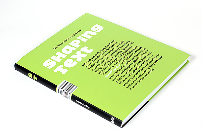
Shaping Text
Wie erstellt man ein Layout? Wie lesen wir? Welche Schrift passt am besten und wie wird mein Text leserlich? Shaping Text ist ein Must-Have für jeden, der sich mit Typografie auseinandersetzt. Das Buch, herausgegeben von Jan Middendorp, erklärt auf vielfältige Weise typografische Grundkenntnisse und erläutert anhand vielfältiger Beispiele, wie man heute gute Typografie macht, wie eine Gestaltung gut wird. Es ist mit dem heutigen Grafikdesign verwurzelt, hinterfragt technische Standards und gibt doch historische Einblicke.
Pressetext: Everyone is a typographer. This is the inevitable conclusion when looking at the way in which today’s computer users are forced to make decisions about fonts and layout for their day-to-day communication. Writing, typesetting and printing have become part of almost everyone’s experience. However, many users are clueless about how fonts work, what constitutes a functional layout and how to communicate best with readers. There has even been a decline in basic typographic knowledge among young design professionals. And yet, a thoughtful and purpose-driven shaping of text lies at the basic of effective, powerful graphic communication.
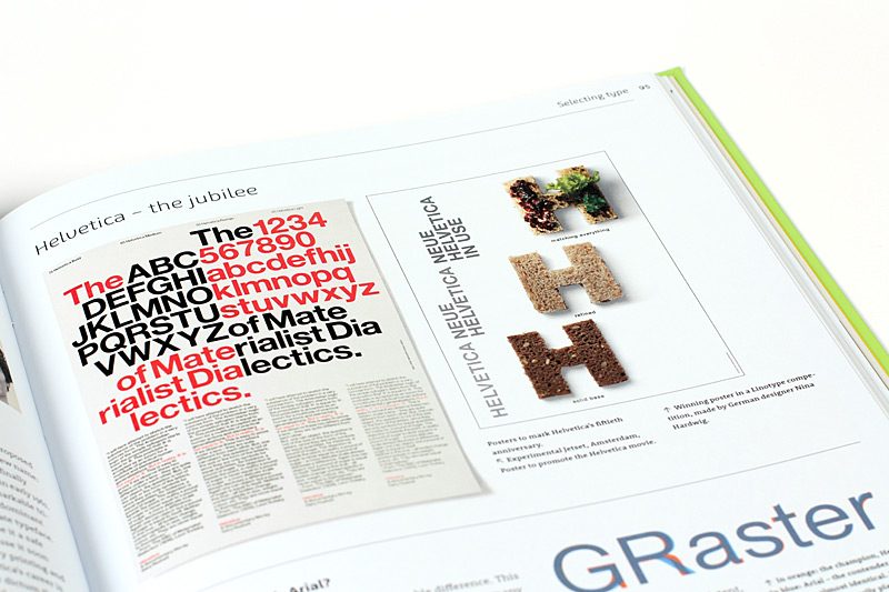
Shaping Text takes a practical and broad approach to typography. It is aimed at design students and graphic designers, and also at those who are concerned with content: writers, editors and publishers. Showing a wide range of examples from first-rate designers across the world, the book examines why and how typographic designs work well in a given context. Particular attention is given to the team play between the text itself – written language – and the design – the shaping of the text – to form a new, multi-level visual message with a complex content.
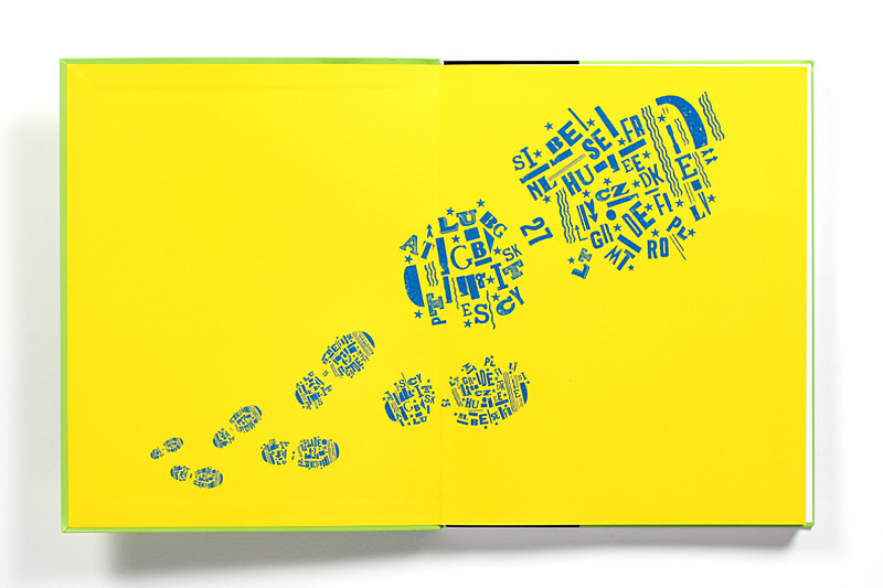
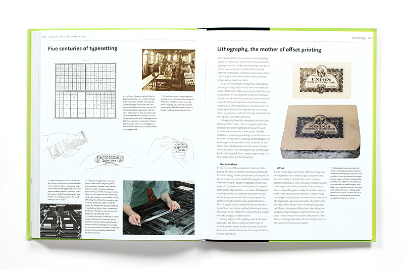
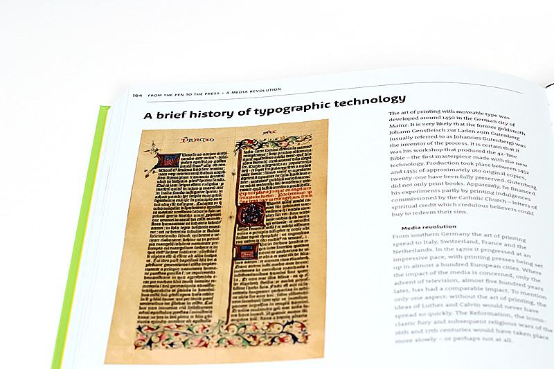
Many textbooks on typography look at the details of type and lettering first, often taking a historical approach, then zoom out to gradually reveal a larger whole. Shaping Text works the other way around. It starts by looking at graphic products – in print, on the screen and in the environment – and then examines the constituting elements, including type, image, ornament, layout, and colour. Historical examples are used as references for most genres of text-shaping; a chronological overview of type design and printing techniques forms a lengthy appendix rather than the core of the book.
Finally Shaping Text is firmly rooted in contemporary design praxis. It discusses the state of the art in type design and technology, and tackles problems and questions that font users may be struggling with. Besides being a typographic writer and consultant for leading companies such as FontShop and MyFonts, the author has worked as a graphic designer and teacher; Shaping Text reflects this broad experience with typographic form and content.
Shaping Text
Autor: Jan Middendorp
Verlag: BIS Publishers
Veröffentlichung: 2012
Umfang: 176 Seiten
Format: 21 x 26 cm
Sprache: Englisch
Specials: Softcover
ISBN: 978-90-6369-223-0
Preis: 29,90 Euro