Slanted Advents Verlosung 24
Volcano Type statt Schokolade! Slanted verschenkt jeden Tag bis Weihnachten einen neuen Font an je 24 glückliche Gewinner.
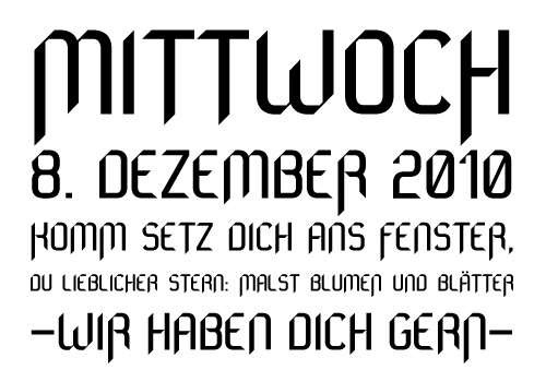
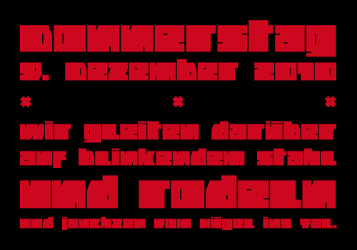
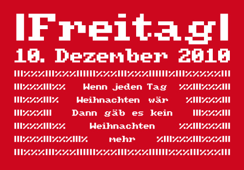
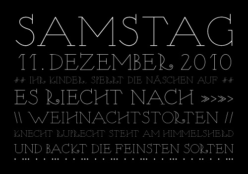
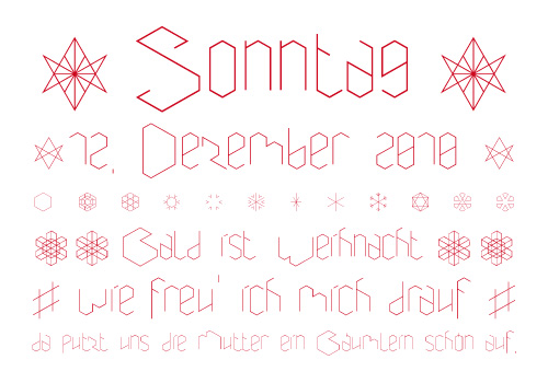
Heute verlosen wir die Schrift Machtwerk, gestaltet von Patrick Hubbuch.
Pressetext: Religions are filled with signs and symbols. Some of them, like the The star of David and the Swastika-Rune received other significations during the third Reich. The superimposition of these two shapes creates the matrice for this font.
Machtwerk is a font, that critically questions and recalls the darkest chapter of our history..
Glossy wurde in der Zeitschrift "Glossy – The Smooth Surface" als Cover- und Titelschrift eingesetzt und u.a. im Buch "Bastard – choose my identity" von Magma und Actar verwendet.
Um an der Verlosung teilzunehmen, schreibt einfach eine Email mit dem Namen der Schrift als Betreff an [email protected]. Wer an der Verlosung teilnimmt erklärt sich damit einverstanden, News von Slanted zu erhalten. Der Rechtsweg ist ausgeschlossen. Die Verlosung endet, sobald eine neue Schrift verlost wird. Wir wünschen euch viel Glück und eine frohe Adventszeit!
Diese Schriften haben wir bereits verlost:
Abracadabra
Abracadabra is a headline-font and shows its characteristics best in big sizes.
Abracadabra loves to be used for fashionable reasons and likes to play with religious looking symbols.
Original font of the Commodore 64. The Commodore 64 was the most-sold personal computer of all time. From 1982 between 17 and 22 million C64 where sold. It looked like a bread bin with push buttons and was connected to a television. The first 64ers had a tapedeck as memory storage (Datasette). Later came the ''Floppy'' disk. for years, the computer surfed on the software wave (for games firstly). At the end of the eighties, it belongs to the passt, but the diverse programs stayed on the market for a while. In 1994 ''Commodore'' went bankrupt, but it kept a strong community of fans. the C64 cannot die. At the end of times, when the world won´t exist anymore, only one message will remain: 38.911 BASIC BYTES FREE.
„Daydream“ – eine Typographie, die inspiriert ist von der Sonne Spaniens und dem Lebensgefühl in der Hafenstadt Bilbao. Dort begegnen einem beim Flanieren in der verwinkelten Altstadt immer wieder verschnörkelte Schaufensterbeschriftungen. Buchstabenornamente, die sich wie Blumenranken um ihren Inhalt schlingen, die Flowerpower assoziieren. Diese blumige Verspieltheit war formgebend für die Schrift „Daydream“.
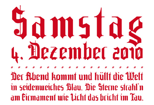
Fl1k is a display font intended for display, headline, logotype, and similar applications. The boundaries between an ordinary Black Letter (fracture) and modernity should be shown fluently. The typical elements of a fracture is mixed with modern features and got a lot of alternate and ligature characters. Fl1k will give you much fun during your design season.
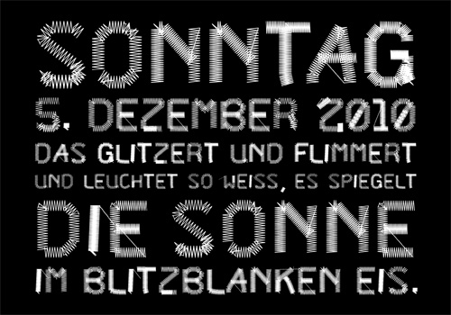
PT Sewed is based on a set of monoline vectors/ letters. Designed for a cultural project. The sewed look was generated for an encyclopedia about jeans. Recommended only for T-shirt Designs and Headlines.
Basierend auf einer Entwurfsskizze von Bauhausstudent Kurt Kranz (1930/31), wurde eine kleine Schriftfamilie kreiert. Die Besten Ergebnisse erzielt man durch das Übereinanderlegen beider Schnitte – Horizontal und Vertical – mit »Multiplizieren« oder ähnlichen Effekten. Der Monochrome Schnitt ist eine Zusammenführung beider Schnitte. Hochachtungsvoll Danke Kurt!
A blackletter type, strongly geometric, mainly used for magazines and headlines. Also readable in smaller sizes e. g. for lyrics of the next heavy metal cd.
Frakturbo is a modern interpretation of the Fraktur-typeface, made for those who don't appreciate the ordinary, classic style of blackletter types.
Originally designed by Alois Ganslmeier as a Billboard-Font, the Coma Font was than developed into a complete typeset with capitals and small letters, Cyrillic letters, Greek letters and Hebrew letters by Andy Jörder and Jörg Herz.
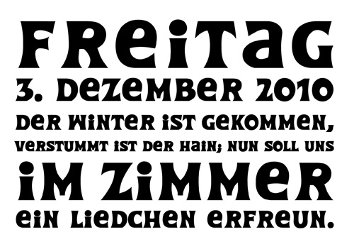
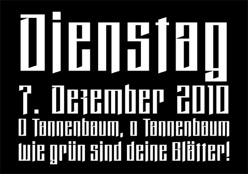
The Coma Font is a massive constructed font which can be used for headlines. When only typed in capitals it gives the impression of baulks for there are no ascenders or descenders. The font comes alive because of its massive appearance, its edgy form and the opulence impression when used line-by-line. Not without reason, the fond is named “dick und eckig”.
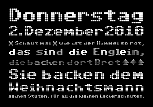
Original Font of the Commodore Amiga 500. Who doesn´t know the Amiga 500? the legitimate sucessor of the legendary Commodore 64. It came on the Market in March 1987 and became the best gaming computer. At the time, the price of the machine was nearly 1000 Deutsch Marks. The Amiga 500 also lead the way against its competitor, the Atari ST which was not as good in the Graphics and sound areas. But, because of badly edited sucessors, and poor marketing from Commodore, the machine didn´t last on the computer shop´s shelves. The rest is well known; the owner of Amiga changed and the name is now achieving new honours again.
Nymphe is a monoline typeface based on the form and character of an art nouveau illustration from 1907. It's somehow oldfashioned but has modern influences that are reflected in irregular serifs in combination with decorative elements. Nymphe is proper for use in font size 7 pt upwards.
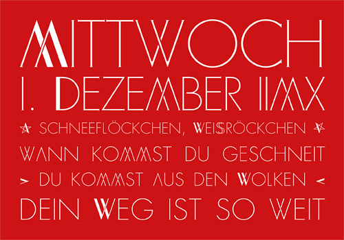
Aneira is a filigree, clearly structured typeface, captured in a grid and all the same exhilarated because of the irregulariity of the baseline. A typeface following the rules of nature, based on the complexity of snow cristals – that's why its name Aneira means “snow” translated from the Welsh language.
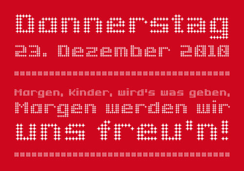
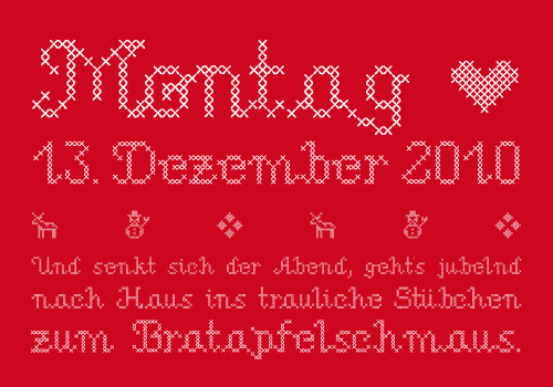
This new embroided-font (stichme) inspired by needlework design books, is aligned on a grid and formed with individual embroidery crosses. The embroided object is then developped in different shapes and forms.
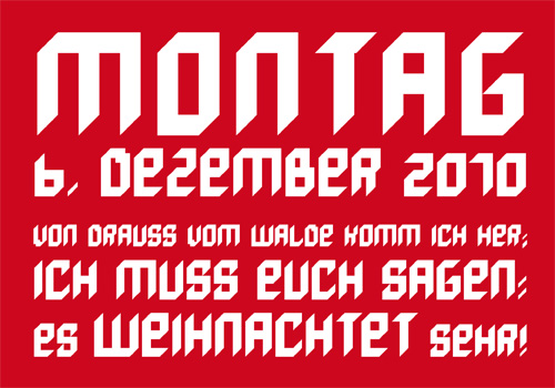
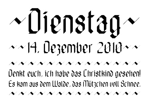
»Die Fette Hubbuch« is a contemporary blackletter typeface, based on a geometric grid. Contrary to the most classical blackletter typefaces, this typeface got no curves. Those individual letter forms were created by using only 45°-angles.
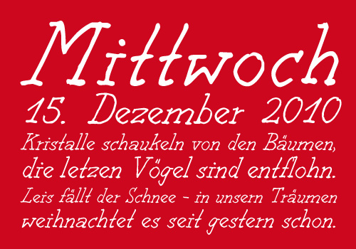
The Decomic Oblique is a Comic-Handwriting from New York illustrator Paul Hoppe. The font was digitalised by Boris Kahl.
A type between letter and number. Cypherals' fresh typeface is a mix-up of numberparts and lines that reveal to be letters.
So who is to say that numbers and letters don´t have much in common?
Dualis is the font you need when a classical and at the same time modern design is desirable. With its harmonious forms it can be mixed very good with other fonts and gives each work an elegant touch. Due to its higher x-height, it looks more modern than the classical typefaces on which it is based.
Hermaphrodite emerged in the Bastard Project as the idea to apply the process of "Antiqua" to a "Grotesk". Concretely, this means drawing by hand a "Grotesk" font and digitalising it. Undesired corners where simply removed.
The first drafts of this majuscule handwriting font were developed in Valparaíso in Chile. The font reflects the atmosphere of this south pacific seaport. It is drawn by felt pen on rough paper. Valparaíso consists of two font weights, Media and Negrita, and includes 287 characters for 28 languages.
NeoPop is an exclusively designed typeface for the issue 7 of the German typographic magazine Slanted.
The handwriting “Handjob” has been generated by dint of a standard graph tablet. The rough and handmade duct grants a unique character. “Handjob” is available in 2 weights: light and regular.
Photocopies are somewhat admirable. especially the old ones. Our first machine was unpredictable, it could be precise or not, distort the document and could never reproduce the right scale. Every copy was a surprise!
Final year project. The lifestyle magazine bearing a similar name, GLOSSY THE SMOOTH SURFACE, is filled with cool illustrations and pics.
