Tabac
Mit ihren 32 Schriftschnitten erschien jetzt bei »Suitcase Type Foundry« die »Tabac«. Eine gut ausgebaute Schrift mit einer Vielzahl an Glyphen und Spezial-Zeichen. Zudem unterstützt sie eine breite Auswahl an Sprachen. »Tabac« ist perfekt für den Gebrauch im Magazin, Buch oder in der Zeitung.
Infotext
Tabac
Due to ongoing collaboration with graphic designers and art directors, we carefully follow their needs when they select typefaces and, as a result, are able to reflect their practical demands and create typefaces specially targeted at specific applications.
Our long-term close research into newspaper and magazine design showed there was a need to design a new serif typeface designated for typesetting that would be as flexible as possible. After drafting the first sketches, it started to be clear that the scope of the future font, the number of styles and, as a consequence, possible applications would be broader than usual. As the main inspiration we chose an Old Style type with less variation in character width, with vertical stress axis and raised x-height. The slightly reduced cap height would better incorporate text with many proper names; besides, shorter caps will result in more manoeuvring space for placing individual accents. The contours are clear and open, and the archetypal serifs connect with letter stems and round strokes without unnecessary protruding sections.
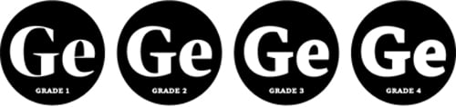
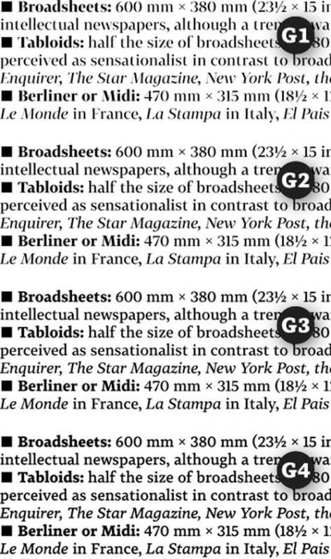
Our main idea was to come up with such large contrast variability so as to provide the type family with access to several classification groups – from text face to title face. In order to achieve this, we decided to scale the weight by slightly strengthening the thin stokes; this approach is typical for newspaper typefaces. The whole family is usually available in several slight variations that differ in weight. This can be particularly useful when tuning the final layout depending on the material, print quality and particular technology used as the typeface proportions remain the same throughout the whole type family.
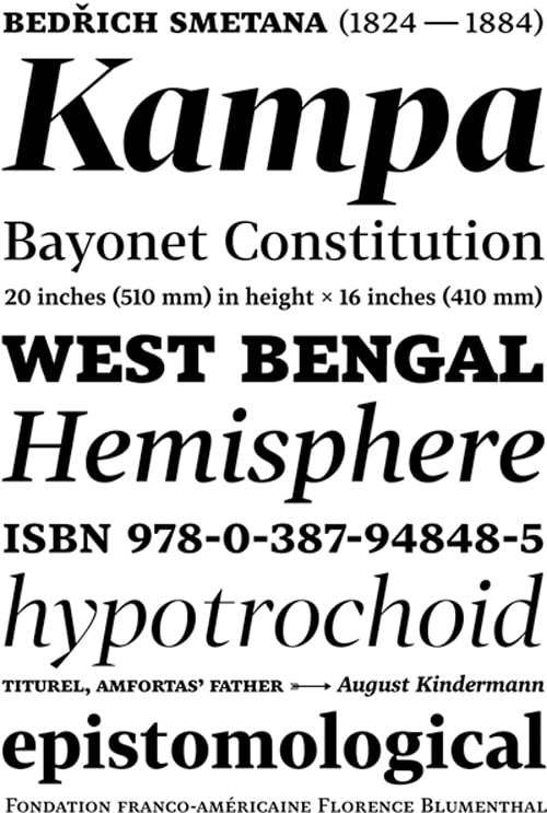
The Tabac type system is a static Old Style typeface with modern shapes and distinct, wedge-shaped serifs. It is primarily designed for newspaper, magazine and book typesetting. By scaling the weight in all styles, including bold, Tabac boasts great variability. Each style works as a font of its own, featuring the full set of glyphs. These styles may be combined depending on the user; the choice of text and title face thus depends fully on the designer’s own taste, on the needs of the readers and the technologies of printing in use.
Tabac’s letters are open, with no extreme variations in shapes and no unexpected surprises, just as it should be in every good text face. That being said, the sober outlines result in a pleasant tension when seen in a line of text. Title sizes clearly show the unique character of the typeface. Accents are clear, constructed specifically to be easily distinguished from each other. The accents fulfil the SCTF Standard; Tabac thus supports over 40 languages that use the Latin script.
The italics are all a shade lighter than the corresponding regular styles. In places where letter construction permits it, the lower case letters boast the same width as Roman type, so as to reduce variation in paragraph length after changing part of the text. Italics are distinct enough through flowing connections of round strokes to the stems and letter shapes.
Compared to the caps, small caps are a little wider. The weight and size of serifs are adapted to the lower case. Small caps have specific versions of some glyphs, such as the degree sign, the slash, the percent, the per mille, the minute, the second, the question mark, the exclamation mark and the parenthesis glyphs. All variations are activated via the OpenType command Small Caps. When turning on the All Caps mode, only the position of quotation marks changes to respect the small caps height.
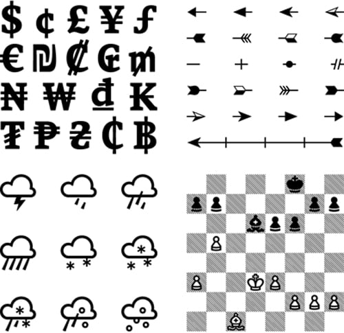
Each character set boasts nine types of numerals. Lining figures are set as the default, but are slightly lower than upper case letters. Non-lining figures, on the other hand, usually drawn to follow the x-height, are slightly taller here. Through this approach, the numerals are then better integrated into the flow of the text. Both lining and non-lining figures are also available in tabular version – the width of tabular figures remains the same throughout all weights so they can be easily used in a single table. Subscript and superscript figures and fractions represent another four types of numerals; most common fractions are pre-set. Currency symbols are broadly supported. Apart from the common monetary symbols (US dollar and cent, British Pound Sterling, Japanese Yen and Euro), the character set also contains other less-common monetary symbols from around the world: the Israeli Shekel, the Costa Rican Colón, the Brazilian Real, the American Mill, the Nigerian Naira, the Korean Won, the Vietnamese Dong, the Lao Kip, the Mongolian Tugrik, the Philippine Peso, the Ukrainian Hryvnia, the Ghanaian Cedi, and the Thai Baht. All symbols are designed for upper and lower case and, when changing lining and non-lining figures, the size changes as well. Wherever technically possible, the currency symbols have the same width as tabular figures so as to make setting of complicated tables as easy as possible.
Tabac contains a number of special characters. Eight direction arrows for upper and lower case are a standard; four directions of double, full and framed arrows have also been added. By combining the glyphs, decorative arrows can be created. For this purpose, the character set contains four spikes and feathers each in both directions and also the centre pieces. Triangles, squares, circles, diamonds and five-pointed stars are available in three sizes each, in full and outlined version. Half-stars come in handy for reviews in music and film magazines. Both French and German card symbols are featured. For typesetting chess boards, sets of chess figures on both white and black squares are available. The figures are precisely stylised using a combination of traditional Czech club and Staunton shapes. When turning on contextual alternatives, normal white spaces are automatically replaced with chess square spaces, making chess typesetting a breeze. Twenty-three weather symbols cover all possible weather options imaginable, from light showers to monsoon rains and light blankets of snow overnight to violent tornadoes – each in well-formed, easily distinguishable shapes.
www.suitcasetype.com/tabac