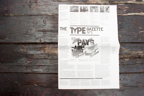
Seit Kurzem gibt es eine neue Typo-Zeitung aus der Schweiz (gestaltet von Ludovic Balland)

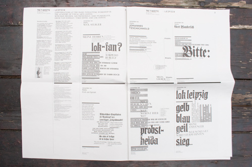
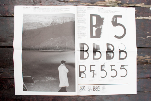
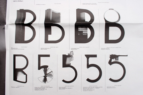
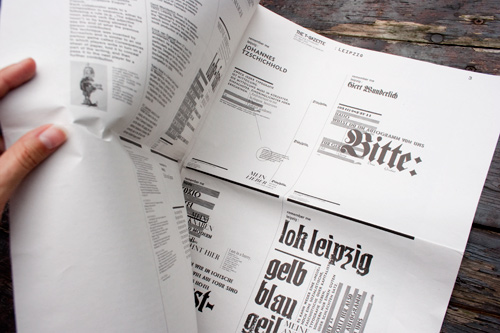
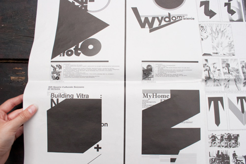
The Type Gazette is a review devoted to typography.
Offscreen—its applications, its spin-offs.
In pictures. It deals with the design and composition/organization of letters as narrative sources.
The first issue introduces the cabinet through the topic letters as a store of memory, presenting among other things a selection of posters originated over the last 2 years , a portrait of Wolfgang W. during a walk in Jordan and a workshop at the Academy of Visual Arts Liepzig. With an introduction by François Rappo.
Format : 32×45cm, 8 pages
+ an inlay magazine
+ a poster

Die Typegazette kann als Einzelheft (Issue 1 / 15 Euro) oder Abo (3 Ausgaben / 35 Euro) über Paypal gekauft werden (Ursprünglich war der Preis für die auf 300 Exemplare limitierte Ausgabe wohl höher, da ein anderer Preis auf der Zeitung abgedruckt wurde ...)


Gast

wieviel inhaltsarme typomagazine braucht die welt noch?

Porter

Hatte das Ding schon in der Hand. Also mich spricht die Gestaltung überhaupt nicht an. Dieses ganze inhaltslose Typowirrwarr – ich versteh es einfach nicht. Balland hat ja doch einen gewissen Ruf, wenn ich allerdings die Poster-Sektion auf seiner Webseite anschaue, frage ich mich allerdings woher dieser Ruf kommt?

Na ja, die manystuff-Generation wird es schon hypen und dieses viel zu dünne Blättchen (sind nicht mehr als eine Handvoll Seiten) für den viel zu hohen Preis bestellen.

Hans

Also so ein Blödsinn von diesem Balland.
Selbstdarsteller!

Gast

magazin für insider, manystuff leser und schweizer grafikstudenten!

maxime

I can definitely stand the shit talking, I even tend to think it brings passion to a debate, when it's clever. But all I see here is playa-hating with no argument. The Type Gazette has many flaws but qualities too. It raises questions that need to be raised. Let's have a real discussion going on here as full-on grown ups who sign their comments, or stop mentioning Manystuff like you're so above it!

Bernie

OK Maxime, what does it ask, and what does it answer, or rather, what answers does it give?

Mine is that typography is not art. Art can communicate on various levels: hidden, open, subliminal, it can mislead or lead to enlightenment. Whatever.

Typography is written speech. It has be clear cut. No experiments, or just a little, because readability is paramount for it to fulfill its job. If you can't read it, it doesn't communicate. Typography doesn't hold a pocket for art. There is no room for subliminal mind concepts, hidden agendas or mysticism. It's pure.

That's the problem most artists encounter when they put there hands on type. They fail.

Typography and art are like two individuals. They can work together, they can help each other, illuminate each other. But you can't make them switch or mingle their clothes. They will lose their purpose and turn into flat cardboard cutouts, into caricatures of themselves.

If you create art with type, call it art, not typography.
If you create type with art, call it typography, not art.

tobe

muss ja dochmal kurz nachfragen, was genau "manystuff" bedeutet?

Es sieht ja von weitem schon recht interessant aus, jedoch wie bernie sagt zu experimentell wie ich schätze...
Würds gern mal in die Hände bekommen, um den Inhalt sehen zu können...

flo

what about experimentation, anti-definition, pushing and exploring boundaries, bernie?
and what about the designers »handschrift« you are asking for, regarding the work of mirko borsche or mario lombardo – you cannot deny, that ludovic balland definitely is a visual author with a strong conception of typography and design.

i am very sceptical about that (very old) art/design-dichotomy, too – both fields are about communication.

hans schumacher

very good english, guys; you seem to have been native in one or two lifes before the current one, i guess – i wont be able to top that but i'm giving a try, for the hack of it …

first of all: 'readable' is a very flexible term – typography is about readability, thats right, but without experimentation the graphic design field becomes limited as a 'Setzkasten' – with some approved items to be used for already known purposes (i.e. the right answers to some well known questions, think of what you know about the effects of the typographical means Mittelachse or linksbündiger Flattersatz, as conservative opposed to progressive and so on). Therefore: to experiment is necessary – experimental stuff is necessary. I cant think that anyone working in the artistic/communicative field would neglect this.

now for the big issues: typography as art or not art doesn't seem to be the question. I think Mr. Bernie is expressing his suspicion that somebody working in the artistic field is putting the means he is using (in this case type&graphics) in an exaggerated way before the 'Inhalt' or, lets put it in a different way, what he is trying to communicate is vanishing behind a firework of hmm … expression, you could also call it 'Handschrift'. Well, nobody is safe of this … * (never mind my english, folks)

postscriptum: * when it comes to 'Handschrift'

Bernie

Well Hans, you put exactly to the point: Most artists don't seem to know what they want to say before they start fooling around with type. And this I find repulsive and boring. A waste of time.

Flo, experimentation is OK, but I don't like having someone else do it for me. I need experimentation to find out what to do with my concept. And I always need to remember that it has to "speak" to my audience. I don't care if I need to align my type left, right or middle. Those are just means of layout, making it look best – fitting for my idea.

I do cringe when I see style dominating matter, style dominating content, like Lombardo or Mike Meiré do with their work. Because I am too old for this kind of shit. My work needs to cope with the demands of my clients, 'cause the pay a lot for that. I am a "dienstleister", but I can do fucked up shit too. No big deal.

I look at new stuff in a analytic way, examine what has been done. To decide: yes or no.

And I also take best, process and include that into my own work. Of course. But I still try to stick to the rules. Rules, that keep my work in check, keeping it plausible, readable, understandable, explorable. Memorable.

Of course you can produce art with type. But make it nice. And stick to some guidelines. Like making up your mind about the message. About the construction, the surroundings, how it mingles with the graphics. Then make it paramount. Make it geil!

Try to imagine what a guy like Picasso would have done with type. But start analyzing his art first, what moved him, etc.

Same thing Hendrix did. He learned to play the blues first, with all the tricks, played the guitar with his teeth or the audience would have thrown beer bottles at him (at some location in the southern united states), and then he moved to Britain, where he started to create his own music, which was lightyears ahead of everything else. And still is.

BTW, Hans, your english language skill is quite profound for a non native speaker. Thumbs up!

flo

tobe, manystuff ist ein weblog von charlotte cheetham, graphic design daily selected: www.manystuff.org

es gibt leute, die finden die dort präsentierten arbeiten elitär, selbstverliebt/-bezogen, und als auswahl zu homogen. alles aus einem teilbereich von grafik-design, der mehr mit selbstausbeutung und -darstellung zu tun hat, als mit breiterer öffentlicher relevanz. & es langweilt inzwischen.

es gibt leute, die finden die dort präsentierten arbeiten interessant, intelligent und reflexiv/innovativ. alles aus einem teilbereich von grafik-design, der wertvoll ist und mehrere punkte macht, im gegenwärtigen feld. & das spannendste, was gerade so unterwegs ist.

ich denke, dass manystuff für viele interessante arbeiten und kleine büros eine sammelstelle darstellt (allerdings kuratiert von einer einzigen person, was bei der – inzwischen großen – öffentlichen wahrnehmung entsprechende fragen von selection & power/macht aufwirft), die eine tendenz und strömung (irgendwo ähnlicher arbeiten) abbildet (gemeinsame ansätze, stilmittel, layoutmerkmale etc.). diese strömung ist eine wertvolle bereicherung des breiteren feldes, und viele arbeiten sind wirklich sehr gut. gleichzeitig beeinflusst diese sammlung viele (ebenso) junge grafik-designerInnen, produziert manystuff eine ziemlich große menge von epigonalem, wird zu einem look – weswegen man vermutlich schon von einer (aufkommenden) manystuff-generation sprechen kann. wie auch immer man das bewerten mag.

ich möchte teil einer jugendbewegung sein.
i-D

Pauline

... langsam nervt es ...

tobias hollender

danke für die antwort, flo!

Oliver

I just want to react on some of Bernie's positions here:
Without a doubt Balland creates typographic design with a strong focus on authorship and experimental approach. His style is very unique and independent – and powerful enough to polarize, to provoke passionate debates on a topic like typography. It's not the goal to make everyone like it. The Gazette is no catalog, it's an expression of attitude, of opinion – questioning exactly the rules you are talking about, Bernie. Like the typographers in e.g. Switzerland and Germany did since the 1950s – who had to see themselves confronted with similar reactions.

«And this I find repulsive and boring. A waste of time.»
That his Gazette starts with introducing the reader to Balland's own position, doesn't mean that he just wants to create a platfrom for self-adulation. And I'm sure he doesn't do those experiments for anyone of us but for his own artistic development. Publshing the Gazette as a medium to put his own ideas up for discussion as well as presenting the ones of contemporary colleagues, in my view is an act of a committed designer who doesn't want his discipline to get stuck on unquestioned rules. At least you should recognize his work as a kind of visual reflection on type. Reflecting on rules and biases isn't and never will be a waste of time but the base of any cultural development.

«I look at new stuff in a analytic way, examine what has been done. To decide: yes or no.»
The new and suprising stuff lies hidden in the «Maybe.» ;)

«Of course you can produce art with type. But make it nice. And stick to some guidelines.»
As Balland's style is very consistent and consequently evolving I'm sure there are guidelines. I also know that he has a profound knowledge of typography. He knows the rules he messes around with very well.

«Typography is written speech. It has be clear cut. No experiments, or just a little, because readability is paramount for it to fulfill its job. If you can't read it, it doesn't communicate. Typography doesn't hold a pocket for art. There is no room for subliminal mind concepts, hidden agendas or mysticism. It's pure.»
Exactly because of being written speech, typography holds a lot more possibilities than just forming words through shapes. In the intersections between type and image there is so much more to communicate than just the pure and exact wording. Finding ways to make the shape itself support the content of the written word in my opinion is one of the biggest challenges a designer can face. Especially in the discipline of poster design.

«Try to imagine what a guy like Picasso would have done with type. But start analyzing his art first, what moved him, etc.»
Good example. Picasso (co-)developed Cubism and reflected on image space, seemingly untouchable rules of perspective. And he – in the end – contributed to a fundamental change of our perception of images. The academic painters hated it, insisted on their rules. But today's applied art wouldn't have been possible or even «readable» if modern art hadn't kicked our great-grandparents' perception's ass. Typography and all its rules as well are subjected to their cultural context.

I definitely don't like all the stuff Balland created during the last years I've been living in Basel. But I'm impressed by him pushing his style forward continuously. And by him keeping a lot of people talking about typography. I'm curious about seeing other typographic designer's positions being contrasted with Balland's work.

Dein Kommentar

Deine E-Mail wird nicht veröffentlicht.

Der Inhalt des Formulars wird durch einen externen Dienst (Mollom) auf Spaminhalte überprüft (Datenschutzrichtlinien)

Verwandter Artikel

Haagse Letters, modulating type.

Haagse Letters is a website where I place my typographic experiments. It's an ongoing project that I will work on ...

in

Nächster Artikel

VIER: Beziehungen

MAGAZIN DER HOCHSCHULE FÜR KÜNSTE BREMEN

Gerade lag die achte Ausgabe von VIER, dem Magazin der Hochschule für Künste Bremen, in meinem Briefkasten. „Und ...

in , 52 Kommentare

Vorheriger Artikel

Die neue Zeitschrift ESCEHAERIEFTE ist da!

Ein persönliches Protokoll.

Die Vorgeschichte. Am Anfang steht ein Treffen zwischen Boris Kochan und Horst Moser. Die Idee: Ein Workshop, bei ...

in 4 Kommentare