Typographics 2016
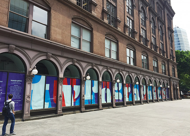
Typographics, the “design conference for people who love type,” completed its second iteration on June 17 and 18, 2016. Held in the Great Hall of New York's historic Cooper Union building, the main conference is part of a larger ten-day type-focused event comprised of lectures, labs, and workshops. Manhattan’s East Village was an ideal setting for the conference, with plenty of cafés and culture within easy walking distance.
Roger Black and Sasha Tochilovsky deftly split the hosting duties this year, keeping their remarks ultra-condensed to stick to the tightly spaced schedule. Column spacing issues aside (those who were there know what I'm talking about), the Great Hall served as a dynamic conference environment, complete with alternating flush-left and flush-right podiums.
The first block of presenters didn't pull any punches, with Tobias Frere-Jones establishing his case for treating screen text as an optical size through his latest release, Mallory, and Fiona Ross laying out a plan for developing more non-Latin scripts through research and collaboration, and sharing her expertise in Indic writing systems. Riley Cran, founder of Lost Type Co-op, took the audience on a humorous tour of ITC’s history, and asked us to consider both if and how today’s typeface designs will be adapted to forthcoming generations of technology. Juliette Cezzar spoke of the dangers of publications losing their typographic identities on the web through the “elevation of the article” across multiple media platforms.
Tobias Frere-Jones
Riley Cran
After a mid-day break for lunch and TypeLabs organized by Petr van Blokland, Tracy Ma detailed her agile process for handling text and design for the weekly publication, Bloomberg Businessweek. Elaborating on the themes of problem solving and international script design, Thai designer Anuthin Wongsunkakon quipped that “if you see problems as opportunities, then you will find yourself with a lot to do.”
Tracy Ma
Anuthin Wongsunkakon
Pentagram partner Emily Oberman shared masterful case studies from her career designing type-based identities for clients like Saturday Night Live and Film Independent, while riffing like a complete professional as she navigated some early technical issues with the projectors. Rounding out the first day of speakers, Rob Giampietro showcased the new Google Fonts directory, and Elizabeth Carey Smith gave an engaging lecture on environmental type, vernacular hoarding, and typographic life cycles.
Elizabeth Carey Smith
A distinctive feature of this year’s conference was the addition of “Spotlight Talks.” Each a minute long and scattered throughout the main conference lineup, these brief stories, observations, and admonishments gave other designers the chance to share what was on their type-saturated minds. Participants included Cyrus Highsmith, Aaron Bell, Paul Barnes, Lynn Dunne, and Erik van Blokland, (amongst others). These talks added humor and nuance to the rhythm of the day’s events.
Cyrus Highsmith
Paul Barnes
Starting off the second day were Marta Cerdà Alimbau, discussing the differences between “tourist” and “nomadic” designers, and YuJune Park and Caspar Lam, who (through delighted lament) explained some of the challenges faced when designing Chinese typefaces. Indra Kupferschmid offered up several expertly vetted methods for choosing typefaces for commercial projects, (all while showing off her intense spreadsheet skills!), and Stephen Doyle won the award for favorite turn of phrase when describing the “kernagonal” issues one faces when “designing with twigs.”
Stephen Doyle
Dan Rhatigan presented an in-depth look at default page design settings and how they influence consumers’ perceptions of how text should appear. Rounding out the morning session was Victoria Rushton, whose wittily self-deprecating tour through her inner creative monologue showed us the pitfalls and solutions to designing a semi-connected script. Her obvious passion and commitment to the project was an inspirational highlight of the day.
Dan Rhatigan
Victoria Rushton
Another theme receiving heavy play at Typographics was editorial and publication design. Beginning with Eduardo Danilo on day one, and continuing with Francesco Franchi and Gabrielle Wilson on day two, attendees were given more than a few tips about selecting and implementing the best typefaces for the job at hand. After being treated to the eye candy that is Jakob Trollbäck’s motion design, Douglas Riccardi prepped the crowd for dinner with his “Culinary Abecedary.” Finally, Nina Stössinger charmed the audience with her pushback against the “continual erosion of the horizontal in Western type,” also known as her latest design, Nordvest. This reversed-contrast stressed-horizontal typeface began as a mistake, but evolved into a rallying cry for challenging established norms in type design.
Gabrielle Wilson
Jakob Trollbäck
Nina Stössinger
Only two years in, Typographics has already established itself as a solid addition to the growing list of international type conferences. Diversity in speaker selection and a willingness to experiment with traditional formats speak to the progressive mindset of the event’s organizers. (Both days culminated in “roundup” sessions, giving audience members the chance to ask questions of the entire gaggle of presenters all at once.) While this and other type conferences promote enlightening historical research, one of Typographics’ strengths is the broad swath of contemporary and impending issues now facing our profession—from pricing models to multi-script design, as well as the future of print. This forward-thinking approach assuredly speaks to a bright future for the Typographics conference.
Patrick Gosnell
Assistant Professor of Graphic Design at Austin Peay State University in Clarksville, Tennessee, USA
[email protected]
Twitter: @Patrick_Gosnell
patrickgosnell.com


