Soleil Magic Caps
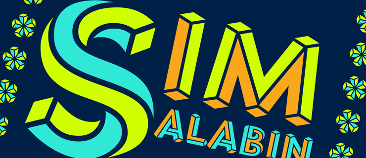
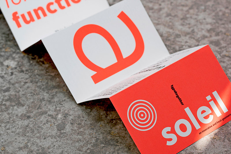
Soleil Magic Caps ist der neue Gefährte von der vielfach ausgezeichneten Grotesk Soleil, die schon vor einiger Zeit bei TypeTogether erschienen ist. Der aus Großbuchstaben bestehende Zeichensatz wurde von Escher Arbeiten inspiriert und basiert auf dem Prinzip »unmöglicher Geometrie«.
Im Pressetext heißt es weiter dazu: “Soleil Magic Caps is composed of one main style and two additional layer styles that can be handled separately to make the mind-bending deconstruction process more visible and attractive. Soleil Magic Caps is a rigorous and reader-centric design that stands out from the crowd and is a superb visual contrast to Soleil.”
Soleil Magic Caps
Foundry: TypeTogether
Designer: Wolfgang Homola
Veröffentlichung: Juli 2015
Schnitte: 1 Hauptstil + 2 zusätzliche Schnitte zur Überlagerung
Preis: 64,10 Euro
Buy
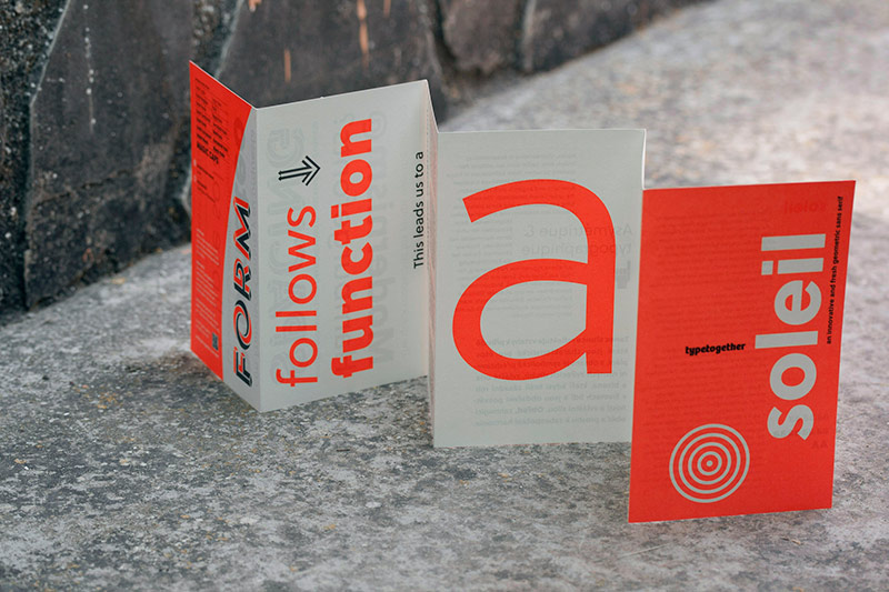
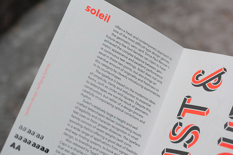
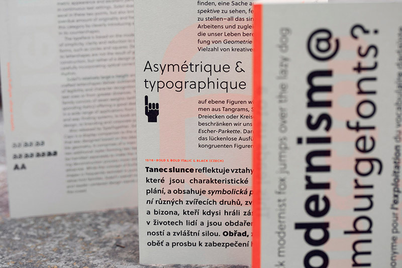
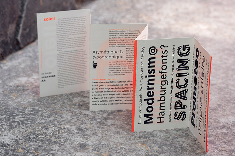
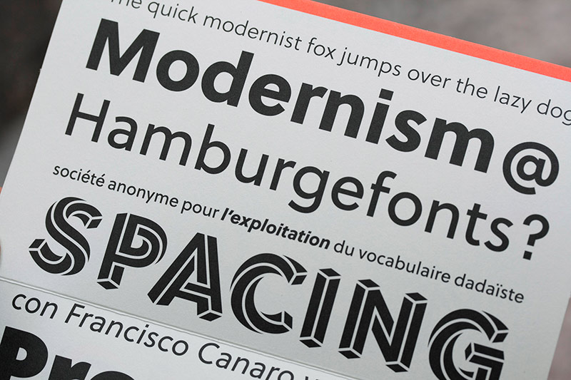
TypeTogether hat neben der Schrift auch ein sehr schönes Specimen zur Soleil veröffentlicht, das von Wolfgang Homola gestaltet wurde. Das Leporello zeigt übersichtlich alle Stile der Soleil, u.a. auch den an Eschers Arbeiten erinnernde Display-Schnitt Soleil Magic Caps. Das Booklet kann online bestellt werden.
Soleil Specimen
Design: Wolfgang Homola
Veröffentlichung: Juli 2015
Format: 10,5 x 17 cm
Papier: Sunken Print Cream
Farbe: 2-farbig Offset
Preis: kostenlos, 3,50 Euro Versand