Read more
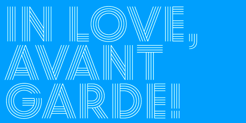
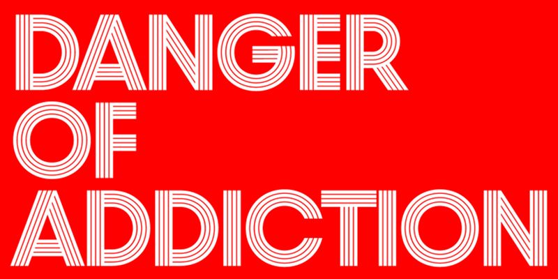
Die Display-Schrift Prism von Sascha Timplan wurde von zwei alten Schriften inspiriert: Der Prisma von Rudolf Koch und der Avant Garde von Herb Lubalin. Die Weiten und Buchstabenproportionen sind unter den 10 Strichstärken identisch – es ändert sich lediglich die Stärke der Innenlinien.
Pressetext: Prism was mainly inspired by two things, the sketches of Rudolf Koch for Prisma and the proportions of Avant Garde by Herb Lubalin. Even when the proportions and widths stay the same from ExtraLight to Black, you get the opportunity to change the weight and get a complete new look for that typeface by changing the grayscale or color. It is a modern combination for headlines, that want to have a different look.
Prism
Foundry: Stereotypes
Designer: Sascha Timplan
Veröffentlichung: März 2013
Format: OpenType OTF
Schnitte: ExtraLight, Thin, UltraLight, Light, Regular, Medium, SemiBold, Bold, ExtraBold, Black
Preis: pro Schnitt 19 $, Familie 30 $