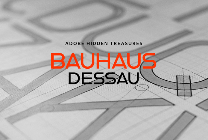
Adobe Hidden Treasures: Bauhaus Dessau
Part 1: Joschmi & Xants
For the 100th anniversary of the Bauhaus Dessau, Adobe has launched the beautiful project “Adobe Hidden Treasures—Bauhaus Dessau,” in which almost forgotten, unfinished font designs and letter sketches of legendary Bauhaus masters have been taken from the archives and now completed.
In collaboration with the Bauhaus Dessau Foundation and Erik Spiekermann, Adobe has realized the project and will now successively publish five new fonts based on legendary Bauhaus designs by Xanti Schawinsky, Joost Schmidt, Carl Marx (July 2018), Alfred Arndt (August 2018) and Reinhold Rossig (September 2018), which we will present to you in a four-part series.
With Hidden Treasures, Adobe honors the legacy of the Bauhaus and the upcoming 100th anniversary next year. “Adobe had the great idea to reinterpret font designs. Actions such as the Hidden Treasures campaign show concretely how current and fascinating the Bauhaus heritage is to this day. Especially for the young generation of designers,” says Dr. Claudia Perren, Director at Bauhaus Dessau.
“Writing is for culture, just as the air we breathe is for us. Without what is written, there would be no culture,” explains Erik Spiekermann. He supervised a team of design experts and students converting the fragments into complete Typekit fonts with the aim of understanding how the masters would have completed their designs.
Using this data, the team completed and digitized the fonts: The first two fonts, Xants and Joschmi, were designed by Luca Pellegrini (ECAL Lausanne, CH) and Flavia Zimbardi (Type@Cooper, Cooper Union, US). They are now available for installation via Typekit.
Joschmi
Joost Schmidt’s (1893-1948) name is undoubtedly connected with monolinear condensed letters of geometric appearance—his unfinished draft of a stencil alphabet, constructed on grid paper in 1930, is much lesser known. These modular shapes simply consist of half circles, quarter circles and square strokes with half-round terminals. From just six original letterforms (a, b, c, d, e, g), Flavia Zimbardi (Type@Cooper, CooperUnion) completed Schmidt’s draft and extended it to a full character set for contemporary use, adding upper case letters and different figure sets including old-style. Joschmi overcomes legibility issues usually associated with this stencil style, with special attention to the design of white space. Zimbardi lends the face even more character by carefully adding round terminals in subtle spots of the alphabet, accessible through stylistic sets.
Xants
In 1932, Xanti Schawinsky (1904-1979) designed an alphabet that combines two styles: a neo-classic stroke contrast paired with characteristics of stencil lettering. This mix is a child of its time and seems to reflect the Swiss and Italian biography of Schawinski. Luca Pellegrini (ECAL Lausanne) took on the modern look and re-drew the letterforms, interrupted by subtle spaces where thick and thin strokes meet. Although Schawinsky had already designed a complete alphabet and figures in the early 1930s, Pellegrini took the character set to another level, adding currency signs, mathematical symbols and all kinds of punctuation—anything needed to set more than just headlines. Xants is a blend of Swiss elegance and exclusiveness with Italian charm and imperfection, a combination that never gets old.
Design competition:
With the publication of the fonts, Adobe is also launching a five-part design competition in which all creative people are invited to design with the new fonts for the first time. There are exclusive prizes to be won, including a trip to the Bauhaus Dessau Foundation. More information on how to participate can be found here.
Livestream:
In addition, there will be live streams from today until June 14th showing a few design possibilities with the new fonts—Erik Spiekermann will be seen and heard personally 😉 Click here to register.
Creative Cloud subscription special:
On the occasion of the project you can subscribe to the Creative Cloud at a special price for 1 year: Creative Cloud for only 35,69 € (incl. VAT) instead of 59,49 € per month. Order here.
Coming soon:
Font 3: July 2018—Designed by Hidetaka Yamasaki, based on the work of Bauhaus master Carl Marx
Font 4: August 2018—Designed by Celine Hurka, based on the work of Bauhaus master Alfred Arndt
Font 5: September 2018—Designed by Elia Preuss, based on the work of Bauhaus master Reinhold Rossig
Background:
Although the Bauhaus was only active for 14 years after its opening, it is still considered today to be the best known modern school for architecture, design and art of the last 100 years. In 1932 the Dessau municipal council, dominated by the National Socialist Party, decides to dissolve the Bauhaus School in Dessau. The unfinished masterpieces of the designers Xanti Schawinsky, Joost Schmidt, Carl Marx, Alfred Arndt and Reinhold Rossig have therefore remained in the archives to this day.
“Hidden Treasures of Creativity is an ongoing project that aims to revive lost creative history to inspire current generations. Last year, Adobe worked with the Munch Museum and the world’s leading Photoshop brush expert, Kyle T. Webster, to recreate Edvard Munch’s brushes. Tens of thousands of people downloaded the brushes and were inspired by the old master. This year, Adobe recognizes the unbroken influence of the Bauhaus, whose goal was to rethink the future, unfold it in everyday creativity, to shape modernity in all its demands—including typography and design from the beginning, which has driven us to innovation to this day. We hope that by bringing these hidden treasures to the present day, we can inspire many creative people,” said Sabina Strasser, Head of Brand Marketing, EMEA at Adobe.