Lost
New Typeface by Federico Parra Barrios
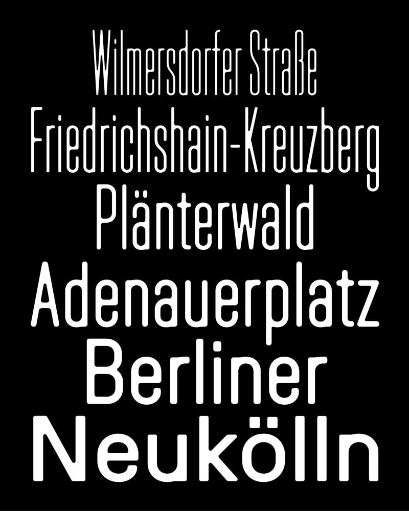
Lost is a typeface that reflects the life choice that its designer, Federico Parra Barrios, made in early 2024, when he left his hometown of Bogotá to settle in Berlin after several years navigating between America and Europe. Discovering his new environment, Federico quickly developed an interest in urban signage and the role of typography in Berlin’s public spaces. He was particularly struck by the metal plaques with embossed letters that are omnipresent throughout the city.
The effects of the embossing—which distorted the metal and altered the letterforms—became the starting point of his research. He was also struck by the way very long words, common in German, are compressed to fit on the narrow plaques. This compression, combined with the embossing, further accentuates the distortions: some details disappear, counters are reduced to an extreme degree, and certain parts of the letters appear darker to the eye. This phenomenon sparked Federico’s interest in exploring what happens between a standard width and a highly condensed one, and in studying how these variations influence the letterforms.
Lost is a variable font that ranges from a standard width—the Normal style—to a very narrow width—the Compressed style. As the letters become narrower, the forms react: the stems become thinner, while certain junctions thicken and round out, echoing the distortions seen on metal plaques. A system of activatable frames, accessible via Stylistic Sets, allows users to create cartouches around words. One can choose between straight, rounded, or pointed terminals, extending the aesthetic of the nameplates that inspired the typeface’s design.
Further information here.


