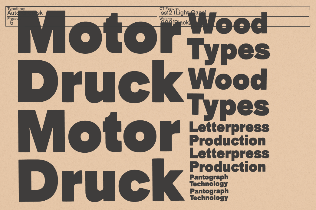
Auto Grotesk
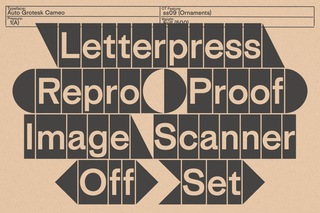
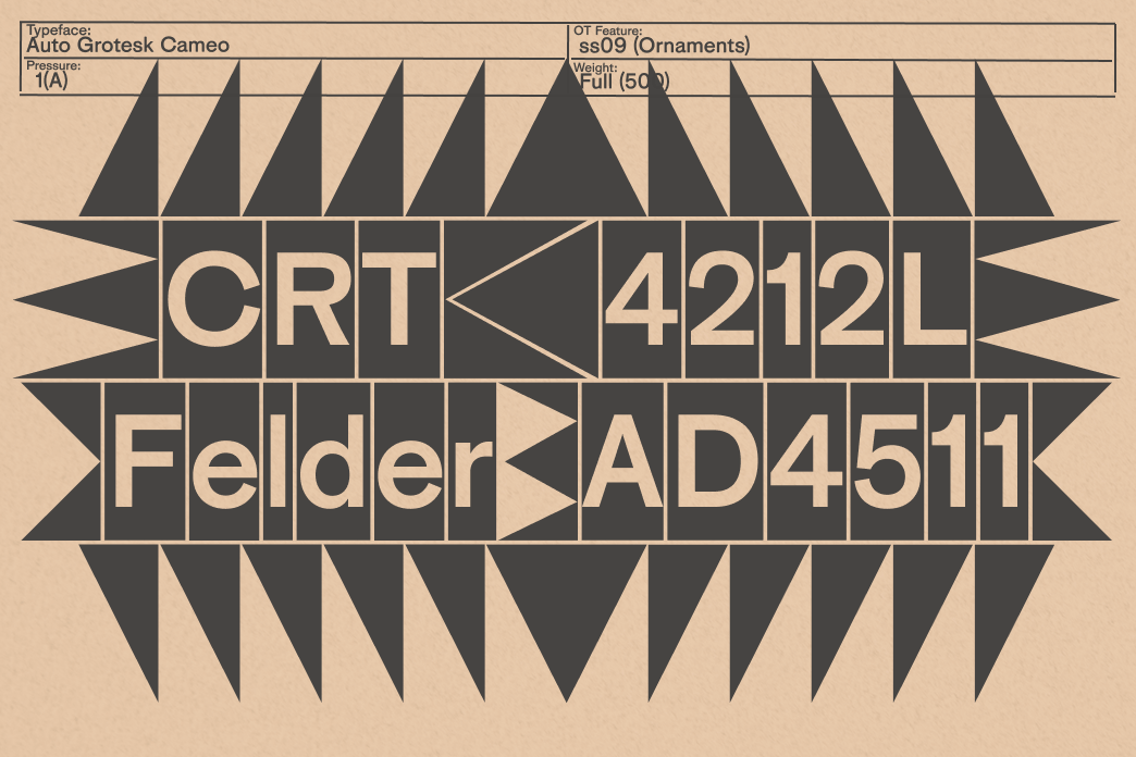
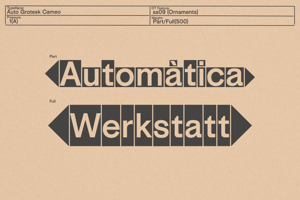
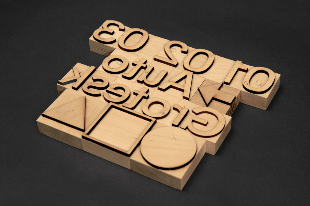
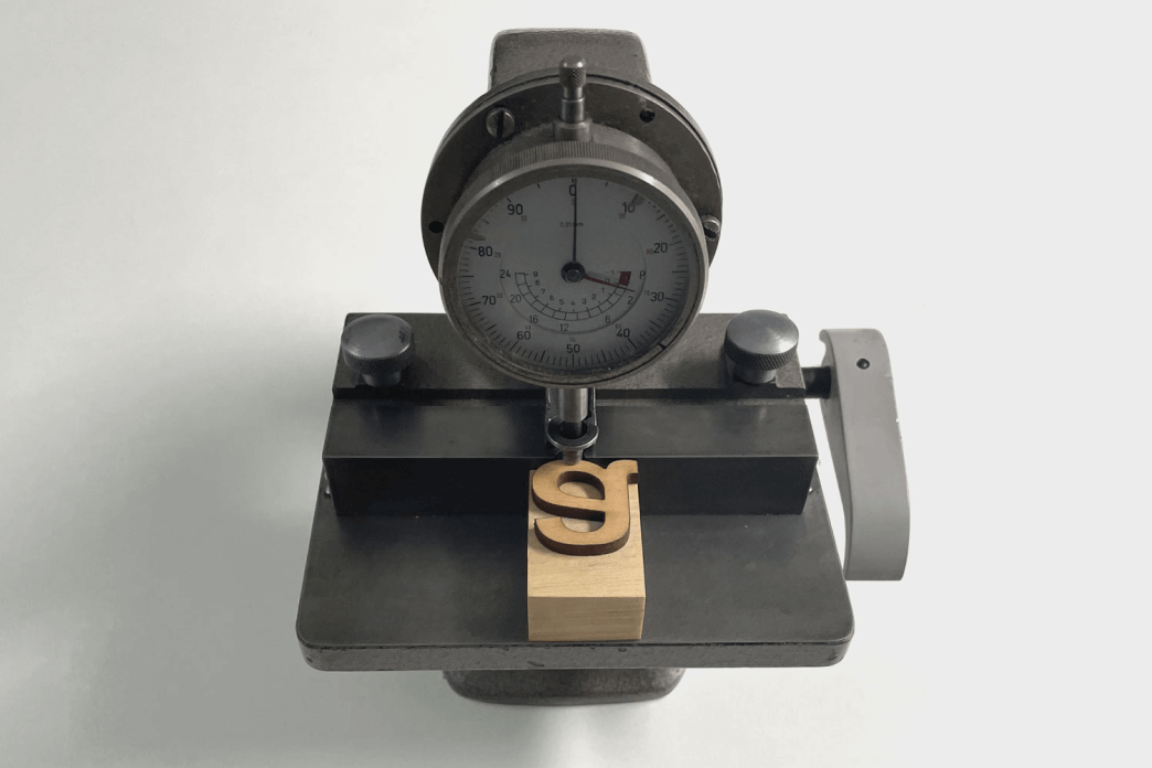
Auto Grotesk bridges centuries of typographic production—linking the tactile liveliness of wooden letters with the precision of digital drawing. Conceived as a wood type for letterpress printing, it was shaped through digital drawing, prototyping, and laser-cutting.
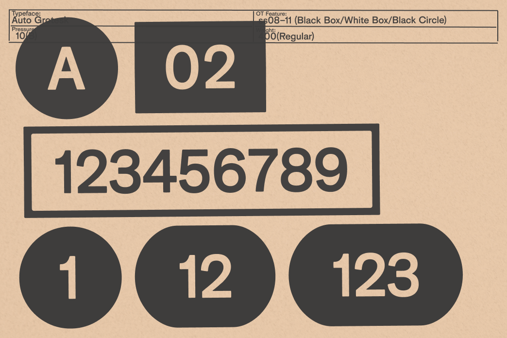
Rather than a faithful revival, Auto Grotesk draws from multiple sources—echoing early sans serifs that paved the way for Akzidenz Grotesk, such as Bauer & Co.’s Cirkular Grotesk and Otto Weisert’s Breite Fette Grotesk. Each style is designed individually, like in traditional type cutting, preserving the charmingly naive irregularities—because let’s face it, perfect is boring. By dialing back optical corrections and mixing rectangular and circular shapes, the letters swing to a lively, unconventional rhythm—true to the material.
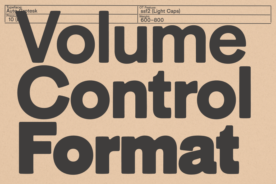
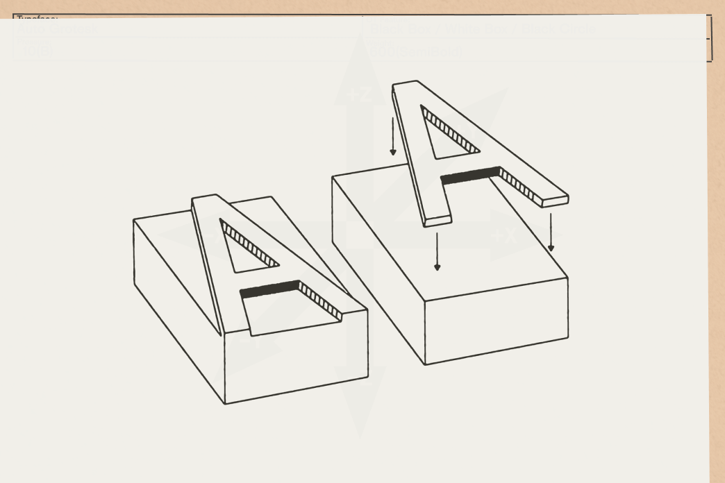
Designed to thrive in both print and pixel, Auto Grotesk softens the sharp sterility of contemporary sans-serifs, translating the quirks of ink squash and paper pressure into a smoother digital texture. Its variable axes of weight and pressure let designers literally tweak how the letters “squish,” carrying the spirit of the press straight into the screen.
Auto Grotesk is a love letter to imperfection: proof that progress and patina can coexist—and that, yes, even in the digital age, wood still leaves a mark.
Get the Auto Grotesk typefamiles here!
