Selestin Typefamily
Artistry and elegance, elevated by imagination and precision
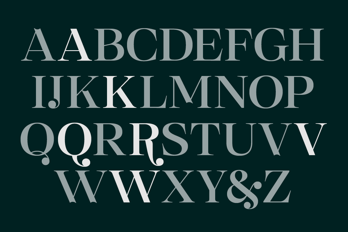
Born from a 36 Days of Type experiment, Tasos Varipatis’ sketches evolved into a type family existing in its own constellation of refinement and warmth. What began as an exploration of contrast, ornament, and expressive form became Selestin: a handcrafted serif with calligraphic roots and expressive details often lost in the digital age.
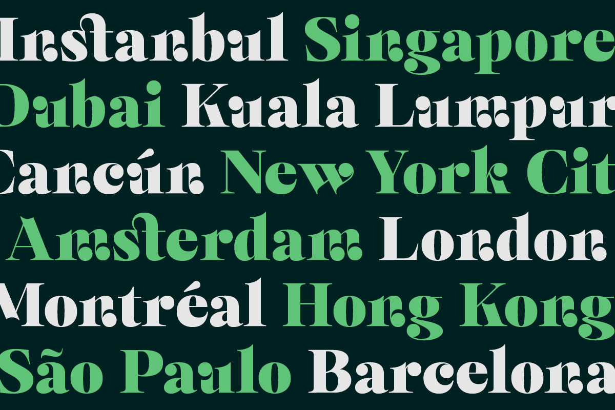
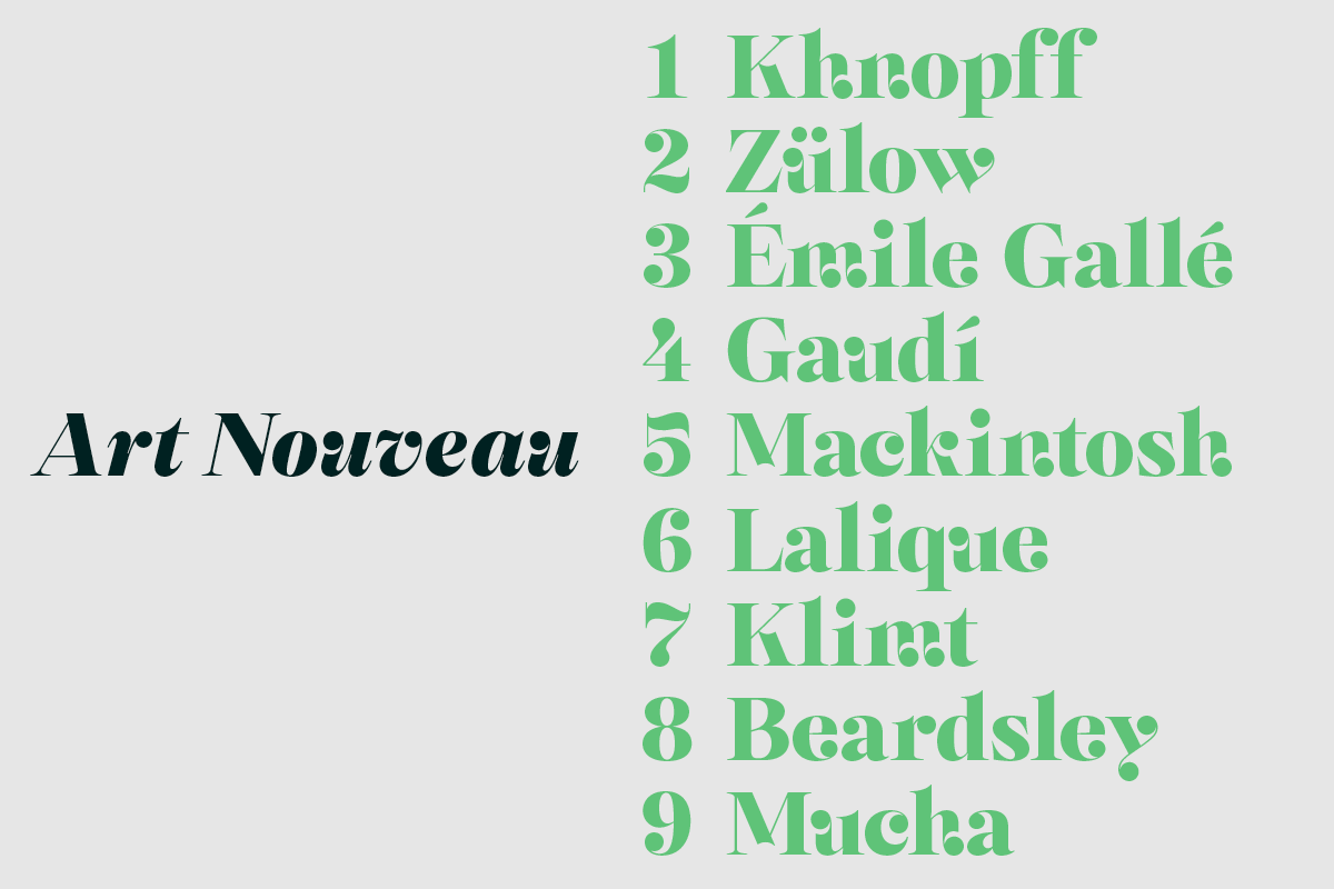
Early sketches of “n,” “h,” and “m” felt disconnected—until Tasos introduced a circular element that reshaped the typeface’s personality. From 2023 to 2025, Selestin grew like a sculpture: curves shaped, engraves refined, its universe slowly forming. A synthesis of experimental drawing and graffiti, Selestin carries influences from Art Nouveau and 18th-century engravings. Its flowing curves and crisp serifs merge classical elegance with contemporary clarity. It feels both hand-made and modern, a quiet rebellion against mass-produced sameness and algorithmic design.
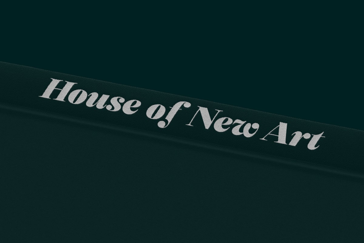
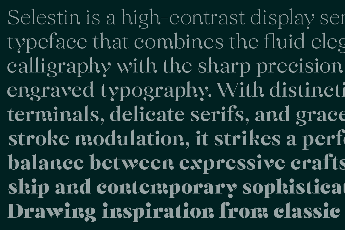
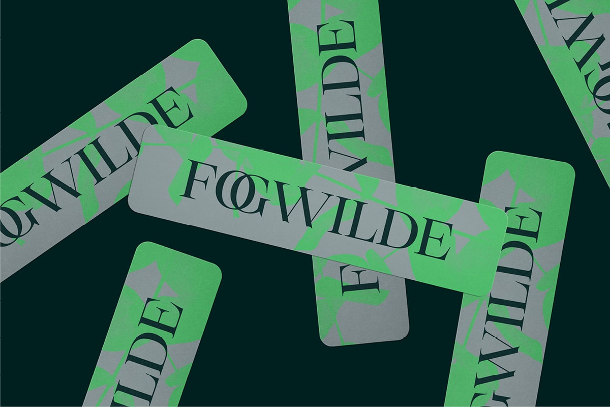
Selestin’s identity defies simple categorization. Its distinctive ball terminals—born from the natural pooling of ink—anchor its rhythm and guide the eye like revolving planets. The typeface feels musical, expressive, and calm, capable of evoking a cosmos, an opera, or a refined gallery space. Beyond beauty, Selestin performs: clear at all scales, versatile in editorial and branding contexts, luxurious yet playful with alternates and ligatures. Designed for opulence and modern sophistication, it elevates publications, packaging, signage, and poetic expression. A bridge between discipline and imagination, between engraved precision and calligraphic freedom—Selestin doesn’t just stand out. It moves.
