Bárur
A Wavy Display Typeface for Bold, Expressive Designs
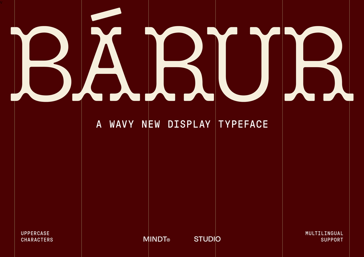
Bárur is a wavy display serif defined by rhythm, softness and flow. The typeface embraces movement as its core principle, echoing ocean waves and natural cycles. Its name, taken from Old Norse for “waves”, captures both its visual language and emotional tone.
The typeface strikes a compelling balance between clarity and expressiveness. Its rounded, subtly sculpted serifs guide the eye smoothly across uppercase letterforms, creating an organic and almost kinetic reading experience. While Bárur references historical serif traditions, it deliberately avoids decorative excess. Instead, it leans toward a cleaner, more geometric construction that situates it firmly in a contemporary context.
Flexibility is built into the system: select characters come with optional serif-less alternates, allowing designers to modulate texture and rhythm within a layout. In addition, the typeface includes 39 ligatures, a full set of numerals, punctuation, and multilingual Latin support—offering a surprising range for a display-focused family.
Currently available in Light and Regular weights, with a Bold style in development, Bárur is released as an early-access typeface and will continue to evolve through free updates. Its strengths shine most clearly in large-scale applications such as logos, branding systems, packaging, editorial headlines and posters. Anywhere a typographic voice with movement and presence is required.
Learn more about Mindt® Studio here.
Bárur
Foundry: Mindt® Studio
Designer: Sarah Schroeder
Release: October 2025
File Formats: OTF/TTF/WOFF/WOFF2,
A trial license may be requested via email ([email protected]).
Include your name, company, position, and the intended use case.


