Feisar Express von Paul van der Laan
Feisar Express heißt die Erweiterung der Fontfamilie Feisar.
Feisar Express, designed by Paul van der Laan, is the latest addition to the Feisar family and is available now from the Type Invaders online shop.
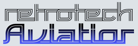
Feisar Express could be called a "retro-futuristic inline script typeface family". But it would be better to say that it is the outcome of an experiment to explore what can be done with current font technology. This family comes in two different inline styles (called One and Two) and each inline style comes in three different variants for up, down and alternating connections (called Uptown, Downtown and Crosstown).
To make these various types of connections possible, Feisar Express contains multiple versions for each letter and therefore one font contains more than 1000 glyphs.
The Uptown variant connects all the letters at the top of the x-height and the Downtown variant does that in a similar vein at the bottom of the x-height. But the Crosstown variant is the real heart-stopper as it always tries to connect the letters in such a way that the connections alternate between the top and the bottom. This is achieved through some clever OpenType programming in the font.
A special introductory price of 50 euros for the complete bundle applies until 15 August.