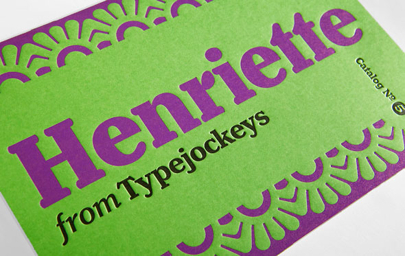
Henriette
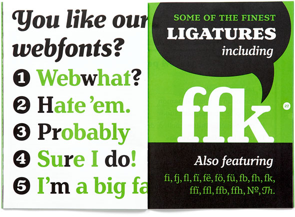
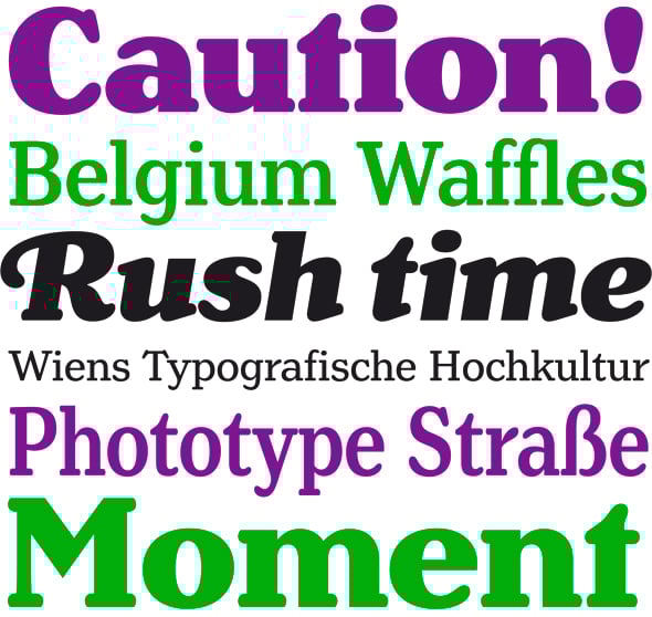
Henriette heißt die neueste Schrift aus dem Hause Typejockeys, die von Michael Hochleiter, der mit seiner Schrift Ingeborg bereits einen Award gewinnen konnte, entwickelt wurde. Sie besteht aus 30 Schriftstilen mit jeweils 5 verschiedenen Schnitten und enthält Small Caps sowie Swash Caps. Alle Schnitte enthalten Ligaturen, Alternative Glyphen, Pfeile und verschiedene Ornamente/figürliche Stile. Inspiriert wurde die Schrift von den alten Straßenschildern Wiens, die es in 16 verschiedenen Schriftvarianten gibt. Die Henriette ist im Schnitt Black als Gratisdownload auf der Website von Typejockeys erhältlich.
Pressetext: In the 1920s the Viennese government decided to standardize the street signs across the city. Since then, around 7,000 streets and squares in the Austrian capital have been labeled with white-on-blue enamel plates. A typeface was especially constructed for the purpose – but we don’t know by whom. It was available in a Heavy and a Bold Condensed version, to support short street names like Gaußplatz, as well as longer names like Wolfgang-Mühlwanger-Straße. Since the 1970s, phototypesetting has been used to produce the plates, which allows the enamel producer to also stretch the typeface to the perfect length (and which kind of hurts sometimes). As the years went by, the typeface was adopted and redrawn by several enamel factories, who each wanted a part of the cake. These adaptations lead to variations on the design, and to the fact that there isn’t a Viennese street sign font but 16 – in part severely – different versions, which we found in our research (bastards not included).
Henriette is not a digitization of any of those versions; rather, it is influenced by all of them. In the end, it is another approach on the typeface that we love for its uniqueness, in the otherwise slender typographic history of our country.
Henriette was developed by Michael Hochleiter, creator of the TDC award winning didone family Ingeborg. Henriette is his second big type family. It consists of 30 styles including 5 weights, Condensed and Compressed widths and accopanying Italics. We also didn’t scimp on OpenType features: All the Romans include a set of Small Caps, the Italics Swash Caps. All weights have ligatures, alternate glyphs, fractions, arrows and several figure styles. In addition to that Henriette comes with a Frames font, that is included with every purchased font.
Henriette - Typejockeys
Gestaltung: Michael Hochleiter
Herausgeber: Typejockeys
Veröffentlichung: 2012
Schnitte: Übersicht
Preis: Komplettpaket 520 Euro