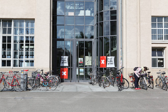
Il y a le feu au lac—Swiss Graphic Design
On the occasion of the publication of Slanted Magazine #23—Swiss Issue, the conference “Il y a le feu au lac—Swiss Graphic Design” on the topic of Swiss graphic design today and yesterday took place last Thursday in cooperation with the HfG Karlsruhe University of Arts and Design. Approximately 300 participants were able to listen to exciting lectures from various areas of Swiss graphic design from 11 a.m. to 5:30 p.m. and see for themselves what is attached to the term “Swiss graphic design” today.
Robert Lzicar started as the first lecturer and took us on a journey into the history of Swiss poster art, within which he explored the question of what is actually associated with the term “Swiss graphic art” today. Among other things, he used the video interviews with designer personalities conducted by the Slanted editorial team during the Tour de Suisse in February 2014 as a basis. As part of his research assignment at the Bern University of the Arts, the impressive platform “Mapping Graphic Design History in Switzerland” was created, which he also presented and on which some of the most important graphic works in Switzerland have been catalogued and are constantly being updated.
Since we received a cancellation from IDPURE at short notice, we were very pleased to be able to include Urs Lehni, a speaker from the field of publishing in Switzerland, in the program. In his publishing project Rollo-Press he regularly issues publications that have won many awards. He presented a project close to his heart, a publication about the late US artist and musician Wesley Willis, whose music was characterized by simplicity and sometimes bizarre lyrics and whose visual worlds had a very unique signature. The extensive oeuvre is to be compiled in a publication.
Ian Party, co-founder of Swiss Typefaces and lecturer at the renowned ECAL in Lausanne, presented Swiss Typefaces’ very own “Swiss Style” and made many connections to his homeland. For example, the professional cyclist imagines riding a bicycle in the curves of his typefaces to find the optimal line.
Kristin Irion runs the Bringolf Irion Vögeli studio together with Natalie Bringolf, where we were allowed to be guests on our editorial trip and gain an insight into their work. Since 1991, the designers and their team have been active not only in the field of corporate design and print products, but also in the area of signage and building lettering. In her lecture, Kristin Irion presented various projects from the above-mentioned areas and showed the path from the idea to the result.
Eric Andersen is a citizen of Zurich with Danish roots and currently designs only posters that have a high recognition value. His clientele is closely connected to his environment and gives him the freedom to experiment in his visual language. This is also noticeable in the various techniques used in the production of his work, such as woodcut, lead typesetting, screen printing or risography, because Andersen does everything himself from design to the final product. In addition to the individual projects, he provided insight into the respective genesis of his posters.
We would like to thank Robert Lzicar, Ian Party, Kristin Irion, Natalie Bringolf and Eric Andersen for accepting our invitation to Karlsruhe. A special thank you to Urs Lehni for curating the conference with us and giving a great talk on such short notice. To the Karlsruhe University of Design for their support and hospitality. To Tanja Hildebrandt, Victoria Langmann and Béla Meiers for designing the visual concept of the conference. To Juliane Hohlbaum and all the students involved who managed the set-up, technology, sales and dismantling. Many thanks!
Thanks also to all participants. We hope you had an inspiring time at Il y a le feu au lac!
Supported by Pro Helvetia Swiss Arts Council
Design: Tanja Hildebrandt, Victoria Langmann, Béla Meiers (HfG Karlsruhe)
Photos: Ceren Bulut and HfG Karlsruhe