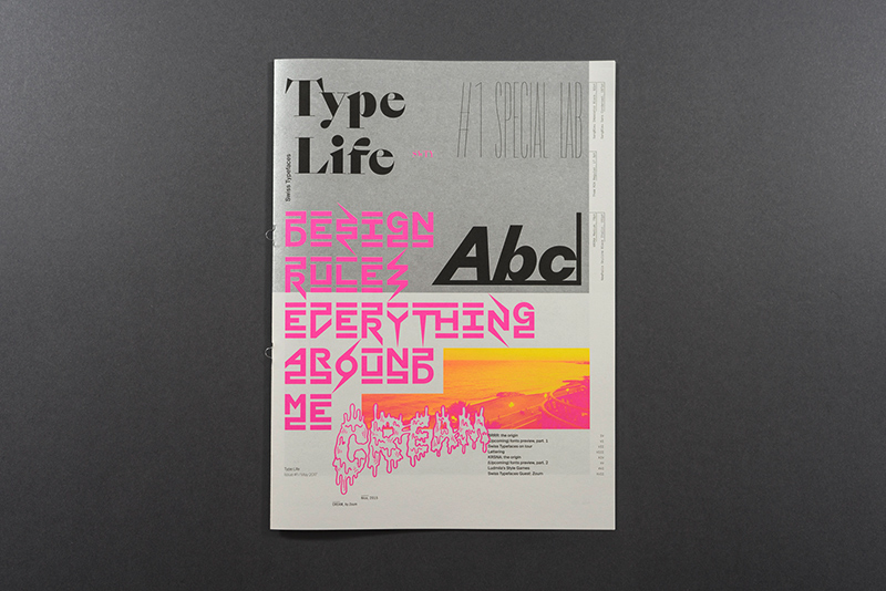
Type Life
Ein Feuerwerk an Inspirationen – das beschreibt das Type Life Magazin schon auf den ersten Blick sehr treffend. Mit einer Mischung aus Fotografie, Lettering und digitaler Typografie, ist es kein typisches Specimen, sondern eine wunderschön veredelte Zelebration von Ideen der Type Foundry Swiss Typefaces. Jede Ausgabe wird einem ausgewählten Thema gewidmet und von verschiedenen Künstlern, Illustratoren und Designern interpretiert. Abgesehen vom Zeitungsformat und den besonderen Metallic- und Neonfarben, wird jede Ausgabe ihren Character im Prozess verändern.
Type Life #1 Special Lab
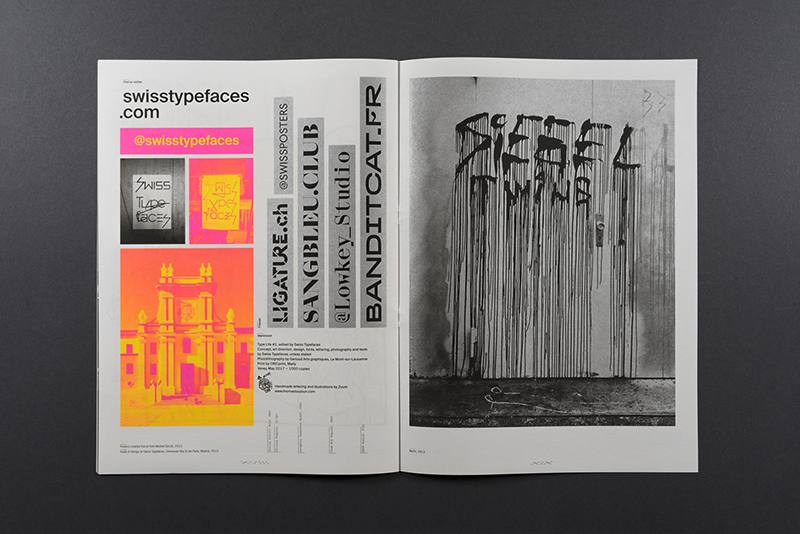
Herausgeber: Swiss Typefaces
Veröffentlichung: 2017
Auflage: 1,000 Stück
Umfang: 20 Seiten
Format: 23,5 × 32 cm
Druckfarben: Metallic Silber, Neon Pink und Gelb
Preis: 5,- Pfund
Introducing Type Life
Type Life is a new series of printed publications about design, typography and lifestyle, presented by Swiss Typefaces. It is packed to the brim with letterforms, and yet it is not a specimen. Type Life is a celebration of style and a wellspring of inspiration. Instead of long texts, there are lots of images, including photography, illustration, lettering, and exclusive previews of upcoming typefaces, forming a highly visual experience. Each issue will be devoted to one chosen theme, and is made in collaboration with guest artists, illustrators, and designers. The printing process along with the use of metallic and neon colors is a key aspect. Apart from the format of a newspaper magazine, the identity of Type Life will change with every issue, depending on the topics and the guests.
Issue #1: Special Lab
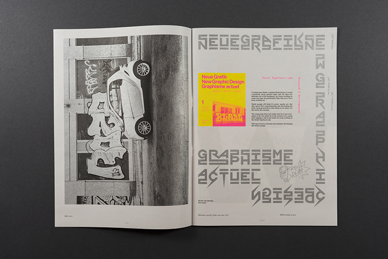
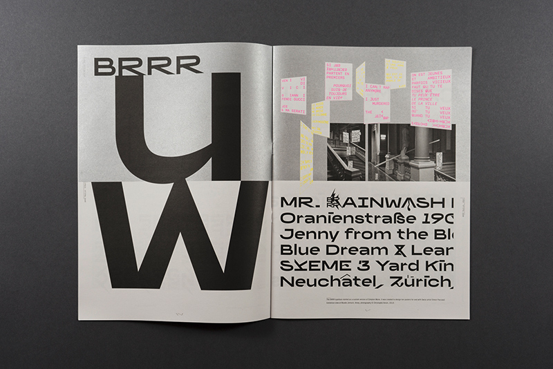
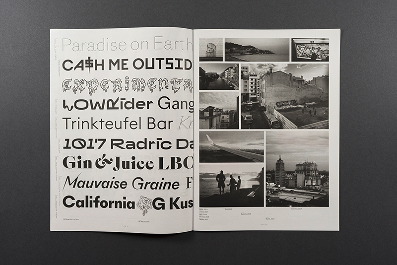
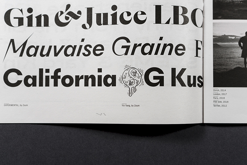
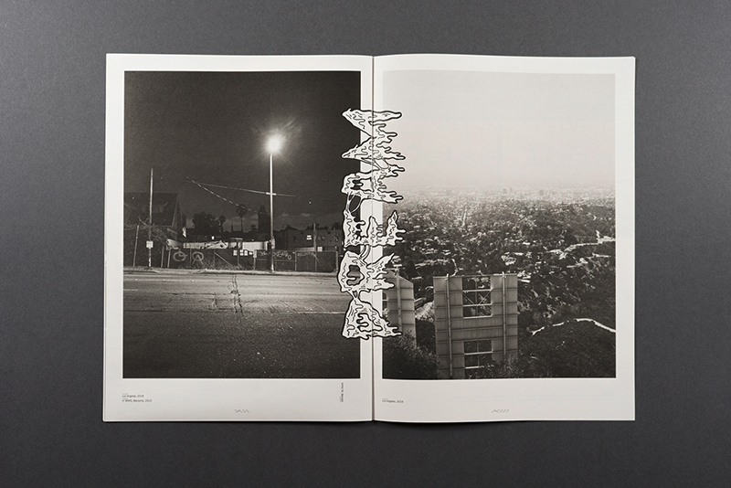
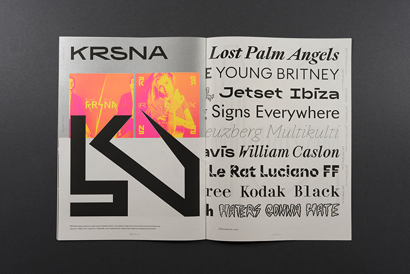
The inaugural issue is a special about the Lab. In this Research & Development department, the designers of Swiss Typefaces explore new ideas for future fonts. Two of the most recent additions to the Lab are showcased here. The first one named BRRR is a playful wide Grotesk with a great deal of disruptive details. A spin-off from Simplon Mono, it was initially created to design a poster series for Swiss artist Simon Paccaud. KRSNA started out as a custom version of NewParis Skyline, made for two vinyl record sleeeves by Geneva-based musician Grace Core. This experimental typeface abandons the convention of a continuous baseline and introduces a three-storey space where the letters can sit at the top, center or bottom, with the remaining space filled by bars and spikes. The resulting word images are captivating patterns with logo-like qualities. Type Life reveals how BRRR and KRSNA came into being by depicting preliminary sketches, evolutionary steps, and photos of experiments made during trips. Reproductions of the very first applications show the fonts in context.
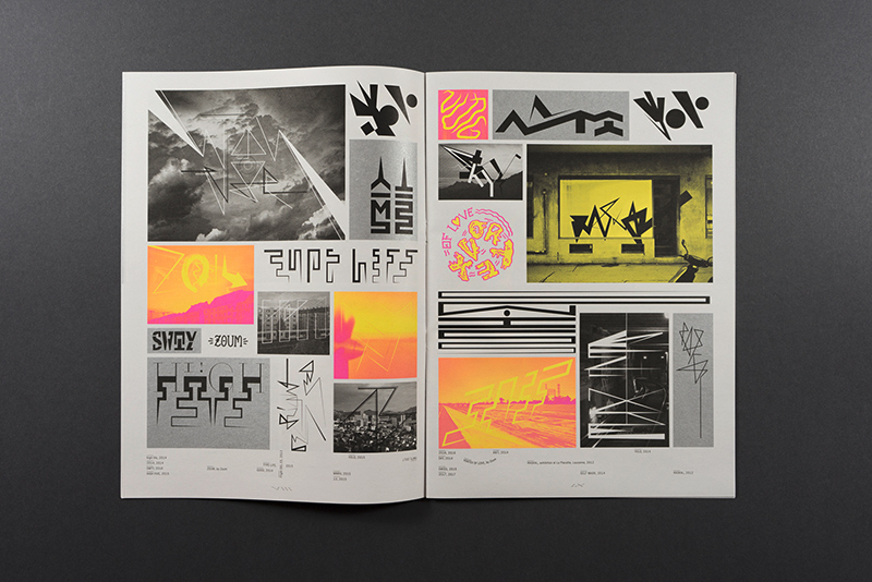
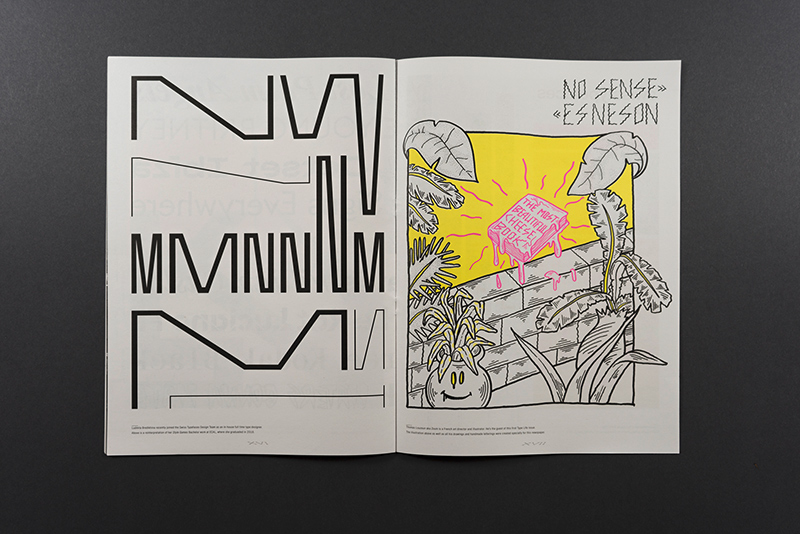
Get to know Zoum, Style Games, and the all-new SangBleu Collection
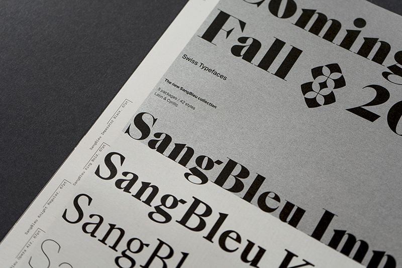
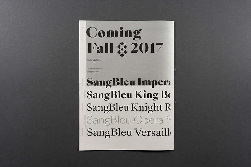
The guest contributor to the first issue is Thomas Louzoun aka Zoum, a French art director and illustrator. His whimsical drawings and handmade letterings were created specifically for Type Life. Among the other contents is a feature of the Style Games Bachelor work made by type designer Ludmila Bredikhina at ECAL, and a luscious spread with samples of fonts that were either just launched or will be made available in the future. On the back cover, Swiss Typefaces drops a bomb by announcing a milestone release for fall 2017: The SangBleu Collection is a brand new typeface series spanning 5 subfamilies with 46 styles – from the succulent Imperator Black to the ethereal Opera Air –, all of them supporting both the Latin and the Cyrillic alphabet.
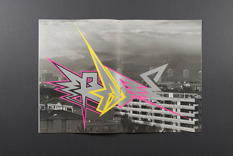
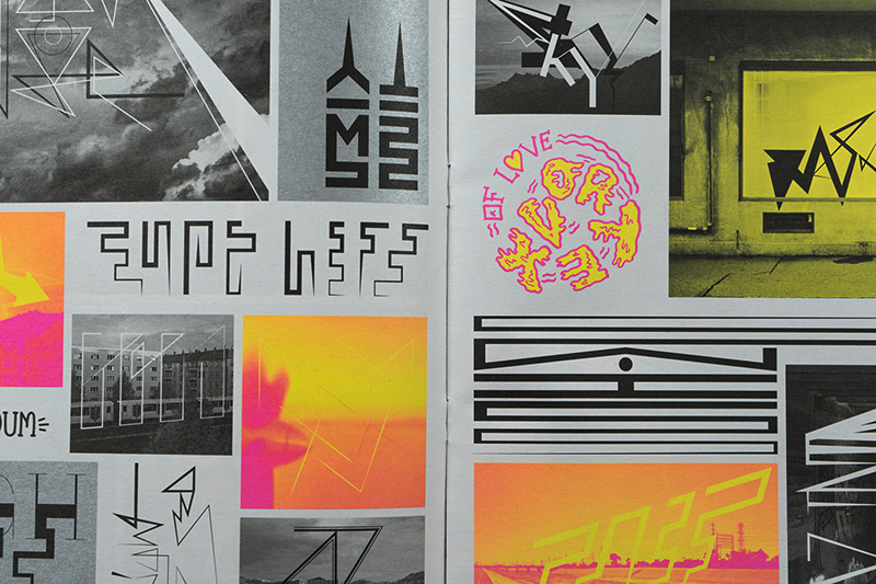
An underlying theme in Type Life #1 is the confrontation of opposites. Systematic typography is interspersed with footloose lettering, accurate vector shapes are shown side by side with drippy comic blackletter. Highbrow clashes with subculture when an icon of the Swiss International Style gets remixed with graffiti. Past meets present also in the typeface designs that always and inevitably are contextualized in history. The digital is contrasted with the analog, the local with the cosmopolitan, the abstract with the personal. On a formal level, all of this is represented by the combination of uncoated newsprint and glamorous spot colors. The minimal but nevertheless unique color palette featuring Pantone neon pink and yellow along with silver and black is a defining element of the publication’s identity.