TypeCon was a Capital Good Time!
Vor Kurzem fand die TypeCon in Washington statt. Patrick Gosnell hat sich dort für uns umgesehen und einen ausführlichen Bericht über das diesjährige Event verfasst. Vielen Dank, Patrick!
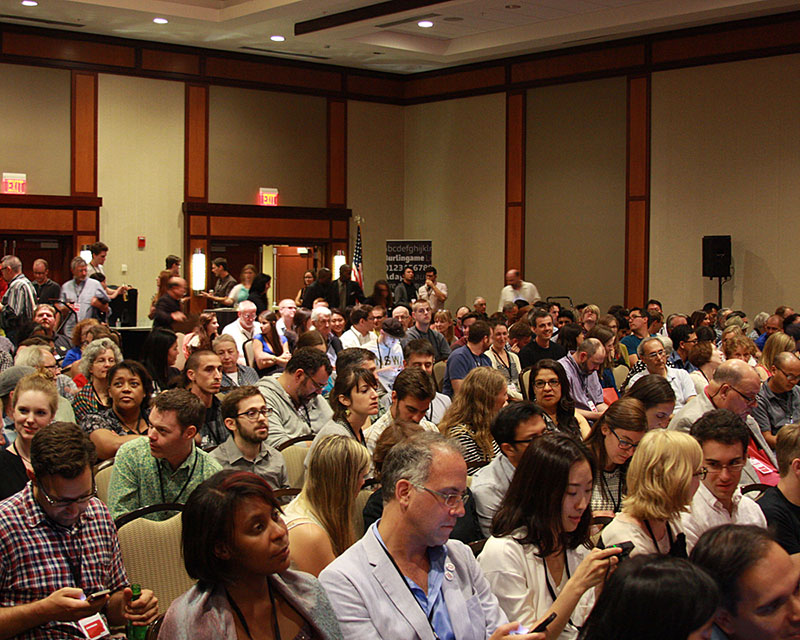
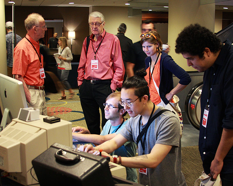
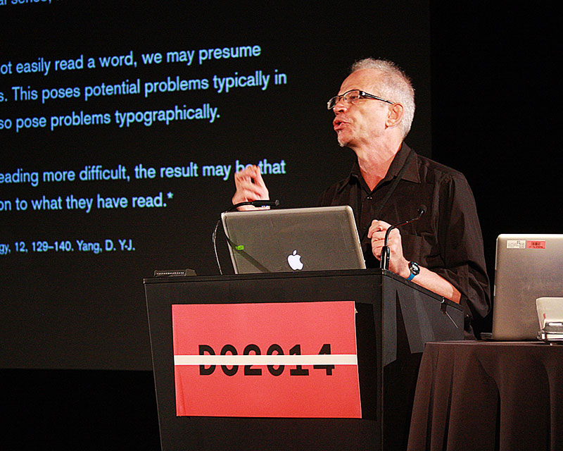
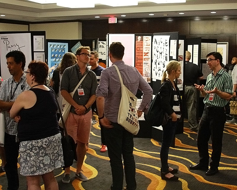
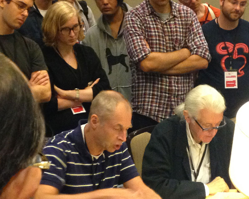
This was my first trip to TypeCon, so I was not quite sure what to expect. Would I be required to correctly label seventeen different forms of Blackletter before being allowed in the door? Would the conference consist of three days of fervent lectures on the difficult nature of hinting Arabic type? (Well, yes, but more on that later!) It turns out that TypeCon is one of the friendliest, most casual and easy-to-step-into conferences that I have attended. Yes, bigwigs like Matthew Carter, Tobias Frere- Jones and Gerry Leonidas are all in the room drinking tea or coffee—but, they’re drinking tea and coffee!—and they’re talking with other people who look just like me! And it’s not just them; everyone here is friendly and jovial, and somewhat amused that a group of people would all fly to Washington, D.C. just to geek out over letters!
After picking up my swag bag and t-shirt (and my ironically illegible nametag) I talked with some wonderful people from Monotype, grabbed a drink and found a seat for Frere-Jones’ keynote on Thursday night. Following the crowd’s preemptive standing ovation, Tobias, with humility and humor, led us through a two-hour deep dive into the history of typographic bank note security techniques. “I like letters that do things,” he quipped, as he shared a plethora of examples ranging from Benjamin Franklin’s notes designed for the colony of Pennsylvania on up to modern-day notes from around the world. It was a fascinating talk in which Frere-Jones said he had only just begun his research, and that he was excited about where these questions would lead. It set the proper tone for what would be an informative and energizing weekend.
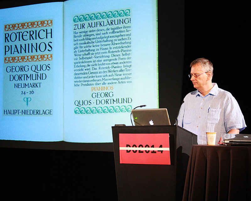
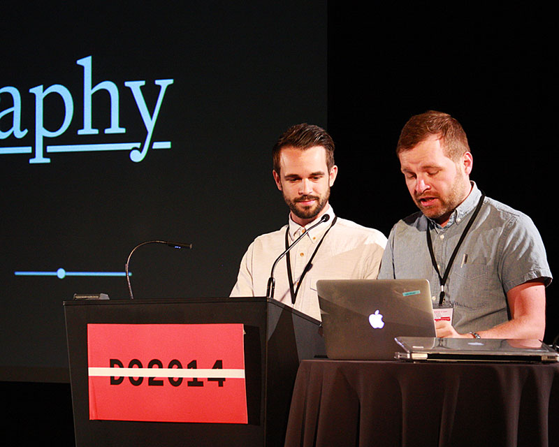
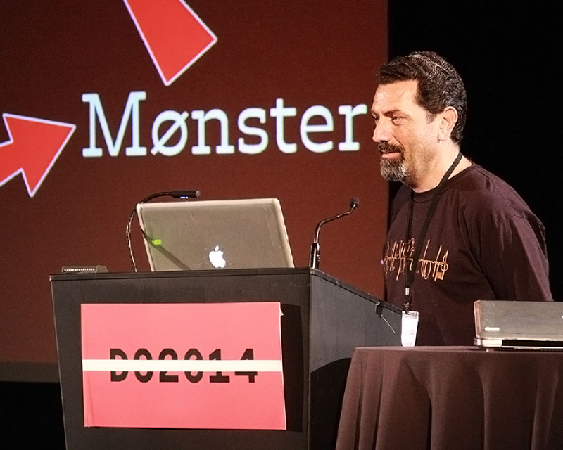
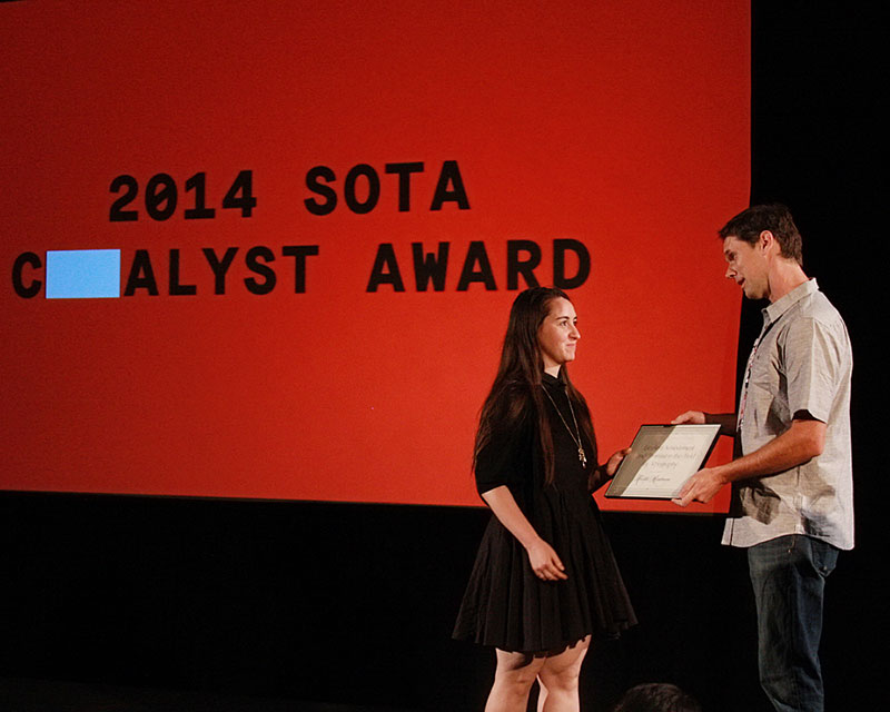
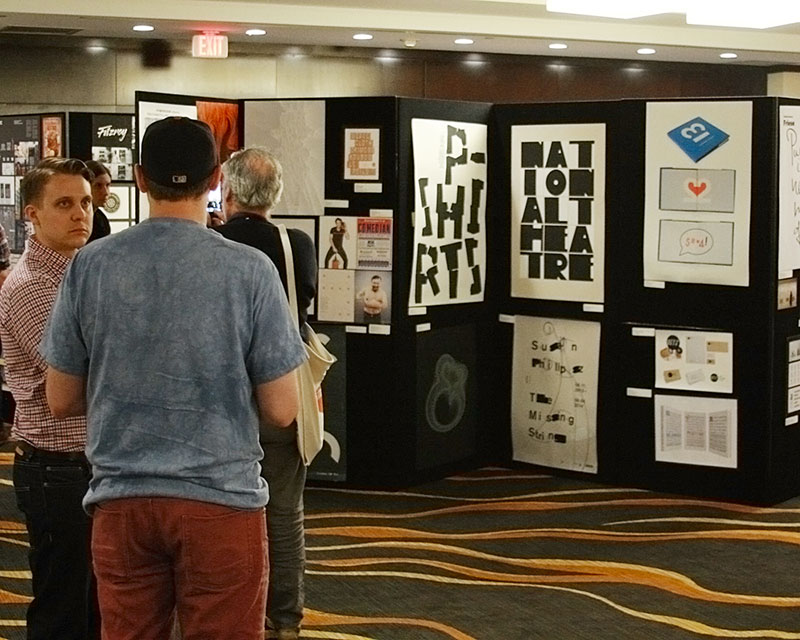
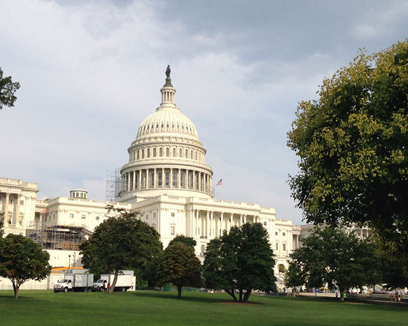
Friday began bright and early with Rob Saunders sharing some exquisite type specimens from his Letterform Archive collection, followed by Marcin Wichary and Dustin Senos from Medium who explained the pains of coding a proper underline. The ever-personable Mitch Goldstein, who teaches at RIT, let us in on a bit of his personal practice in a talk about the impact of combining letterforms with image making. And Nancy Sharon Collins treated us to a wry yet oh-so-proper survey of the history of printed calling cards. After a quick lunch and a jog over to the National Mall to see some monuments, the afternoon turned international with Hrant Papazian and Sarang Kulkarni speaking about the pitfalls in designing for other cultures and matching Devanagari scripts with Latin while retaining a sense of individualism respectively. The evening concluded with recent KABK graduate, Krista Radoeva, being presented with the SoTA Catalyst Award. Her work with Cyrillic and historical, ornamental type was astute beyond her years.
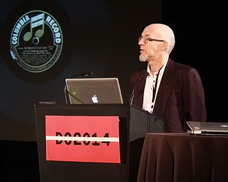
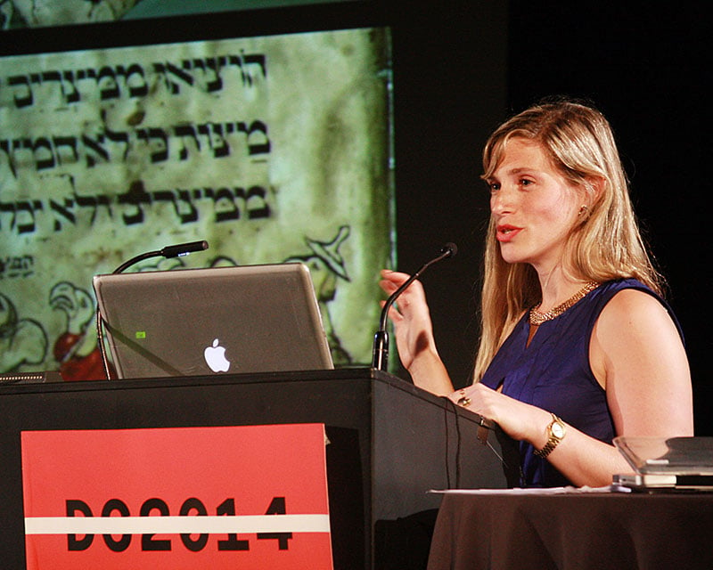
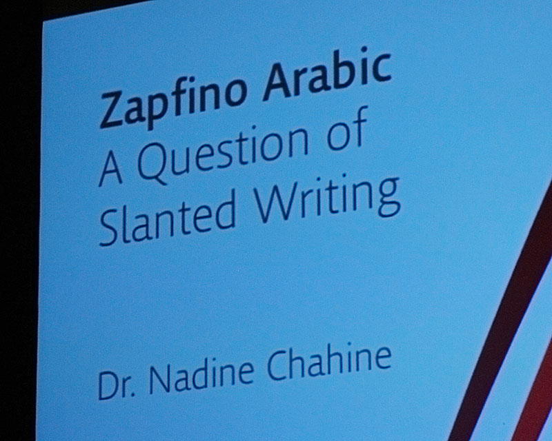
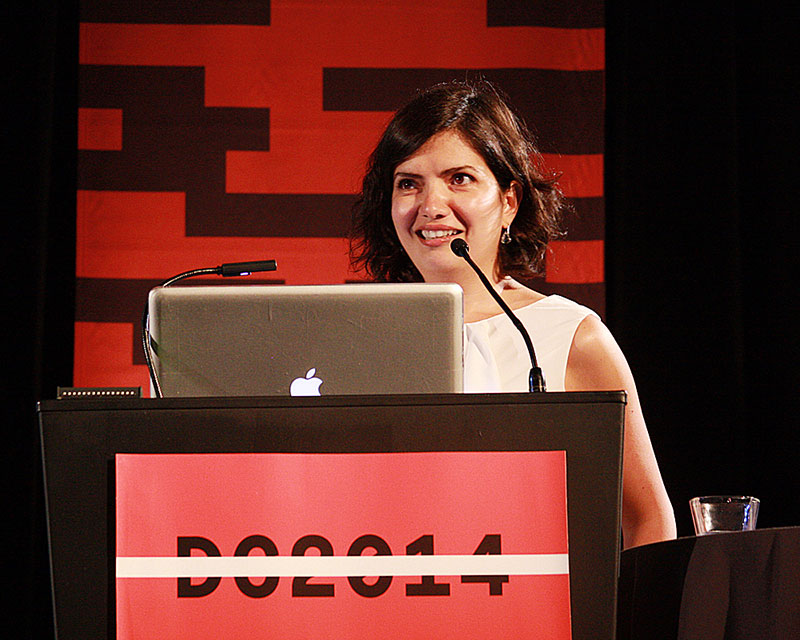
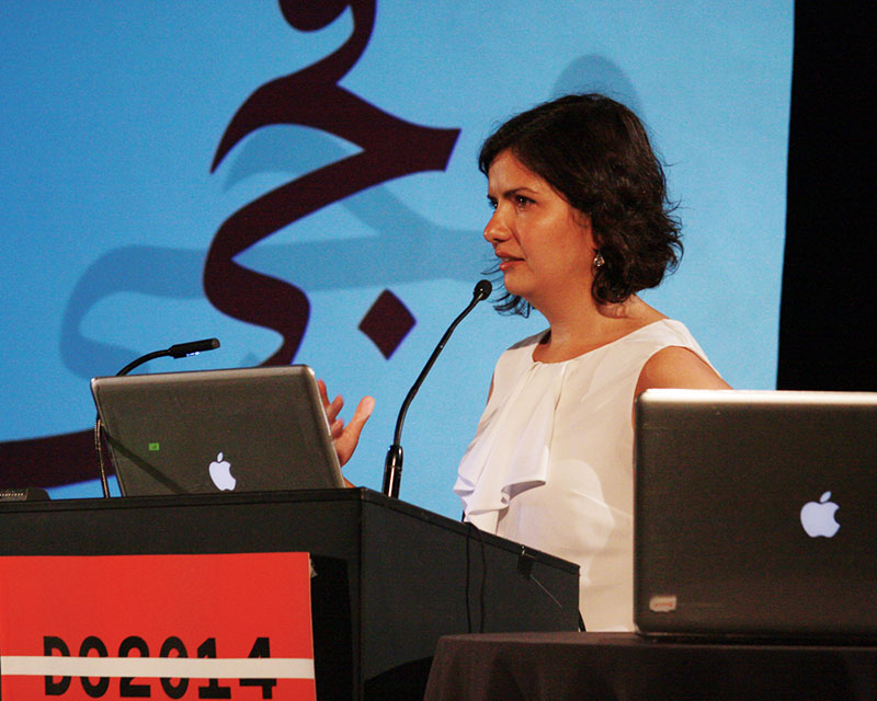
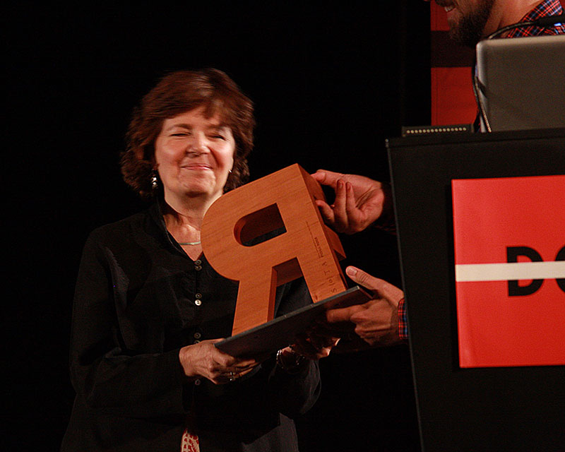
Saturday was full-steam-ahead as well, with Mila Waldeck enlightening the crowd by presenting the work of George Maciunas, the leader of the famed Fluxus group. It was amazing to see how his work from the 1960s seemingly anticipated much of the experimentation that was to take place in the 1990s with the digital revolution. Mark Jamra was up next, sharing the gripping tale of designing and producing a new 12-line wood typeface in just five days with a group of students. Thierry Blancpain debunked some of the myths surrounding Swiss graphic design, while ultimately succeeding in only making everyone in the audience want to move to Switzerland! Nick Shinn stole the afternoon with a raucous overview of the American record industry and the type and lettering that graced a multitude of packaging formats. Just before dinner, Monotype’s always-graceful Nadine Chahine delivered an entrancing talk about her journey to design an Arabic companion to Zapfino with Hermann Zapf. The night was capped off with the much-anticipated presentation of the SoTA Typography Award. There was palpable excitement and agreement in the room when Fiona Ross’ name was called. She has done so much to promote excellence in the design of non-Latin scripts for the industry, and she was surrounded by a multitude of friends and admirers as she humbly accepted the award.
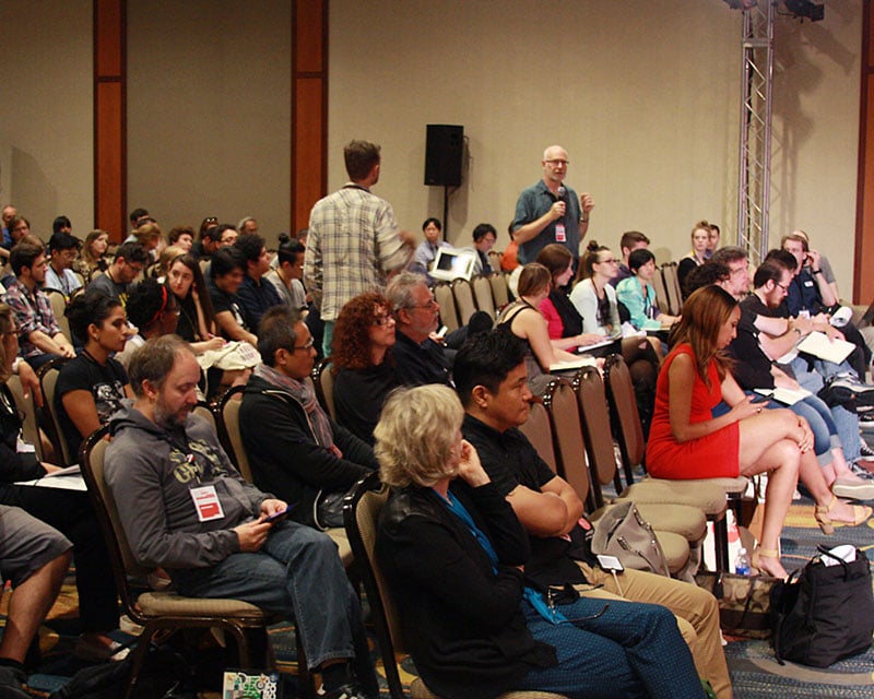
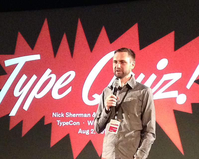
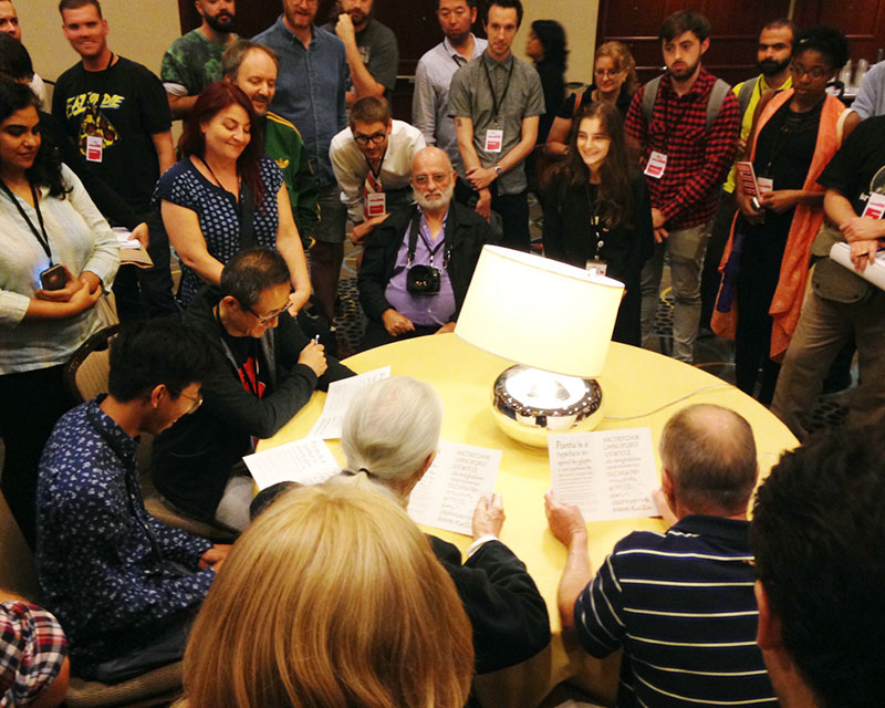
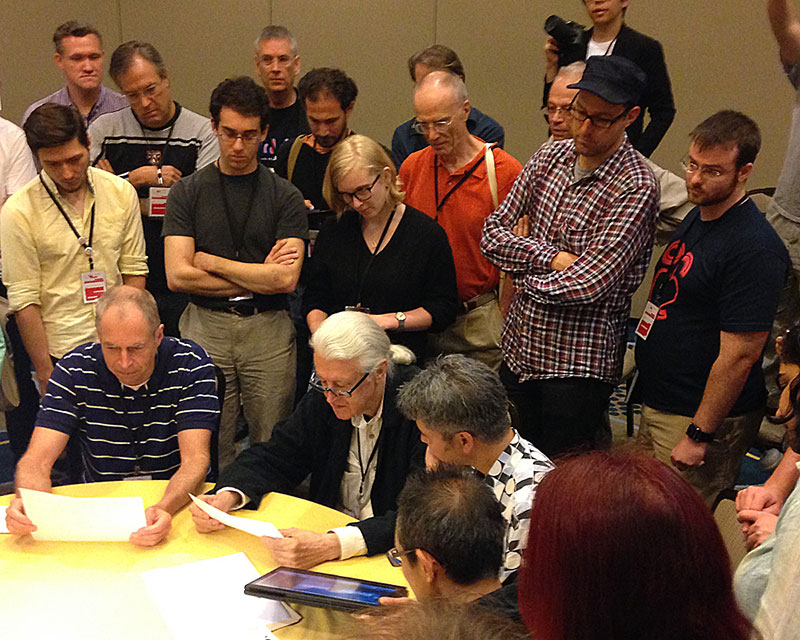
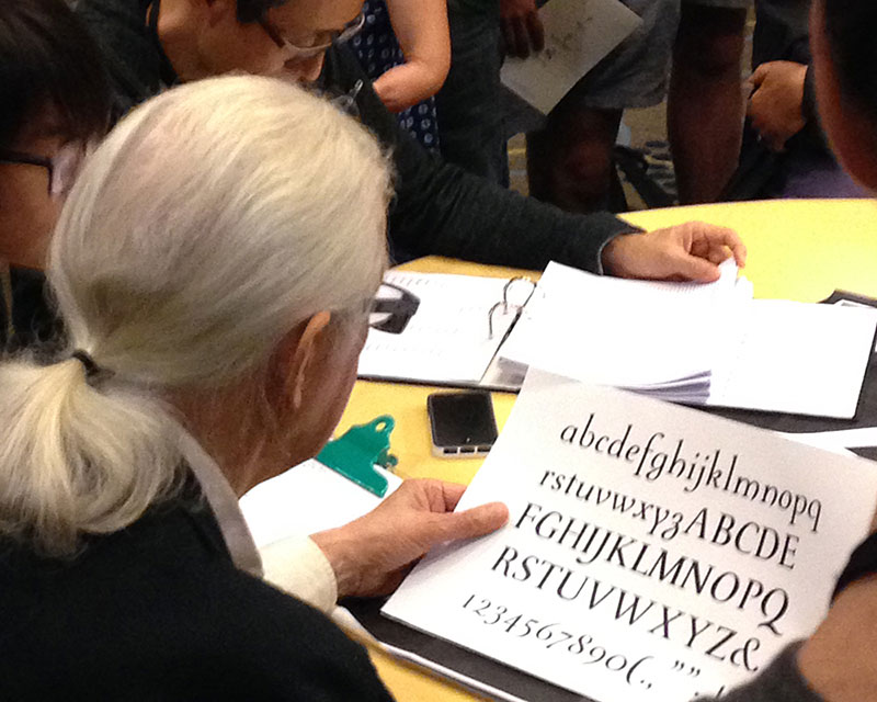
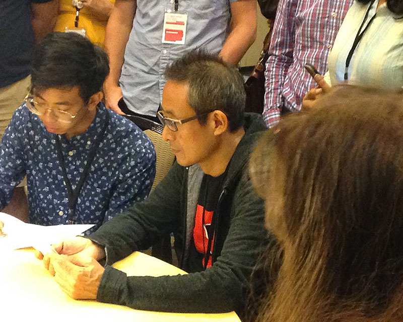
Sunday morning brought with it heavy eyes after enjoying some of D.C.’s happening bar scene the night before. It also brought some more technical (yet still entertaining) talks to round out a weekend full of diphthongs and diacritics, followed by an entertaining type crit judged by John Downer, Akira Kobayashi and Matthew Carter. TypeCon was all I wanted it to be and more. It was a time to make new friends and connections, to learn, to expand my worldview, and most of all, to feel comfortable expressing my inner type nerd.